The DayNight Solution
Google’s preferred solution is for you to use a theme that adapts based upon whether the device is in dark mode or not. That way, you can have a light theme “normally” while having a dark theme in dark mode.
In particular, AppCompat supports this via its DayNight theme family, though for best results on Android 10 you should use 1.1.0-beta01 or newer.
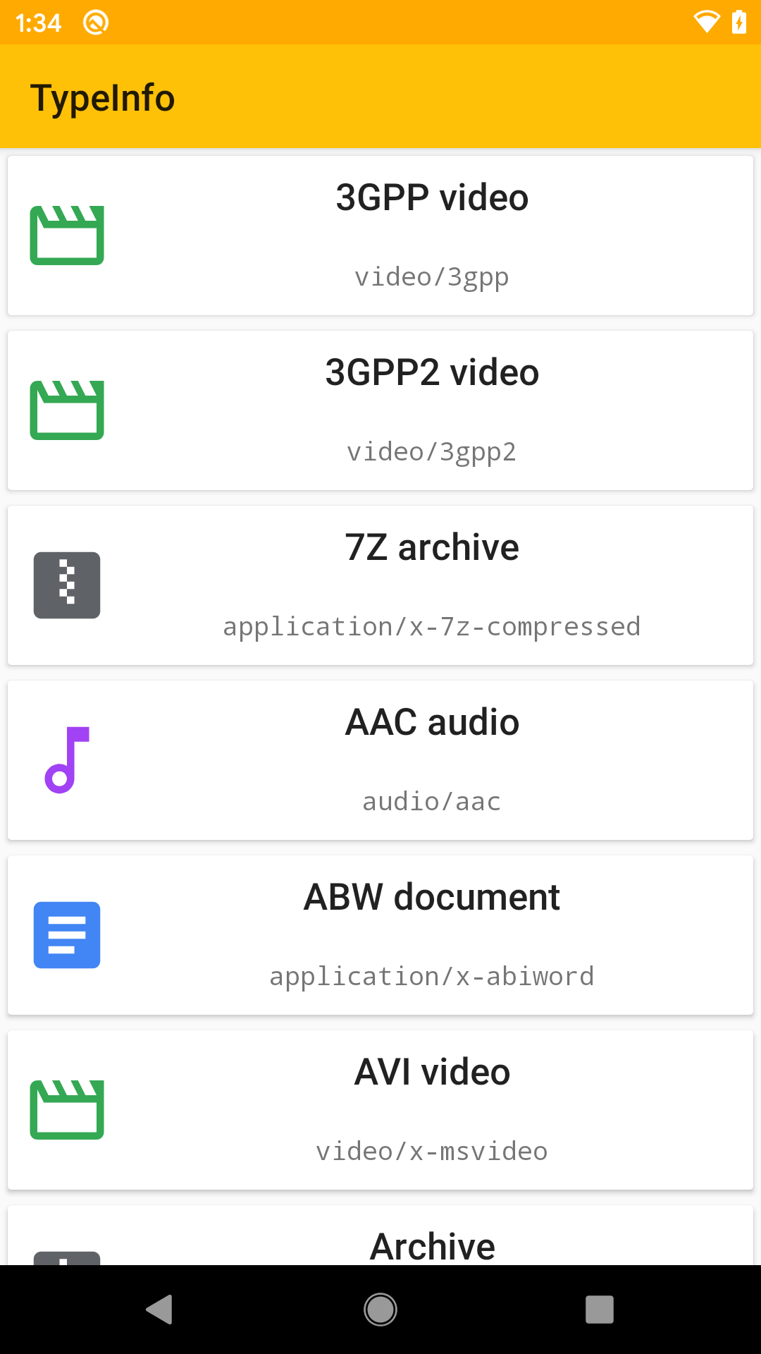
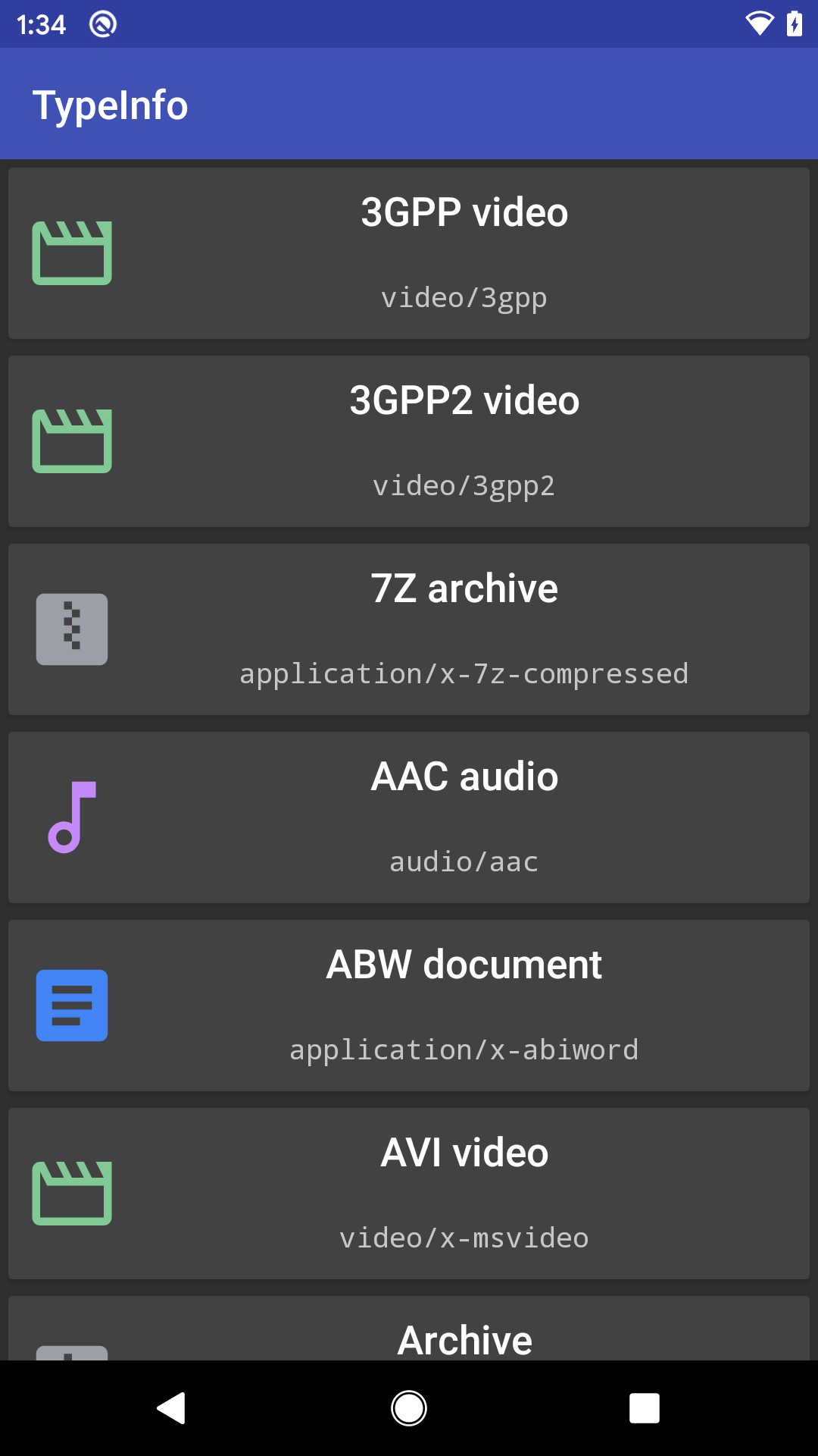
The TypeInfo sample module uses a DayNight theme. This sample presents information about a bunch of MIME types, as will be discussed in an upcoming chapter.
Use a DayNight Theme
Switching to a DayNight theme, in many cases, only requires you to change the parent theme to Theme.AppCompat.DayNight (or to another theme that extends from Theme.AppCompat.DayNight):
<resources>

  <!-- Base application theme. -->
  <style name="AppTheme" parent="Theme.AppCompat.DayNight">
    <!-- Customize your theme here. -->
    <item name="colorPrimary">@color/colorPrimary</item>
    <item name="colorPrimaryDark">@color/colorPrimaryDark</item>
    <item name="colorAccent">@color/colorAccent</item>
  </style>

</resources>
In dark mode, Theme.AppCompat.DayNight inherits from Theme.AppCompat, and so it has a dark base to the theme. Otherwise, Theme.AppCompat.DayNight inherits from Theme.AppCompat.Light, and so it has a light base to the theme. And, there are sub-themes, such as Theme.AppCompat.DayNight.DarkActionBar, that might fit your needs better.
Define -night Resources
Then, you can create alternative versions of colors, drawables, etc. that will be used in dark mode. These should go in resource sets with the -night qualifier.
For example, you might have one set of colors for normal mode in res/values/:
<?xml version="1.0" encoding="utf-8"?>
<resources>
  <color name="colorPrimary">#ffc107</color>
  <color name="colorPrimaryDark">#ffaa00</color>
  <color name="colorAccent">#536dfe</color>
</resources>
…and replacements for some of those colors in res/values-night/:
<?xml version="1.0" encoding="utf-8"?>
<resources>
  <color name="colorPrimary">#3F51B5</color>
  <color name="colorPrimaryDark">#303F9F</color>
  <color name="colorAccent">#FFC107</color>
</resources>
The combination of the DayNight theme and your custom -night resources will allow your app to adapt automatically as the user switches between normal and dark mode:
Setting the Dark Mode Policy
You can teach AppCompat — specifically AppCompatDelegate — how you want your DayNight theme to behave, such as forcing it to always use dark mode.
Policy Options
There are four main options, identified by constants on AppCompatDelegate:
| Constant | Meaning |
|---|---|
MODE_NIGHT_NO |
Use a light theme |
MODE_NIGHT_YES |
Use a dark theme |
MODE_NIGHT_FOLLOW_SYSTEM |
Use a light or dark theme based on Android 10’s system status |
MODE_NIGHT_AUTO_BATTERY |
Use a dark theme when the device battery level is low, otherwise use a light theme |
The overall default is MODE_NIGHT_FOLLOW_SYSTEM, even though this only really works on Android 10. The effect of this mode on older devices is undocumented.
Policy Locations
If you pass one of those constants to AppCompat.setDefaultNightMode(), this will update all current activities for that new policy, plus that policy will be used for future activities in your running process.
If you want to affect only a single activity, you can call getDelegate() to retrieve the AppCompatDelegate instance for your AppCompatActivity, then call setLocalNightMode() on it.
The TypeInfo sample app uses AppCompat.setDefaultNightMode(), even though there is only one activity.
Policy Persistence
setLocalNightMode() affects only that one activity instance, while AppCompat.setDefaultNightMode() affects your entire process. However, neither is persisted. You will want to establish your policy on each process invocation, such as in a custom Application subclass.
The TypeInfo sample app, since it contains only one activity, applies the policy in that activity (MainActivity). MainActivity has a checkable overflow menu to allow the user to toggle the policy. MainMotor persists that in SharedPreferences, plus loads the last-saved value on startup.
Policy Policies
If you are bothering with DayNight, presumably there are cases where you want light themes and cases where you want dark themes. As a result, there are three main patterns for using these policies:
- You elect to use
MODE_NIGHT_FOLLOW_SYSTEMorMODE_NIGHT_AUTO_BATTERY, putting control over the light/dark decision into the system and AppCompat implementation - You elect to allow the user to choose between these modes, perhaps via a preference screen (or, as in the case of the
TypeInfosample, a menu) - You elect to toggle modes yourself based on other criteria (ambient light sensor, particular times of the day, etc.)
The Design Problem
Technically, supporting DayNight is easy.
From a design standpoint, now you need two designs, with two color schemes, two sets of artwork, etc. Careful creation of those designs can minimize the differences, to help both the designers and the developers maintain these things over time. However, the designs are needed, to confirm that both the light and dark themes are usable (e.g., text is readable in both themes, despite changing text and background colors).
Prev Table of Contents Next
This book is licensed under the Creative Commons Attribution-ShareAlike 4.0 International license.