Dark Mode
Android 10 offers a system-level option to enable “dark mode”. In dark mode, light UI backgrounds get flipped to dark ones. This primarily affects system UI, but apps can elect to react to this change as well, or otherwise support a dark theme for their apps.
In this chapter, we will explore Android 10’s dark mode options and see how our apps might adopt a dark theme.
Turning to the Dark Side
In the early days of Android, dark themes were typical. Then, starting with Android 4.x and increasing afterwards, Google started encouraging light themes. Now, Google is back to endorsing dark themes.
Reasons
Partly, this is for the user experience. People using their devices at night can do so more easily if the UI is darker and therefore offers less glare. This is why navigation apps often switch into a dark mode at different points (e.g., when ambient light seems to be low), so drivers do not have this bright light shining at them constantly. Also, some users may have visual impairments or other conditions where such glare is a bigger problem than for other people.
Also, with some types of modern displays, black pixels consume less power.
User Actions
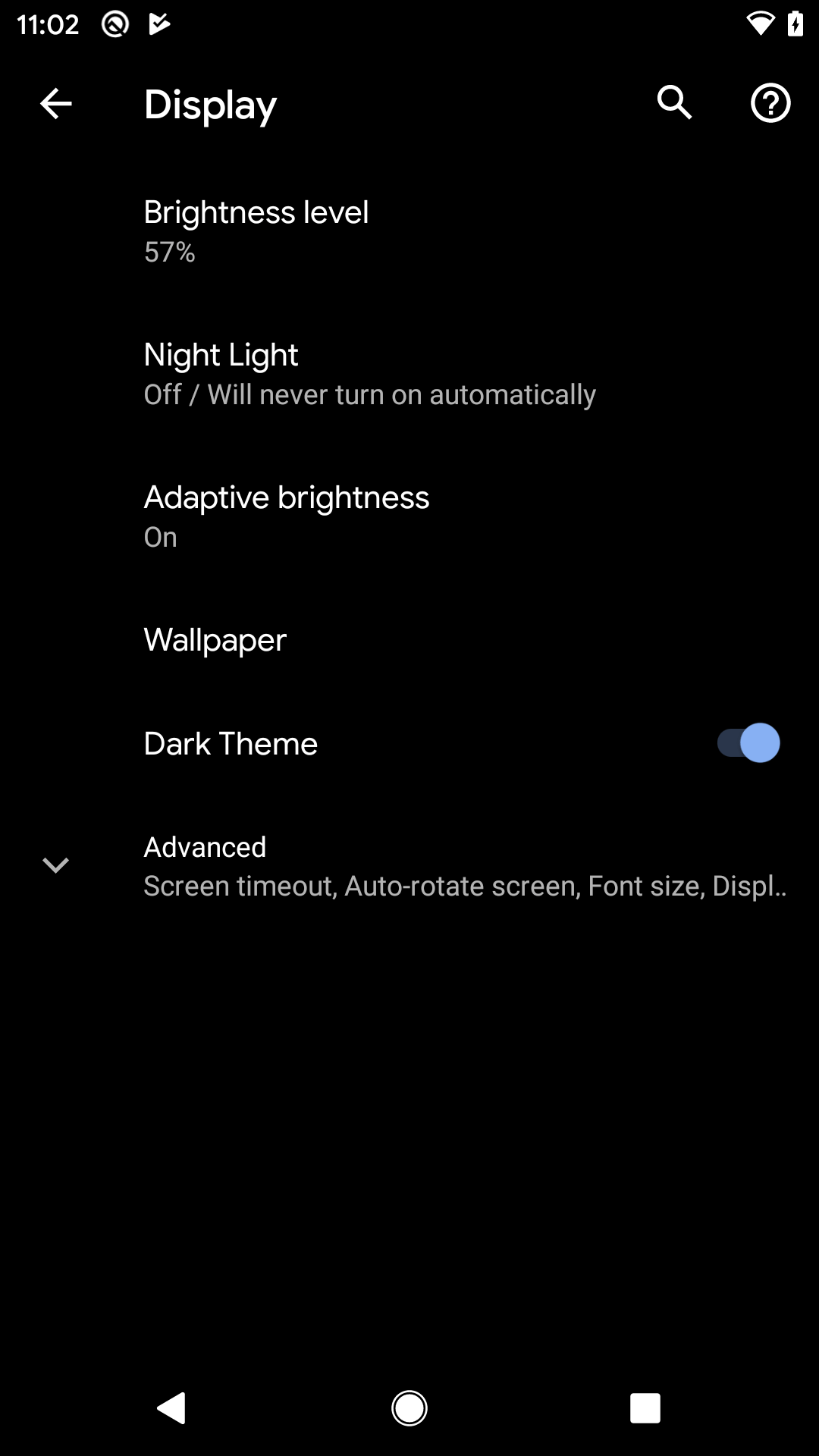
Users can switch to dark mode via the Settings app and the “Dark theme” option in the Display screen:

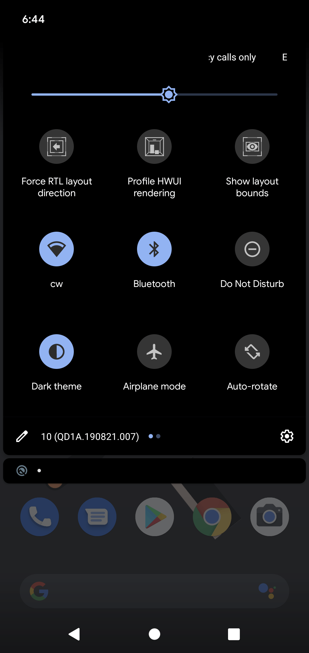
The user can also add a tile to the notification shade to be able to rapidly toggle between normal and dark modes:

Also, according to the documentation:
On Pixel devices, the Battery Saver mode also enables Dark theme at the same time. Other OEMs may or may not support this behavior.
And, if you use AppCompat with its DayNight support, you could offer an in-app toggle between light and dark themes, as we will explore later in the chapter.
Prev Table of Contents Next
This book is licensed under the Creative Commons Attribution-ShareAlike 4.0 International license.