Elements of Style
There are a few elements to consider when working with style resources:
- Where do you put the style attributes to say you want to apply a style?
- What attributes can you define via a style?
- What values can those attributes have in a style definition?
The Locations Where We Use Styles
To indicate that we want to use a <style> to style a widget, we apply the style attribute to the widget, with a reference to our style resource (e.g., @style/CustomText). So, for example, our res/layout/row.xml resource uses style="@style/CustomText" on the activityHash and viewmodelHash widgets, but not the others:
<?xml version="1.0" encoding="utf-8"?>
<androidx.constraintlayout.widget.ConstraintLayout
  xmlns:android="http://schemas.android.com/apk/res/android"
  xmlns:app="http://schemas.android.com/apk/res-auto"
  xmlns:tools="http://schemas.android.com/tools"
  android:layout_width="match_parent"
  android:layout_height="wrap_content"
  android:padding="@dimen/content_padding">

  <TextView
    android:id="@+id/activityHash"
    style="@style/CustomText"
    android:layout_width="wrap_content"
    android:layout_height="wrap_content"
    app:layout_constraintEnd_toEndOf="parent"
    app:layout_constraintTop_toTopOf="parent"
    tools:text="0x12345678" />

  <TextView
    android:id="@+id/viewmodelHash"
    style="@style/CustomText"
    android:layout_width="wrap_content"
    android:layout_height="wrap_content"
    app:layout_constraintBottom_toBottomOf="parent"
    app:layout_constraintEnd_toEndOf="parent"
    app:layout_constraintTop_toBottomOf="@id/activityHash"
    tools:text="0x90ABCDEF" />

  <androidx.constraintlayout.widget.Barrier
    android:id="@+id/barrier"
    android:layout_width="wrap_content"
    android:layout_height="wrap_content"
    android:layout_marginEnd="4dp"
    android:layout_marginStart="4dp"
    app:barrierDirection="start"
    app:constraint_referenced_ids="activityHash,viewmodelHash" />

  <TextView
    android:id="@+id/timestamp"
    android:layout_width="wrap_content"
    android:layout_height="wrap_content"
    app:layout_constraintBottom_toBottomOf="parent"
    app:layout_constraintStart_toStartOf="parent"
    app:layout_constraintTop_toTopOf="parent"
    tools:text="01:23" />

  <TextView
    android:id="@+id/message"
    android:layout_width="wrap_content"
    android:layout_height="wrap_content"
    android:textAppearance="?android:attr/textAppearanceLarge"
    app:layout_constraintBottom_toBottomOf="parent"
    app:layout_constraintEnd_toStartOf="@id/barrier"
    app:layout_constraintStart_toEndOf="@id/timestamp"
    app:layout_constraintTop_toTopOf="parent"
    tools:text="onDestroy()" />

</androidx.constraintlayout.widget.ConstraintLayout>If you apply the style attribute to a widget, if affects only that widget.
The style attribute can be applied to a container, to affect that container. However, doing this does not automatically style widgets that reside inside of the container.
You can also apply a style to an activity or an application as a whole… in the form of a theme. We will explain the differences more a bit later in this chapter.
The Available Attributes
When styling a widget or container, you can apply any of that widget’s or container’s attributes in the style itself. So, if it shows up in the “XML Attributes” or “Inherited XML Attributes” portions of the Android JavaDocs, or it shows up in the Attributes pane of the Android Studio graphical layout designer, you can put it in a style.
If we go back to CustomText, we will see that our style has three <item> elements, identifying three attributes that we wish to control:
  <style name="CustomText">
    <item name="android:textColor">?colorAccent</item>
    <item name="android:textStyle">italic</item>
    <item name="android:fontFamily">monospace</item>
  </style>
Note that Android will ignore invalid styles. If you put an attribute in a style that is unused by something that you apply the style to, the attribute is ignored. It does not crash the app. It so happens that TextView has android:textColor, android:textStyle, and android:fontFamily attributes, to control the text color, style (bold, italic, etc.) and font (e.g., monospace) respectively. If we applied this style to the ConstraintLayout at the root of row.xml, all three style attribute values would be ignored, as a ConstraintLayout does not have a text color, style, or font.
Also, while layout directives, such as android:layout_width, can be put in a style, usually they are not. Styles tend to be limited to other aspects of look-and-feel: colors, fonts, etc.
The Possible Values
Sometimes, the value that you will give those attributes in the style will be some constant, like 30sp or #FFFF0000.
Sometimes, the value will appear to be string, but in reality it is one of a limited number of possible “enumerated” values. For example, android:textStyle supports italic as a value, as the sample project is using in CustomText. It does not support aeroasdfasdf as a value.
Sometimes, the value will be a reference to a resource, such as @dimen/standard_padding or @color/really_red.
Sometimes, though, you want to perform a bit of indirection — you want to apply some other attribute value from the theme you are inheriting from. In that case, you will wind up using the somewhat cryptic ? and ?android:attr/ syntax.
For example, the android:textColor attribute in the CustomText style does not have a value of #D81B60 or @color/colorAccent, even though both of those are the color that we actually wind up applying. Instead, android:textColor has ?colorAccent. This says “go find the colorAccent value defined for our theme and use it here too”. Our theme is AppTheme, and it has a colorAccent value:
  <style name="AppTheme" parent="Theme.AppCompat.Light.DarkActionBar">
    <!-- Customize your theme here. -->
    <item name="colorPrimary">@color/colorPrimary</item>
    <item name="colorPrimaryDark">@color/colorPrimaryDark</item>
    <item name="colorAccent">@color/colorAccent</item>
  </style>
This way, if we change the theme’s colorAccent, we also change the android:textColor of CustomText to match.
The Results
We applied the CustomText style to two of our four TextView widgets, so those two are now red italic monospace:
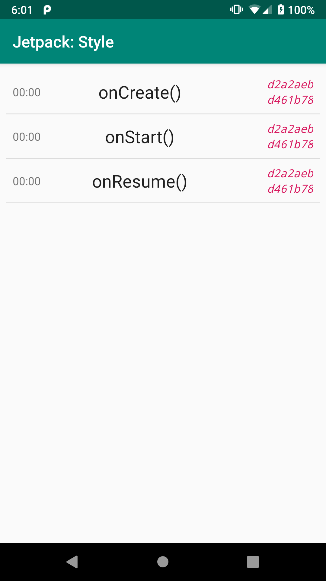
CustomStyle App, Showing
CustomText Style
Prev Table of Contents Next
This book is licensed under the Creative Commons Attribution-ShareAlike 4.0 International license.