Themes: Would a Style By Any Other Name…
Themes are styles applied to an activity or application, via an android:theme attribute on the <activity> or <application> element. They affect properties that apply to the entire activity, such as the default colors to use. They also can define default attributes to use for widgets used by that activity, without manually applying style attributes to those widgets.
The CustomTheme sample module in the Sampler and SamplerJ projects is a variation of the preceding sample, where we want to make TextView widgets display red italic monospace text. This time, though, we are going to work with our AppTheme style resource as a theme.
The Locations Where We Apply a Theme
A theme usually is applied via an android:theme attribute in the manifest. If you apply it to an <activity>, that activity will use the designated theme. If you apply it to an <application>, that theme will be used for all activities in the app… except for any that override it with their own android:theme attribute.
If the theme you are applying is your own, just reference it as @style/..., just as you would in a style attribute of a widget (e.g., @style/AppTheme). This includes themes defined in libraries that you are using (@style/Theme.AppCompat.Dialog). If the theme you are applying, though, comes from Android, typically you will use a value with @android:style/ as the prefix, such as @android:style/Theme.Material.Dialog or @android:style/Theme.Material.Light.
So, our sample app uses android:theme on the <application>, pointing to AppTheme:
<?xml version="1.0" encoding="utf-8"?>
<manifest package="com.commonsware.jetpack.sampler.theme"
  xmlns:android="http://schemas.android.com/apk/res/android">

  <application
    android:allowBackup="true"
    android:icon="@mipmap/ic_launcher"
    android:label="@string/app_name"
    android:roundIcon="@mipmap/ic_launcher_round"
    android:supportsRtl="true"
    android:theme="@style/AppTheme">
    <activity android:name=".MainActivity">
      <intent-filter>
        <action android:name="android.intent.action.MAIN" />

        <category android:name="android.intent.category.LAUNCHER" />
      </intent-filter>
    </activity>
  </application>

</manifest>The Theme Declaration
Themes are just style resources.
So, our AppTheme appears in res/values/styles.xml alongside CustomText, though with slight alterations from what we used in the previous sample:
<resources>

  <!-- Base application theme. -->
  <style name="AppTheme" parent="Theme.AppCompat.Light.DarkActionBar">
    <!-- Customize your theme here. -->
    <item name="colorPrimary">@color/colorPrimary</item>
    <item name="colorPrimaryDark">@color/colorPrimaryDark</item>
    <item name="colorAccent">@color/colorAccent</item>
    <item name="android:textViewStyle">@style/CustomText</item>
  </style>

  <style name="CustomText" parent="android:Widget.Material.TextView">
    <item name="android:textColor">?colorAccent</item>
    <item name="android:textStyle">italic</item>
    <item name="android:fontFamily">monospace</item>
  </style>

</resources>
The Parent, and an AppCompat Recap
Any style resource can have a parent attribute. This is an inheritance model: anything using the style resource gets the attributes defined both directly in that style resource plus any defined by its parent.
A theme always has a parent, and that parent should be another theme. There are hundreds, if not thousands, of attributes to be configured on a theme, so you want to inherit the vast majority of them. AppTheme is declared to have Theme.AppCompat.Light.DarkActionBar as its parent, so the activity in this app will not only get the attributes defined directly in AppTheme but all the attributes defined by Theme.AppCompat.Light.DarkActionBar.
Theme.AppCompat.Light.DarkActionBar is part of the AppCompat system. If you have an activity that extends AppCompatActivity — as all of the ones in this book do — that activity must use a theme that inherits from Theme.AppCompat. Theme.AppCompat.Light.DarkActionBar itself inherits from Theme.AppCompat, so AppTheme indirectly inherits from Theme.AppCompat.
The Style Override
A theme can have attributes that override ones defined in parents. Theme.AppCompat declares colorPrimary, colorPrimaryDark, and colorAccent attributes — AppTheme overrides them and provides the values that should be used in the app.
One particular class of attributes defined in parents are references to style resources that should be used to style particular types of widgets. For example, android:textViewStyle says “this is the style resource that should be used for all TextView widgets”. AppTheme has this attribute and points it to CustomText, so now the CustomText defines the default look for all TextView widgets used in activities that use AppTheme.
However, we now have to consider the parent of a regular (non-theme) style. When we use a style attribute to apply a style resource to a widget, the attributes defined in the style are used to override those from the default style for the type of widget, such as TextView. The CustomStyle sample module did not have a parent for CustomText, and the three attributes defined by CustomText would override whatever the defaults are for TextView. However, in the CustomTheme project, CustomText is the default, courtesy of it being applied via android:textViewStyle. As a result, we need CustomText to have values for all relevant attributes, mostly through inheritance from some parent. There are three major possibilities for the parent value for an AppCompat project like this one:
- If there is an AppCompat style for that widget (e.g.,
Widget.AppCompat.Button), use it as the parent - If there is no AppCompat style, and the project has a
minSdkVersionof 21 or higher, look for aMaterialstyle for that widget, such as theandroid:Widget.Material.TextViewparent used here (theandroid:prefix is becauseWidget.Material.TextViewcomes from the framework, whileWidget.AppCompat.ButtonorTheme.AppCompat.Light.DarkActionBarcomes from a library) - If there is no AppCompat style, and the project has a lower
minSdkVersionthan 21… the story gets very complicated and is well outside the scope of this book
The Result
Since our CustomText is now being applied by default for all TextView widgets, our row can go back to having no style attributes:
<?xml version="1.0" encoding="utf-8"?>
<androidx.constraintlayout.widget.ConstraintLayout
  xmlns:android="http://schemas.android.com/apk/res/android"
  xmlns:app="http://schemas.android.com/apk/res-auto"
  xmlns:tools="http://schemas.android.com/tools"
  android:layout_width="match_parent"
  android:layout_height="wrap_content"
  android:padding="@dimen/content_padding">

  <TextView
    android:id="@+id/activityHash"
    android:layout_width="wrap_content"
    android:layout_height="wrap_content"
    app:layout_constraintEnd_toEndOf="parent"
    app:layout_constraintTop_toTopOf="parent"
    tools:text="0x12345678" />

  <TextView
    android:id="@+id/viewmodelHash"
    android:layout_width="wrap_content"
    android:layout_height="wrap_content"
    app:layout_constraintBottom_toBottomOf="parent"
    app:layout_constraintEnd_toEndOf="parent"
    app:layout_constraintTop_toBottomOf="@id/activityHash"
    tools:text="0x90ABCDEF" />

  <androidx.constraintlayout.widget.Barrier
    android:id="@+id/barrier"
    android:layout_width="wrap_content"
    android:layout_height="wrap_content"
    android:layout_marginEnd="4dp"
    android:layout_marginStart="4dp"
    app:barrierDirection="start"
    app:constraint_referenced_ids="activityHash,viewmodelHash" />

  <TextView
    android:id="@+id/timestamp"
    android:layout_width="wrap_content"
    android:layout_height="wrap_content"
    app:layout_constraintBottom_toBottomOf="parent"
    app:layout_constraintStart_toStartOf="parent"
    app:layout_constraintTop_toTopOf="parent"
    tools:text="01:23" />

  <TextView
    android:id="@+id/message"
    android:layout_width="wrap_content"
    android:layout_height="wrap_content"
    android:textAppearance="?android:attr/textAppearanceLarge"
    app:layout_constraintBottom_toBottomOf="parent"
    app:layout_constraintEnd_toStartOf="@id/barrier"
    app:layout_constraintStart_toEndOf="@id/timestamp"
    app:layout_constraintTop_toTopOf="parent"
    tools:text="onDestroy()" />

</androidx.constraintlayout.widget.ConstraintLayout>Moreover, our red italic monospace look will be applied to all four TextView widgets in the row, not just the two that we manually specified in the CustomStyle sample:
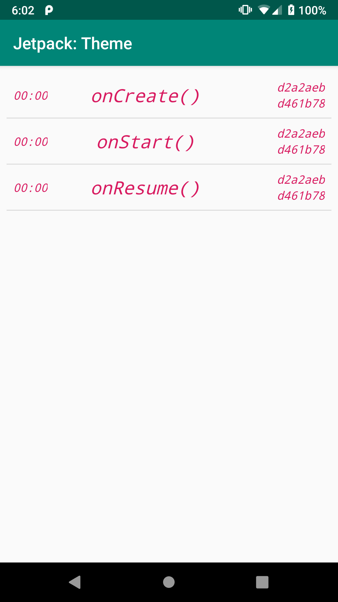
CustomTheme Sample, As Initially Launched
Prev Table of Contents Next
This book is licensed under the Creative Commons Attribution-ShareAlike 4.0 International license.