A Trivial List
The RecyclerViewBasics sample module in the Sampler and SamplerJ projects demonstrate a fairly simple list. The items in the list will be a set of randomly-generated integers, where we will show the values both as a hexadecimal number and as a color:
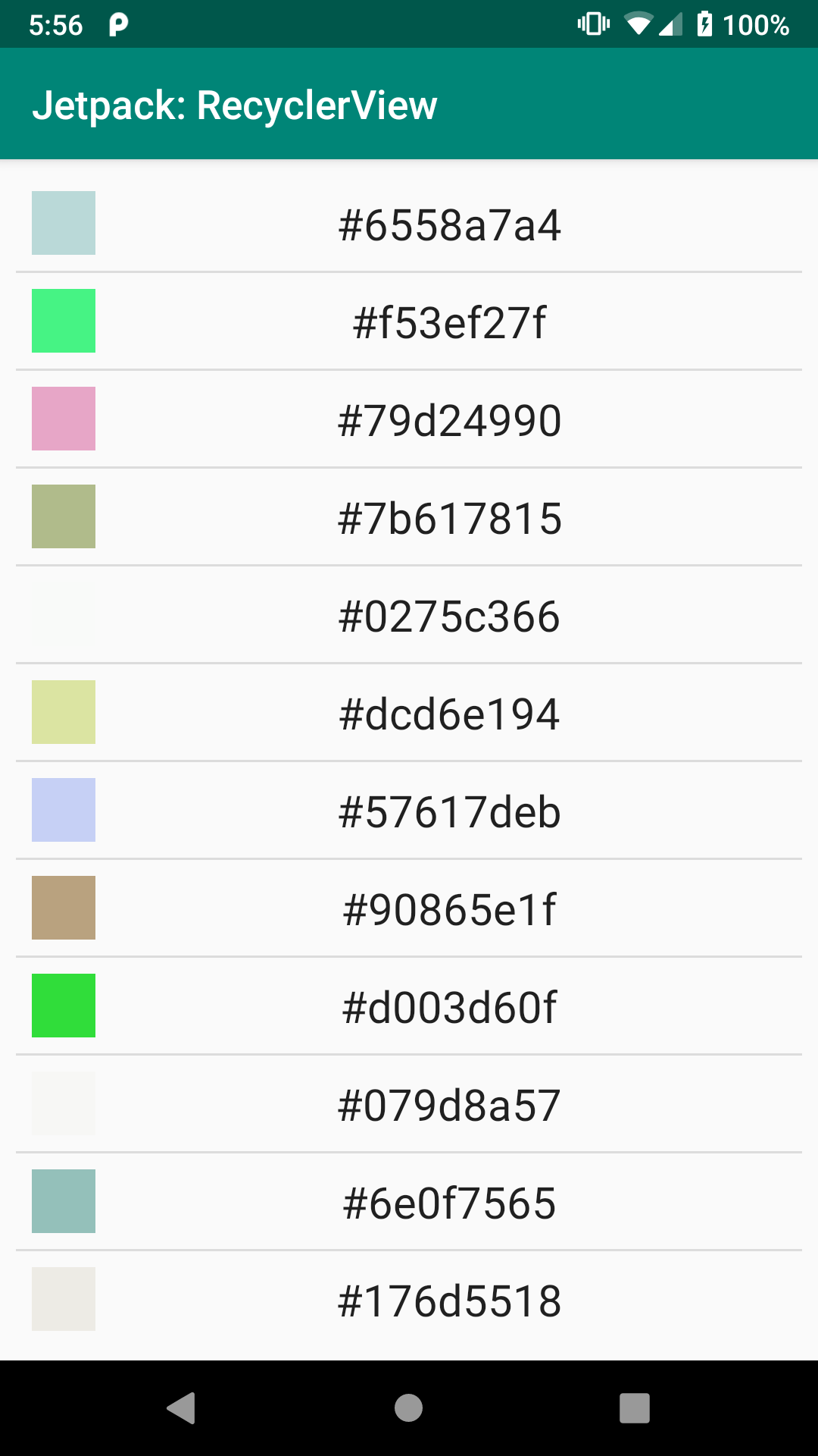
RecyclerViewBasics Sample
The Dependency
RecyclerView comes from a library, not the framework portion of the Android SDK. As a result, we need a new dependency, one for androidx.recyclerview:recyclerview:
dependencies {
  implementation 'androidx.appcompat:appcompat:1.3.1'
  implementation 'androidx.recyclerview:recyclerview:1.2.1'
  implementation 'androidx.constraintlayout:constraintlayout:2.1.1'
  implementation "org.jetbrains.kotlin:kotlin-stdlib-jdk7:$kotlin_version"
  implementation "androidx.activity:activity:1.3.1"
}
Elsewhere, you may see references to com.android.support:recyclerview-v7. That library offers the same RecyclerView, but is part of the older Android Support Library. Jetpack projects should use the androidx edition of RecyclerView.
The Layouts
This project has two layout resources: activity_main and row.
The Activity Layout
The activity_main layout resource contains a RecyclerView inside of a ConstraintLayout:
<?xml version="1.0" encoding="utf-8"?>
<androidx.constraintlayout.widget.ConstraintLayout
  xmlns:android="http://schemas.android.com/apk/res/android"
  xmlns:app="http://schemas.android.com/apk/res-auto"
  xmlns:tools="http://schemas.android.com/tools"
  android:layout_width="match_parent"
  android:layout_height="match_parent"
  android:padding="@dimen/content_padding"
  tools:context=".MainActivity">

  <androidx.recyclerview.widget.RecyclerView
    android:id="@+id/items"
    android:layout_width="0dp"
    android:layout_height="0dp"
    app:layout_constraintBottom_toBottomOf="parent"
    app:layout_constraintStart_toStartOf="parent"
    app:layout_constraintEnd_toEndOf="parent"
    app:layout_constraintTop_toTopOf="parent" />

</androidx.constraintlayout.widget.ConstraintLayout>As with ConstraintLayout itself, RecyclerView needs to have its fully-qualified class name in the layout resource XML, which is why we have an <androidx.recyclerview.widget.RecyclerView> element instead of simply a <RecyclerView> element. Otherwise, RecyclerView is just an ordinary thing that we can size and position as needed. Here, we have it set to fill the ConstraintLayout, excluding 8dp of padding that the ConstraintLayout applies.
Note that RecyclerView knows how to scroll, so we do not need to wrap RecyclerView in a ScrollView.
When constructing a new UI, if you wish to use the drag-and-drop GUI builder in Android Studio, you can find RecyclerView in the “Containers” category of the Palette:
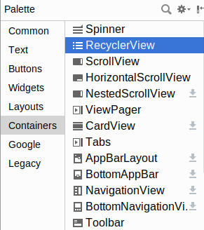
RecyclerView
The Row Layout
This project has a second layout resource, named row. Each row in our RecyclerView will be created from this row layout resource as a template:
<?xml version="1.0" encoding="utf-8"?>
<androidx.constraintlayout.widget.ConstraintLayout
  xmlns:android="http://schemas.android.com/apk/res/android"
  xmlns:app="http://schemas.android.com/apk/res-auto"
  android:layout_width="match_parent"
  android:layout_height="wrap_content"
  android:background="?android:attr/selectableItemBackground"
  android:clickable="true"
  android:focusable="true"
  android:padding="@dimen/content_padding">

  <View
    android:id="@+id/swatch"
    android:layout_width="@dimen/swatch_size"
    android:layout_height="@dimen/swatch_size"
    app:layout_constraintBottom_toBottomOf="parent"
    app:layout_constraintStart_toStartOf="parent"
    app:layout_constraintTop_toTopOf="parent" />

  <TextView
    android:id="@+id/label"
    android:layout_width="wrap_content"
    android:layout_height="wrap_content"
    android:layout_marginStart="@dimen/label_start_margin"
    android:textAppearance="?android:attr/textAppearanceLarge"
    app:layout_constraintBottom_toBottomOf="parent"
    app:layout_constraintEnd_toEndOf="parent"
    app:layout_constraintStart_toEndOf="@id/swatch"
    app:layout_constraintTop_toTopOf="parent" />
</androidx.constraintlayout.widget.ConstraintLayout>Once again, our root is a ConstraintLayout, this time with two children: a TextView… and a View.
Here, View is literally referring to android.view.View, the root class of all widgets and containers. View is not used all that often, as it does not render anything in the foreground: no text, no image, etc. However, it can have a background color, so the primary usage of View is for lines, boxes, and other shaded areas that have no children. In this case, we are using it for the color swatch seen on the left side of the rows, so we give it an ID of swatch.
The label TextView will be used to show the hexadecimal number that we randomly generate and are using for the color. Here, we use android:textAppearance as an attribute. That sets a bunch of things at once: text size, text style, etc. In particular, our value (?android:attr/textAppearanceLarge) is a reference to a standard text appearance from our activity’s theme. We will explore themes more later in the book. For now, take it on faith that ?android:attr/textAppearanceLarge will give us a standard “large” text appearance.
The ConstraintLayout has three attributes that we have not used before:
android:background="?android:attr/selectableItemBackground"android:clickable="true"android:focusable="true"
The android:clickable and android:focusable attributes control whether the user can interact with this element. By default, container classes like ConstraintLayout are non-interactive, so they ignore any touch or key events. By setting android:clickable="true" and android:focusable="true", we are indicating that this particular container is interactive, and so we should pay attention to touch and key events. This is typical of a container that serves as the root for an individual item in a RecyclerView.
In particular, those tie into android:background="?android:attr/selectableItemBackground". android:background says “this is what the background of this thing should be”. The default background for a container like ConstraintLayout is transparent. In this case, we are replacing that with something that we are pulling from our theme (?android:attr/selectableItemBackground), which will apply a standard “selectable” background. If you run the sample apps, and you tap on a row in the list, you will see a ripple effect — this comes from the “selectable” background.
The LayoutManager
As with our other samples, our activity is MainActivity, whether that is written in Java:
package com.commonsware.jetpack.samplerj.recyclerview;

import android.os.Bundle;
import com.commonsware.jetpack.samplerj.recyclerview.databinding.ActivityMainBinding;
import java.util.ArrayList;
import java.util.List;
import java.util.Random;
import androidx.appcompat.app.AppCompatActivity;
import androidx.recyclerview.widget.DividerItemDecoration;
import androidx.recyclerview.widget.LinearLayoutManager;

public class MainActivity extends AppCompatActivity {
  private final Random random = new Random();

  @Override
  protected void onCreate(Bundle savedInstanceState) {
    super.onCreate(savedInstanceState);

    final ActivityMainBinding binding =
      ActivityMainBinding.inflate(getLayoutInflater());

    setContentView(binding.getRoot());

    ColorAdapter adapter = new ColorAdapter(getLayoutInflater());

    adapter.submitList(buildItems());
    binding.items.setLayoutManager(new LinearLayoutManager(this));
    binding.items.addItemDecoration(
      new DividerItemDecoration(this, DividerItemDecoration.VERTICAL));
    binding.items.setAdapter(adapter);
  }

  private List<Integer> buildItems() {
    ArrayList<Integer> result = new ArrayList<>(25);

    for (int i = 0; i < 25; i++) {
      result.add(random.nextInt());
    }

    return result;
  }
}
… or Kotlin:
package com.commonsware.jetpack.sampler.recyclerview

import android.os.Bundle
import androidx.appcompat.app.AppCompatActivity
import androidx.recyclerview.widget.DividerItemDecoration
import androidx.recyclerview.widget.LinearLayoutManager
import com.commonsware.jetpack.sampler.recyclerview.databinding.ActivityMainBinding
import java.util.*

class MainActivity : AppCompatActivity() {
  private val random = Random()

  override fun onCreate(savedInstanceState: Bundle?) {
    super.onCreate(savedInstanceState)

    val binding = ActivityMainBinding.inflate(layoutInflater)

    setContentView(binding.root)

    binding.items.apply {
      layoutManager = LinearLayoutManager(this@MainActivity)
      addItemDecoration(
        DividerItemDecoration(this@MainActivity, DividerItemDecoration.VERTICAL)
      )
      adapter = ColorAdapter(layoutInflater).apply {
        submitList(buildItems())
      }
    }
  }

  private fun buildItems() = List(25) { random.nextInt() }
}
The UI is set up in onCreate(). Here, we configure the RecyclerView.
One thing that we need to teach the RecyclerView is what sort of look we want it to have overall. In this case, we want a vertically-scrolling list. For that, we can use a LinearLayoutManager.
RecyclerView uses a LayoutManager to control the overall layout of items within its scrollable area. LinearLayoutManager lays those items out in a list. By default, that list is vertical.
(despite the name, LinearLayoutManager is not related to LinearLayout, except in the most general sense)
So, we create an instance of LinearLayoutManager and associate it with the RecyclerView via setLayoutManager().
If you do not want a vertically-scrolling list, you could use:
-
GridLayoutManager, which implements a two-dimensional vertically-scrolling list, with rows consisting of multiple cells -
StaggeredGridLayoutManager, which implements a “staggered grid”, which has columns of cells, but where the cells do not have to all have the same size
In addition, it is possible to create your own RecyclerView.LayoutManager, or use ones from third-party libraries.
The Divider
By default, a RecyclerView just shows its items, and nothing else. However, with a vertically-scrolling list, frequently we want some sort of divider between the rows in the list. Sometimes, that is not necessary, as we have stuff in the items themselves that visually distinguish one from another. The rest of the time, we will want the help of RecyclerView to handle this.
RecyclerView delegates that sort of work to one or more ItemDecoration objects. The primary one offered by the RecyclerView library is DividerItemDecoration, which draws a thin line for you.
DividerItemDecoration can be used both for the normal vertically-scrolling list and for the less-common horizontally-scrolling list. Hence, we need to tell DividerItemDecoration which way to draw the divider line. For a vertically-scrolling list, we need a divider configured for such a list, so we pass DividerItemDecoration.VERTICAL to the DividerItemDecoration constructor when we set it up.
You can then add these ItemDecoration objects to a RecyclerView via addItemDecoration() calls.
The Data
The data that we want to depict in the list is a roster of 25 random numbers. To that end, we have a buildItems() Java method:
  private List<Integer> buildItems() {
    ArrayList<Integer> result = new ArrayList<>(25);

    for (int i = 0; i < 25; i++) {
      result.add(random.nextInt());
    }

    return result;
  }
… or Kotlin function:
private fun buildItems() = List(25) { random.nextInt() }
In each case, we create a list of 25 random numbers, using Random.nextInt() as the source of the number. buildItems() is called from onCreate() and will be used to populate our RecyclerView.Adapter.
The ViewHolder
Each RecyclerView is associated with one or more implementations of RecyclerView.ViewHolder. Each instance of a ViewHolder class wraps one piece of data (in our case, one random number) and ties it to one visual representation of that data. However, courtesy of recycling, a ViewHolder will get reused. As the user scrolls, and items scroll off the screen, their associated ViewHolder objects will need to be associated with new pieces of data that are to be scrolled onto the screen.
Our particular implementation is ColorViewHolder, both in Java:
package com.commonsware.jetpack.samplerj.recyclerview;

import android.widget.Toast;
import com.commonsware.jetpack.samplerj.recyclerview.databinding.RowBinding;
import androidx.recyclerview.widget.RecyclerView;

class ColorViewHolder extends RecyclerView.ViewHolder {
  private final RowBinding binding;

  ColorViewHolder(RowBinding binding) {
    super(binding.getRoot());

    this.binding = binding;

    binding.getRoot().setOnClickListener(
      v -> Toast.makeText(binding.label.getContext(), binding.label.getText(),
        Toast.LENGTH_LONG).show());
  }

  void bindTo(Integer color) {
    binding.label.setText(
      binding.label.getContext().getString(R.string.label_template, color));
    binding.swatch.setBackgroundColor(color);
  }
}
… and Kotlin:
package com.commonsware.jetpack.sampler.recyclerview

import android.widget.Toast
import androidx.recyclerview.widget.RecyclerView
import com.commonsware.jetpack.sampler.recyclerview.databinding.RowBinding

class ColorViewHolder(private val binding: RowBinding) :
  RecyclerView.ViewHolder(binding.root) {
  init {
    binding.root.setOnClickListener { _ ->
      Toast.makeText(
        binding.label.context,
        binding.label.text,
        Toast.LENGTH_LONG
      ).show()
    }
  }

  fun bindTo(color: Int) {
    binding.label.text =
      binding.label.context.getString(R.string.label_template, color)
    binding.swatch.setBackgroundColor(color)
  }
}
The Constructor
Something outside of the ViewHolder is responsible for setting up the visual representation and providing the View for it to our constructor. We will see how that works a bit later in this chapter. Our ColorViewHolder is expecting this View to be the root of our row layout resource, so we can work with its contents.
The job of our constructor is to find the individual widgets that we need and configure them for our use.
Here, we pass in our RowBinding and get the root from it to pass to the ViewHolder superclass.
The Toast
We also call setOnClickListener() on the row itself, to find out when it is clicked. There, to provide feedback to the user, we show a Toast.
A Toast is a transient message, meaning that it displays and disappears on its own without user interaction. Moreover, it does not take focus away from the currently-active Activity, so if the user is busy writing the next Great Programming Guide, they will not have keystrokes be “eaten” by the message.
Since a Toast is transient, you have no way of knowing if the user even notices it. You get no acknowledgment from them, nor does the message stick around for a long time to pester the user. Hence, the Toast is mostly for advisory messages, ones that if the user misses them, no harm will come.
Making a Toast is fairly easy. The Toast class offers a static makeText() method that accepts a String (or string resource ID) and returns a Toast instance. The makeText() method also needs the Activity (or other Context) plus a duration. The duration is expressed in the form of the LENGTH_SHORT or LENGTH_LONG constants to indicate, on a relative basis, how long the message should remain visible. Once your Toast is configured, call its show() method, and the message will be displayed.
The Binding
Other than needing to use the base class of RecyclerView.ViewHolder, there is no other particular protocol that is mandated between the adapter and the view holder. However, at some point, our ViewHolder needs to be handed the data that it is supposed to represent in these widgets.
For that, ColorViewHolder has bindTo(). It takes a color integer and pours it into the label and swatch widgets.
For the label, we use getString(), where our string resource has a placeholder to format the number:
<string name="label_template">#%1$08x</string>
That cryptic placeholder (#%1$08x) means that we want to format the first parameter (%1) as an eight-digit hexadecimal value (08x).
For the color swatch, we call setBackgroundColor(). This is a method available on any View that can be used to set its background color to a particular value. In our case, we are using a randomly-generated color, not a color resource, so we can just pass in the color integer.
The Adapter
We still need to tell the RecyclerView what to display. That is handled by an implementation of RecyclerView.Adapter. Here, “adapter” refers to the adapter pattern: an adapter takes data and adapts it for some other role. In our case, an Adapter takes some collection of data and uses it to define the visual representation of that data, in the form of View and ViewGroup objects.
Our Adapter — named ColorAdapter — will use the row layout that we defined earlier to define the visual representation of each piece of data. ColorAdapter uses our ColorViewHolder to manage the actual widgets.
We have two implementations of ColorAdapter, in Java:
package com.commonsware.jetpack.samplerj.recyclerview;

import android.view.LayoutInflater;
import android.view.ViewGroup;
import com.commonsware.jetpack.samplerj.recyclerview.databinding.RowBinding;
import androidx.annotation.NonNull;
import androidx.recyclerview.widget.DiffUtil;
import androidx.recyclerview.widget.ListAdapter;

class ColorAdapter extends ListAdapter<Integer, ColorViewHolder> {
  private final LayoutInflater inflater;

  ColorAdapter(LayoutInflater inflater) {
    super(DIFF_CALLBACK);
    this.inflater = inflater;
  }

  @NonNull
  @Override
  public ColorViewHolder onCreateViewHolder(@NonNull ViewGroup parent,
                                            int viewType) {
    return new ColorViewHolder(RowBinding.inflate(inflater, parent, false));
  }

  @Override
  public void onBindViewHolder(@NonNull ColorViewHolder holder, int position) {
    holder.bindTo(getItem(position));
  }

  private static final DiffUtil.ItemCallback<Integer> DIFF_CALLBACK =
    new DiffUtil.ItemCallback<Integer>() {
      @Override
      public boolean areItemsTheSame(@NonNull Integer oldColor,
                                     @NonNull Integer newColor) {
        return oldColor.equals(newColor);
      }

      @Override
      public boolean areContentsTheSame(@NonNull Integer oldColor,
                                        @NonNull Integer newColor) {
        return areItemsTheSame(oldColor, newColor);
      }
    };
}… and Kotlin:
package com.commonsware.jetpack.sampler.recyclerview

import android.view.LayoutInflater
import android.view.ViewGroup
import androidx.recyclerview.widget.DiffUtil
import androidx.recyclerview.widget.ListAdapter
import com.commonsware.jetpack.sampler.recyclerview.databinding.RowBinding

class ColorAdapter(private val inflater: LayoutInflater) :
  ListAdapter<Int, ColorViewHolder>(ColorDiffer) {

  override fun onCreateViewHolder(
    parent: ViewGroup,
    viewType: Int
  ): ColorViewHolder {
    return ColorViewHolder(RowBinding.inflate(inflater, parent, false))
  }

  override fun onBindViewHolder(holder: ColorViewHolder, position: Int) {
    holder.bindTo(getItem(position))
  }

  private object ColorDiffer : DiffUtil.ItemCallback<Int>() {
    override fun areItemsTheSame(oldColor: Int, newColor: Int): Boolean {
      return oldColor == newColor
    }

    override fun areContentsTheSame(oldColor: Int, newColor: Int): Boolean {
      return areItemsTheSame(oldColor, newColor)
    }
  }
}
The Base Class
When we created ColorViewHolder, we directly extended RecyclerView.ViewHolder. You can do the same thing with RecyclerView.Adapter, having your class (e.g., ColorAdapter) extend it directly. In this case, we are using ListAdapter, a supplied partial implementation of RecyclerView.Adapter that knows how to work with lists of data.
NOTE: There are two things named ListAdapter in the Android SDK. We are using androidx.recyclerview.widget.ListAdapter, which works with RecyclerView. The android.widget.ListAdapter interface is designed for use with the older AdapterView family of widgets, such as ListView. Make sure that you use the right one, as otherwise you will get lots of strange compile errors.
ListAdapter uses generics and takes two data types:
- The type of data for individual elements in the list to be shown (in our case, a Java
Integeror KotlinInt) - The
RecyclerView.ViewHolderclass that we want to use for the items in the list (in our case,ColorViewHolder)
The Constructor and the “Differ”
The ListAdapter constructor requires an implementation of a DiffUtil.ItemCallback object.
Part of what ListAdapter does for us is help deal with changes to our list of data. This app, as it stands, only shows one set of random numbers in the list. But, suppose we had a button that allowed the user to add more numbers. We would need our RecyclerView.Adapter to be able to show both the old numbers and the new numbers.
ListAdapter has all of the smarts to handle that for us as efficiently as possible. However, ListAdapter knows nothing about our data and our visual representation of that data, and knowing more about those things helps with efficiency. The DiffUtil.ItemCallback is our way of teaching ListAdapter more about our data. Specifically, a DiffUtil.ItemCallback has two Java methods or Kotlin functions:
-
areItemsTheSame()takes in two pieces of data from our list (old and changed) and needs to returntrueif they are the actual same thing -
areContentsTheSame()takes in two pieces of data and returnstrueif their visual representation will be the same when the data is rendered on the screen
If our ListAdapter were adapting the items in an online shopping cart, we would return true from areItemsTheSame() if both objects are really the same underlying cart entry. But, suppose the user had more than one of some particular product in the cart, such as three boxes of laundry detergent. areItemsTheSame() might return false for some pair, as the first box is not the same box as the second box. However, areContentsTheSame() might return true, as the visual representation might be the same (e.g., a thumbnail image of the laundry detergent box).
In our case, not only is the data not changing, but it is very simple and distinct, so we can use content equality for both areItemsTheSame() and areContentsTheSame(). So, we have a ColorDiffer that does just that, either in the form of a static Java class or a singleton Kotlin object. We use ColorDiffer in our ColorAdapter constructor, so now ListAdapter knows about how to compare our colors.
onCreateViewHolder()
Any RecyclerView.Adapter needs to know how to do two other things:
- Create the
ViewHolderthat we want, including setting up its UI; and - Bind data from our collection to
ViewHolderinstances as they are displayed on the screen
onCreateViewHolder() handles the first of these. It creates instances of ColorViewHolder and returns them.
However, ColorViewHolder wants the View that represents the UI for the row in our list. That UI is defined in the row layout resource. We need some way to get a View for a layout resource. All our prior uses of layout resources were for activities, and we just passed the resource ID to setContentView(). That will not work here.
So, our ColorAdapter constructor takes in a LayoutInflater object. LayoutInflater knows how to “inflate” layout resources. In Android, “inflate” means:
- Walk a tree of XML elements in an XML resource
- Create Java objects for each element in that tree
- Stitch those objects together into their own tree structure, mirroring the tree defined in the XML
- Return the Java object representing the root of the tree
Given that our row layout is:
<?xml version="1.0" encoding="utf-8"?>
<androidx.constraintlayout.widget.ConstraintLayout
  xmlns:android="http://schemas.android.com/apk/res/android"
  xmlns:app="http://schemas.android.com/apk/res-auto"
  android:layout_width="match_parent"
  android:layout_height="wrap_content"
  android:background="?android:attr/selectableItemBackground"
  android:clickable="true"
  android:focusable="true"
  android:padding="@dimen/content_padding">

  <View
    android:id="@+id/swatch"
    android:layout_width="@dimen/swatch_size"
    android:layout_height="@dimen/swatch_size"
    app:layout_constraintBottom_toBottomOf="parent"
    app:layout_constraintStart_toStartOf="parent"
    app:layout_constraintTop_toTopOf="parent" />

  <TextView
    android:id="@+id/label"
    android:layout_width="wrap_content"
    android:layout_height="wrap_content"
    android:layout_marginStart="@dimen/label_start_margin"
    android:textAppearance="?android:attr/textAppearanceLarge"
    app:layout_constraintBottom_toBottomOf="parent"
    app:layout_constraintEnd_toEndOf="parent"
    app:layout_constraintStart_toEndOf="@id/swatch"
    app:layout_constraintTop_toTopOf="parent" />
</androidx.constraintlayout.widget.ConstraintLayout>…then a call to inflate() on a LayoutInflater, supplying R.layout.row as the first parameter, should return a ConstraintLayout object that holds onto a TextView and a View.
That is what onCreateViewHolder() does: calls inflate(), gets the root View, passes that to the ColorViewHolder() constructor, and returns the ColorViewHolder instance.
LayoutInflater has a few inflate() methods, taking different parameters. They all do the same basic thing: “inflate” the layout into a View hierarchy. The particular inflate() that you will use most often takes three parameters:
- The resource ID of the layout that you want to inflate
- The
ViewGroupthat the widgets in that layout will eventually be added to -
falseto say “but please do not add them to the parent right away” (something else will do that when appropriate,RecyclerViewandLinearLayoutManagerin this case)
In our case, we are using view binding, which means that our binding object (e.g., RowBinding) is the one using the LayoutInflater, and we call a similar inflate() method on the binding object.
onBindViewHolder()
onBindViewHolder() will be called when RecylerView wants to show one of our pieces of data. We are passed the 0-based index into our collection of data representing what RecyclerView wants, and we are passed a ViewHolder (created by onCreateViewHolder() previously) to use for the visual representation.
ListAdapter gives us a getItem() method that we can use to get our color for a given position. We then just call bindTo() on the ColorViewHolder, and ColorViewHolder takes it from there.
Applying the ColorAdapter
To make use of ColorAdapter, we first need to give it some colors to display. Subclasses of ListAdapter have a submitList() method that you can use for that. You provide a List of your data, such as the results of our buildItems() call.
Then, to have the colors show up, you call setAdapter() on the RecyclerView, handing it your RecyclerView.Adapter instance.
We do both of these things in onCreate() of MainActivity as part of the overall setup:
  @Override
  protected void onCreate(Bundle savedInstanceState) {
    super.onCreate(savedInstanceState);

    final ActivityMainBinding binding =
      ActivityMainBinding.inflate(getLayoutInflater());

    setContentView(binding.getRoot());

    ColorAdapter adapter = new ColorAdapter(getLayoutInflater());

    adapter.submitList(buildItems());
    binding.items.setLayoutManager(new LinearLayoutManager(this));
    binding.items.addItemDecoration(
      new DividerItemDecoration(this, DividerItemDecoration.VERTICAL));
    binding.items.setAdapter(adapter);
  }
  override fun onCreate(savedInstanceState: Bundle?) {
    super.onCreate(savedInstanceState)

    val binding = ActivityMainBinding.inflate(layoutInflater)

    setContentView(binding.root)

    binding.items.apply {
      layoutManager = LinearLayoutManager(this@MainActivity)
      addItemDecoration(
        DividerItemDecoration(this@MainActivity, DividerItemDecoration.VERTICAL)
      )
      adapter = ColorAdapter(layoutInflater).apply {
        submitList(buildItems())
      }
    }
  }
Prev Table of Contents Next
This book is licensed under the Creative Commons Attribution-ShareAlike 4.0 International license.