EditText: Making Users Type Stuff
Along with buttons and labels, fields are the third “anchor” of most GUI toolkits. In Android, they are implemented via the EditText widget, which is a subclass of the TextView used for labels.
Along with the standard TextView attributes (e.g., android:textStyle), EditText has others that will be useful for you in constructing fields, notably android:inputType, to describe what sort of input your EditText expects (numbers? email addresses? phone numbers?).
Graphical Layout Editor
The Palette in the graphical layout editor has a whole section dedicated primarily to EditText widgets, named “Text”:
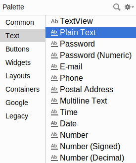
The first entry is a TextView. The second entry (“Plain Text”) is a general-purpose EditText. The rest come pre-configured for various scenarios, such as a password.
You can drag any of these into your layout, then use the Attributes pane to configure relevant attributes, or edit the EditText XML as you see fit. The “Id” and “Text” attributes are the same as found on TextView, as are many other attributes, inherited from TextView.
Notable Attributes
The “Hint” item in the Attributes pane allows you to set a “hint” for this EditText. The “hint” text will be shown in light gray in the EditText widget when the user has not entered anything yet. Once the user starts typing into the EditText, the “hint” vanishes. This might allow you to save on screen space, replacing a separate label TextView.
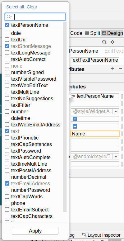
The “Input Type” item in the Attributes pane allows you to describe what sort of input you are expecting to receive in this EditText, lining up with many of the types of fields you can drag from the Palette into the layout:
Prev Table of Contents Next
This book is licensed under the Creative Commons Attribution-ShareAlike 4.0 International license.