Using Toolbar Directly
So, let’s see how we can use vector drawables and menu resources to add interactive elements to the app bar. First, we will look at how to do this using Toolbar directly as a widget.
The Toolbar sample module in the Sampler and SamplerJ projects are a variation on the show-a-list-of-random-colors ViewModel sample from earlier in the book. Most of the changes are tied to using Toolbar, but if you examine the full modules, you will see that this sample also blends in the instance state management — using ViewModelProvider.Factory — that we saw in some of show-a-list-of-lifecycle-events samples.
Adding the Widget
We can add a Toolbar to our layout, positioning it wherever we want. Typically, it appears at the top of the activity, but that is not a requirement.
So, the Toolbar project edition of the activity_main layout has a Toolbar above the RecyclerView, wrapped in the ConstraintLayout:
<?xml version="1.0" encoding="utf-8"?>
<androidx.constraintlayout.widget.ConstraintLayout
  xmlns:android="http://schemas.android.com/apk/res/android"
  xmlns:app="http://schemas.android.com/apk/res-auto"
  xmlns:tools="http://schemas.android.com/tools"
  android:layout_width="match_parent"
  android:layout_height="match_parent"
  tools:context=".MainActivity">

  <androidx.appcompat.widget.Toolbar
    android:id="@+id/toolbar"
    android:layout_width="0dp"
    android:layout_height="wrap_content"
    android:background="?attr/colorPrimary"
    app:theme="?attr/actionBarPopupTheme"
    app:layout_constraintStart_toStartOf="parent"
    app:layout_constraintEnd_toEndOf="parent"
    app:layout_constraintTop_toTopOf="parent" />

  <androidx.recyclerview.widget.RecyclerView
    android:id="@+id/items"
    android:layout_width="0dp"
    android:layout_height="0dp"
    android:padding="@dimen/content_padding"
    app:layout_constraintBottom_toBottomOf="parent"
    app:layout_constraintStart_toStartOf="parent"
    app:layout_constraintEnd_toEndOf="parent"
    app:layout_constraintTop_toBottomOf="@id/toolbar" />

</androidx.constraintlayout.widget.ConstraintLayout>Usually, the app bar is set to be flush with the status bar and the sides of the screen. So, whereas the ViewModel sample had 8dp of padding in the ConstraintLayout, this sample moves that padding to the RecyclerView, so the Toolbar is not inset from the edges.
The Toolbar has attributes that mostly set up the size and position. A simple Toolbar can use wrap_content for the height, and it will be sized appropriately for toolbar buttons and such. android:background allows you to specify the background color, and here we defer to the theme and use whatever we have set there as colorPrimary (?attr/colorPrimary). We will explore the app:theme attribute more in the next section.
Tailoring the Theme
The theme used by prior sample projects in this book was based on Theme.AppCompat.Light.DarkActionBar. As the name suggests, this adds an action bar to the top of the activity, with an eye towards it having a dark color, so text will be shown in white for a good contrast.
The problem is that we do not want an action bar. We have our own Toolbar that we want to show instead.
The theme has no way of knowing this, and so by default, we would wind up with two app bars, stacked on top of each other:
Toolbar, Stacked
This is… not good.
There is another base theme, Theme.AppCompat.Light.NoActionBar, which skips the theme-supplied action bar, leaving it up to us. So, the Toolbar sample modules use that base theme instead:
<resources>

  <!-- Base application theme. -->
  <style name="AppTheme" parent="Theme.AppCompat.Light.NoActionBar">
    <!-- Customize your theme here. -->
    <item name="colorPrimary">@color/colorPrimary</item>
    <item name="colorPrimaryDark">@color/colorPrimaryDark</item>
    <item name="colorAccent">@color/colorAccent</item>
    <item name="actionBarPopupTheme">@style/PopupOverlay</item>
  </style>

  <style name="PopupOverlay" parent="ThemeOverlay.AppCompat.Dark.ActionBar">
    <item name="iconTint">@android:color/white</item>
  </style>

</resources>
The next problem is that the stock look of a Toolbar assumes that the background color will be light, and so we want dark text and icons on it. In our case, the background color is relatively dark, and so we would prefer light text and icons. This is a bit tricky to set up. One recipe is:
- Define a style resource that inherits from
ThemeOverlay.AppCompat.Dark.ActionBar(here calledPopupOverlay) - In that style resource, define the
iconTintto be whatever color you want — in this case, we are using@android:color/whiteto pull in a framework-defined white color - In the theme for the activity (
AppThemein our case), define anactionBarPopupThemeattribute and have it point to the style resource that you just created - Give the
Toolbaranapp:themeattribute that delegates to the theme’sactionBarPopupTheme(app:theme="?attr/actionBarPopupTheme")
ThemeOverlay.AppCompat.Dark.ActionBar will give us light text, and white for the iconTint will give us light icons.
Defining the Menu Resource
The sample app has a menu resource, res/menu/actions.xml, that contain interactive elements that will go into the Toolbar:
<?xml version="1.0" encoding="utf-8"?>
<menu xmlns:android="http://schemas.android.com/apk/res/android"
  xmlns:app="http://schemas.android.com/apk/res-auto">

  <item
    android:id="@+id/refresh"
    android:title="@string/menu_refresh"
    android:icon="@drawable/ic_refresh_black_24dp"
    app:showAsAction="ifRoom" />
  <item
    android:id="@+id/about"
    android:title="@string/menu_about"
    app:showAsAction="never" />
</menu>In the graphical menu editor, we see two children — refresh and about — of the root menu in the “Component Tree”:
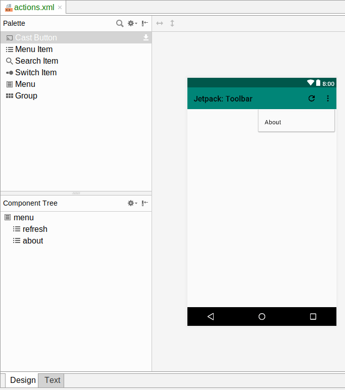
The preview area shows these items as well, though they appear differently due to the way that each of those items is configured, as we will see.
Hey, Why Is the Preview Showing Dark Text and Icons?
In the above screenshot, the title (“Jetpack: Toolbar”) and the icons in the Toolbar show up dark. The graphical menu editor attempts to use our app’s theme, but it has limits, and in this case it is not picking up some of the changes that we made to the theme.
In general, consider the Android Studio preview options to be approximations of what you will see when you run the app on an emulator or device.
Refresh
One of our two menu items is called refresh, and we will use it to allow the user to come up with a new random list of colors:
  <item
    android:id="@+id/refresh"
    android:title="@string/menu_refresh"
    android:icon="@drawable/ic_refresh_black_24dp"
    app:showAsAction="ifRoom" />
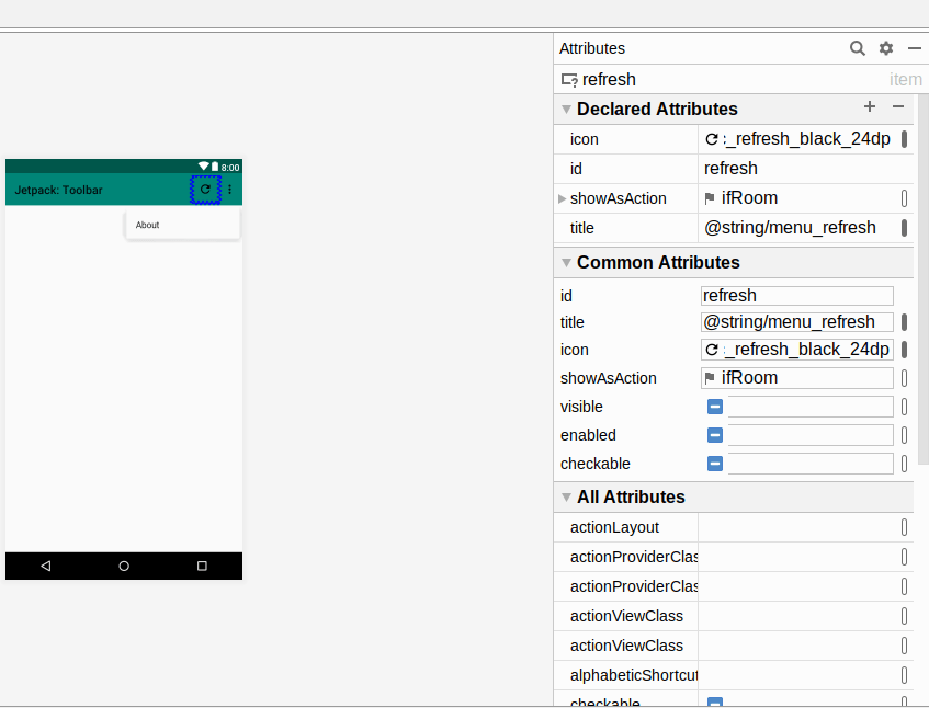
refresh Details
Each interactive element in our Toolbar will have an <item> element inside of the root <menu> element of our menu resource. Items always have:
- An ID, using the same
android:idsystem that we use for widget IDs - A title, via the
android:titleattribute, usually pointing to a string resource
Items usually have a showAsAction attribute. For AppCompat-based activities, that should be app:showAsAction — if you see code with android:showAsAction, that is a menu resource for use with the native framework action bar or Toolbar, not the AppCompat-compatible Toolbar that we use from AndroidX. showAsAction has three major options:
-
always, to say that we really want this item to be shown as a toolbar button -
ifRoom, to say that we would prefer it be shown as a toolbar button, but that is not essential -
never, to say that this item is unimportant and does not need a dedicated button in theToolbar
Items that go into the Toolbar that do not wind up with toolbar buttons go into “the overflow menu”. If you have used Android apps that have a vertical ellipsis (“…”) icon in their app bars, where a menu pops open when you tap it… that’s the overflow menu. In our case, the refresh item has ifRoom, so if there is space for it to have a toolbar button, it will have one, otherwise it will go into the overflow.
For items that might be toolbar buttons, usually you will want to provide an android:icon attribute with a pointer to a drawable resource. Here, we are using a refresh icon from the Vector Asset Wizard, using a stock refresh vector asset that is supplied by Google.
About
Our about menu item is not nearly as important, so we set it to have never for showAsAction and skip the android:icon attribute:
  <item
    android:id="@+id/about"
    android:title="@string/menu_about"
    app:showAsAction="never" />
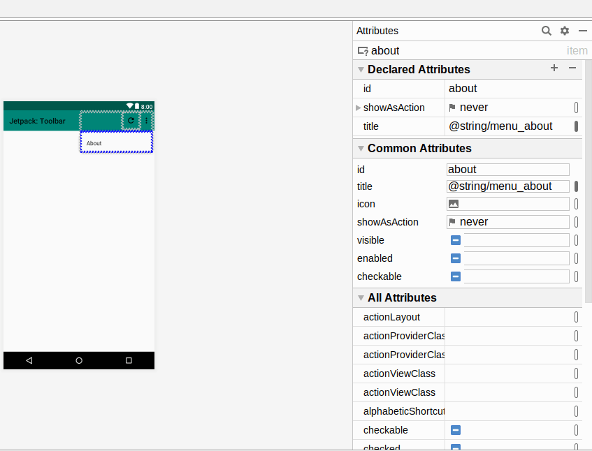
about Details
Populating the Toolbar
We have a Toolbar in our layout. We have a menu resource. We now need to tie the two together. That requires a bit of code in onCreate() of our MainActivity, whether that is in Java:
    binding.toolbar.setTitle(R.string.app_name);
    binding.toolbar.inflateMenu(R.menu.actions);
…or Kotlin:
    binding.toolbar.apply {
      setTitle(R.string.app_name)
      inflateMenu(R.menu.actions)
(the Kotlin will appear to be missing a closing brace, but that is because there is more code in this apply() that we will see in the next section)
First, we get access to the Toolbar, either via findViewById() in Java or by using synthetic accessors in Kotlin. Then, we call two functions on the Toolbar:
-
setTitle()sets the title text — when we use aToolbarmanually like this, we need to provide that value ourselves -
inflateMenu(), where we pass it an ID of our menu resource (R.menu.actions)
Under the covers, inflateMenu() uses a MenuInflater to convert our menu resource XML into Menu and MenuItem objects, which Toolbar will use to configure the Toolbar contents and show our toolbar button and overflow menu:
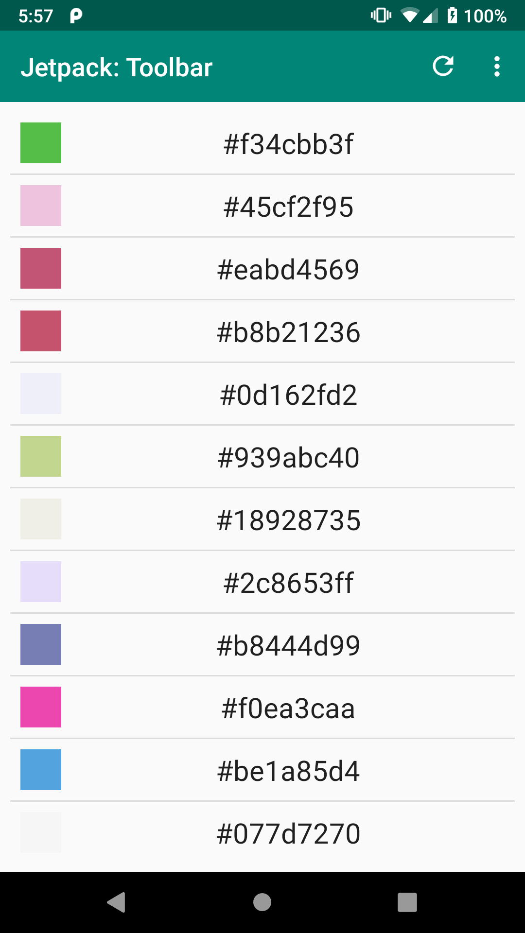
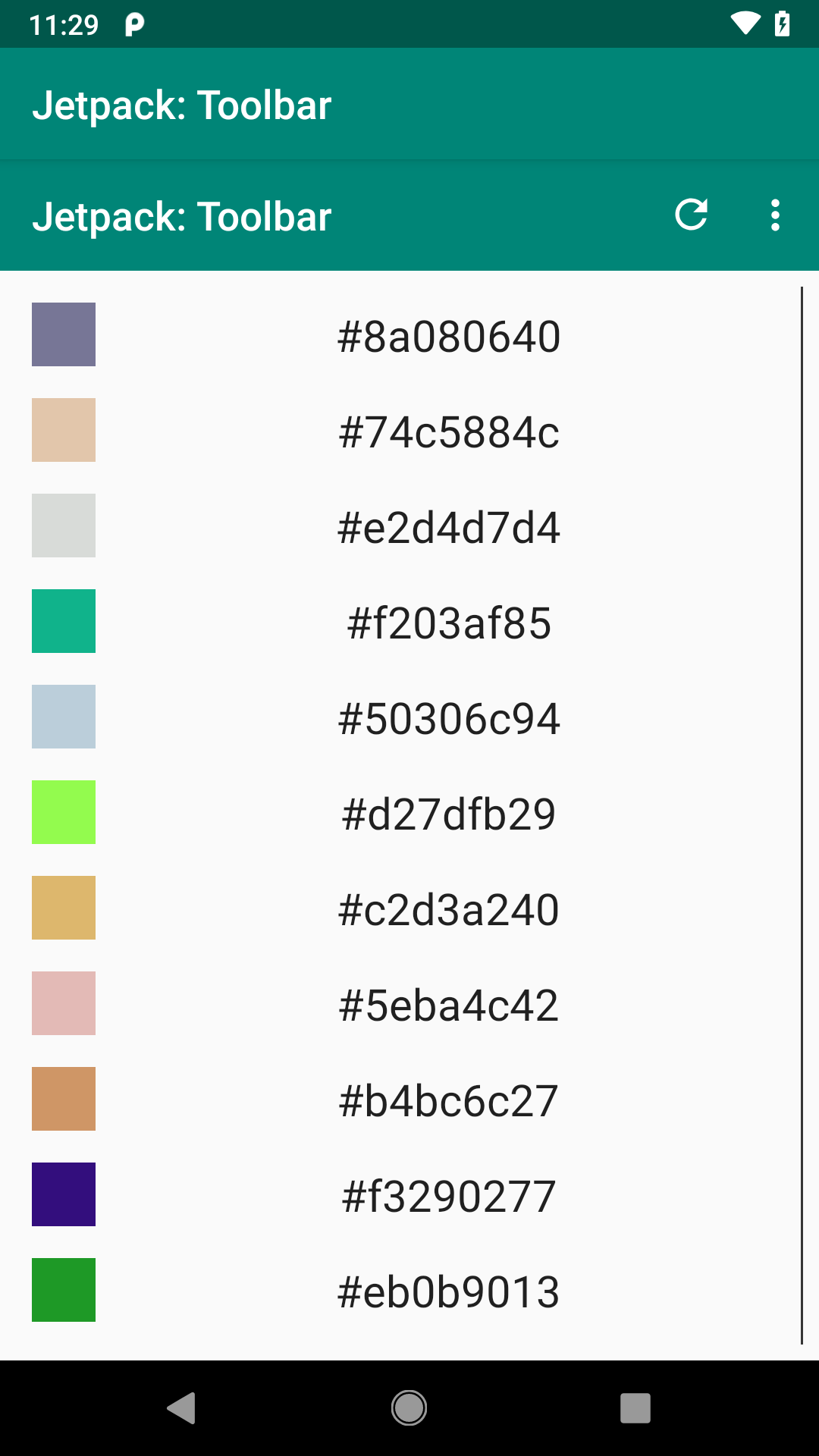
Toolbar Sample, As Initially Launched on Android 9.0
The overflow menu appears when you tap the “…” button in the Toolbar:
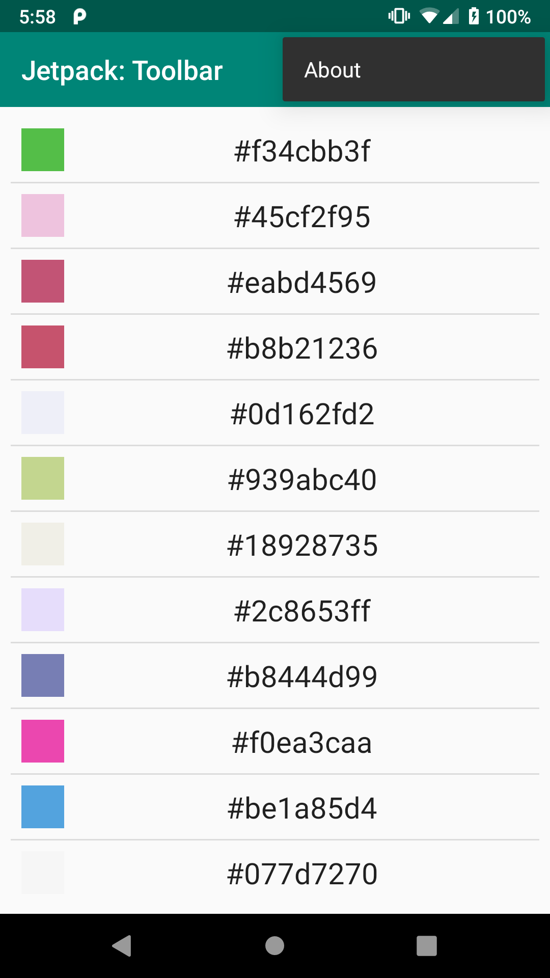
Toolbar Sample, Showing Overflow Menu Contents, on Android 9.0
Responding to Events
While our toolbar button and overflow menu are pretty, they are useless unless we arrange to find out when the user clicks on our refresh and about items.
For that, we call setOnMenuItemClickListener() on the Toolbar:
    binding.toolbar.setOnMenuItemClickListener(item -> {
      if (item.getItemId() == R.id.refresh) {
        vm.refresh();
        adapter.submitList(vm.numbers);
        return true;
      }
      else if (item.getItemId() == R.id.about) {
        Toast.makeText(MainActivity.this, R.string.msg_toast,
          Toast.LENGTH_LONG).show();
        return true;
      }
      else {
        return false;
      }
    });
    binding.toolbar.apply {
      setTitle(R.string.app_name)
      inflateMenu(R.menu.actions)

      setOnMenuItemClickListener { item ->
        when (item.itemId) {
          R.id.refresh -> {
            vm.refresh()
            colorAdapter.submitList(vm.numbers)
            true
          }
          R.id.about -> {
            Toast.makeText(
              this@MainActivity,
              R.string.msg_toast,
              Toast.LENGTH_LONG
            ).show()
            true
          }
          else -> false
        }
      }
    }
Our lambda expression is passed the MenuItem object corresponding to the <item> from our menu resource that the user tapped on. We can call getItemId() to determine which <item> it was.
If they clicked refresh, we call a refresh() function on the revised ColorViewModel that generates a fresh set of colors:
package com.commonsware.jetpack.samplerj.toolbar;

import java.util.ArrayList;
import java.util.Random;
import androidx.lifecycle.SavedStateHandle;
import androidx.lifecycle.ViewModel;

public class ColorViewModel extends ViewModel {
  private static final String STATE_NUMBERS = "numbers";
  ArrayList<Integer> numbers;
  private final SavedStateHandle state;

  public ColorViewModel(SavedStateHandle state) {
    this.state = state;
    numbers = state.get(STATE_NUMBERS);

    if (numbers == null) {
      numbers = buildItems();
    }
  }

  void refresh() {
    numbers = buildItems();
    state.set(STATE_NUMBERS, numbers);
  }

  private ArrayList<Integer> buildItems() {
    Random random = new Random();

    ArrayList<Integer> result = new ArrayList<>(25);

    for (int i = 0; i < 25; i++) {
      result.add(random.nextInt());
    }

    return result;
  }
}
package com.commonsware.jetpack.sampler.toolbar

import androidx.lifecycle.SavedStateHandle
import androidx.lifecycle.ViewModel
import java.util.*

private const val STATE_NUMBERS = "numbers"

class ColorViewModel(private val state: SavedStateHandle) : ViewModel() {
  private val random = Random()
  var numbers = state.get<List<Int>>(STATE_NUMBERS) ?: buildItems()

  fun refresh() {
    numbers = buildItems()
    state.set(STATE_NUMBERS, numbers)
  }

  private fun buildItems() = List(25) { random.nextInt() }
}We then update the ColorAdapter with the new colors, and it updates the list.
If the user clicked about, we show a Toast — in a real app, an “About” item would bring up some screen that contains a copyright notice, license terms, version information, and so on.
The lambda expression needs to return true if the item click was handled by the lambda, or false if the item was not recognized for one reason or another.
Prev Table of Contents Next
This book is licensed under the Creative Commons Attribution-ShareAlike 4.0 International license.