Setting Up the App Bar
Next up is to configure the app bar in our ToDo application. The app bar is that bar at the top of your activity UI, showing your app’s title. It can also have toolbar-style buttons and an “overflow menu”, each holding what are known as action items.
Google has made a bit of a mess of this app bar over the years, mixing the terms “app bar”, “action bar”, and “toolbar”. This book will tend to use:
-
Toolbar, in monospace, when referring to the actualToolbarclass - “App bar”, when referring to the concept of this bar
- “Toolbar buttons”, when referring to the icons that can appear in this bar that the user can tap on to perform actions
In this tutorial, we will add a Toolbar to our UI that will serve as our app bar. In that Toolbar, we will add an action item to the overflow menu to launch an “about” page, though we will not actually show that page until a later tutorial. And, along the way, we will update our app’s theme with a new color scheme.
This is a continuation of the work we did in the previous tutorial. The book’s GitLab repository contains the results of the previous tutorial as well as the results of completing the work in this tutorial.
 You can learn more about styles and themes in the "Defining and Using Styles" chapter of Elements of Android Jetpack!
You can learn more about
You can learn more about styles and themes in the "Defining and Using Styles" chapter of Elements of Android Jetpack!
You can learn more about Toolbar in the "Configuring the App Bar" chapter of Elements of Android Jetpack!
Step #1: Defining Some Colors
Just as Android has layout, drawable, and string resources, Android has color resources. We can define some colors in a resource file, then apply those colors elsewhere in our app.
By convention, colors are defined in a colors.xml file. Colors are considered “value” resources, like our strings, and so the file would go into res/values/colors.xml.
But, we need to choose some colors.
To that end, visit https://www.materialpalette.com/, which offers a very simple point-and-click way of setting up a color palette for use in an Android app:
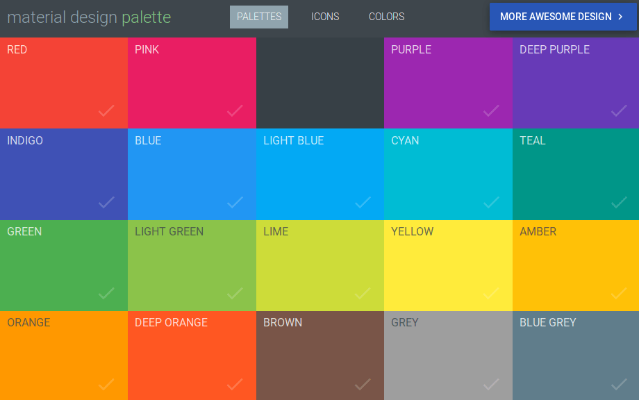
For the purposes of this tutorial, click on “Teal”, then “Amber”:
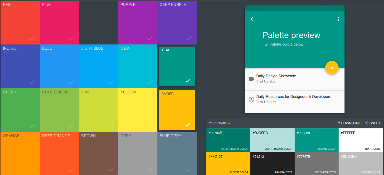
Then, click the “Download” button in the “Your Palette” area, and choose “XML” as the type of file to download. This will trigger your browser to download a file named colors_teal_amber.xml. Open in it your favorite text editor. You should see something like:
<!-- Palette generated by Material Palette - materialpalette.com/teal/amber -->
<?xml version="1.0" encoding="utf-8"?>
<resources>
  <color name="primary">#009688</color>
  <color name="primary_dark">#00796B</color>
  <color name="primary_light">#B2DFDB</color>
  <color name="accent">#FFC107</color>
  <color name="primary_text">#212121</color>
  <color name="secondary_text">#757575</color>
  <color name="icons">#FFFFFF</color>
  <color name="divider">#BDBDBD</color>
</resources>
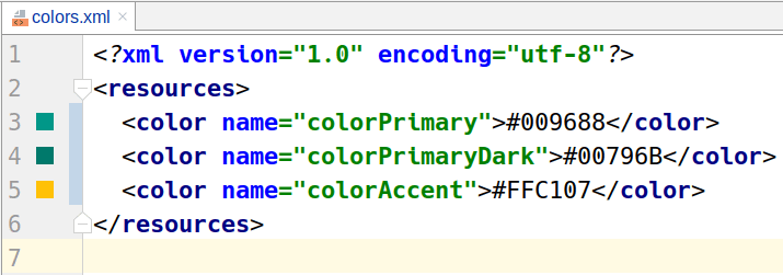
Then, in Android Studio, open your existing res/values/colors.xml file, which will have three colors already defined:
<?xml version="1.0" encoding="utf-8"?>
<resources>
  <color name="colorPrimary">#008577</color>
  <color name="colorPrimaryDark">#00574B</color>
  <color name="colorAccent">#D81B60</color>
</resources>
The file from the Material “Palette” site has colors for the same roles as Android Studio uses, but with slightly different names (e.g., primary instead of colorPrimary). In the end, the names do not matter all that much. For the purposes of this tutorial, we will use Android Studio’s names.
With that in mind, adjust res/values/colors.xml to use the colors from the Material “Palette” site:
- Change
colorPrimaryto#009688 - Change
colorPrimaryDarkto#00796B - Change
colorAccentto#FFC107
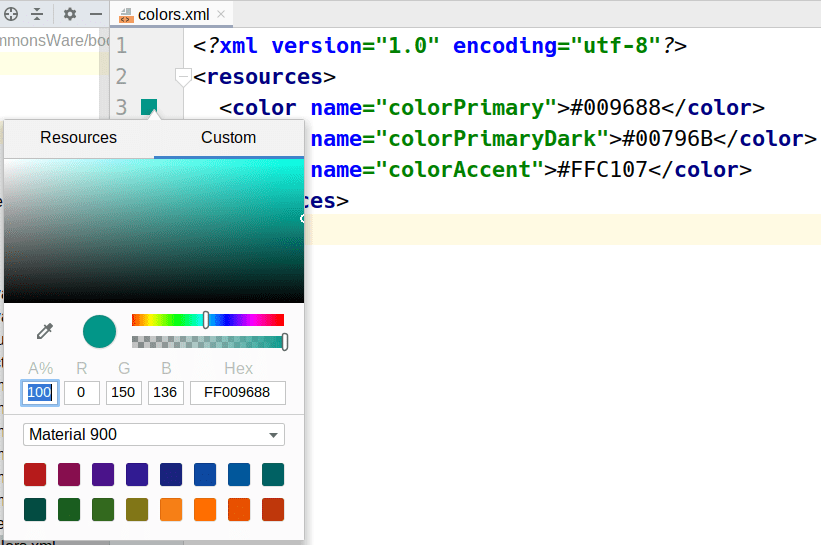
You will see that the Android Studio color resource editor contains color swatches in the “gutter” area, adjacent to each of the color values:
The color swatches are clickable and will bring up a color picker, if you wanted to change any of the colors a bit from what the site gave you:
Prev Table of Contents Next
This book is licensed under the Creative Commons Attribution-ShareAlike 4.0 International license.