Step #9: Adding the Notes
There is only one more widget to add: another TextView, this time for the notes.
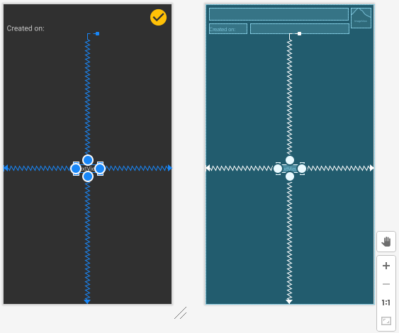
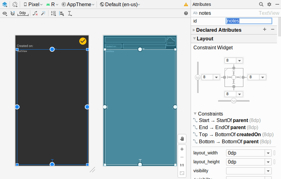
Over in the design tab, drag one more TextView out of the “Palette” pane into the preview area. Set the constraints to have the top of the TextView attach to the bottom of the createdOn TextView, and have the other three sides attach to the edges of the ConstraintLayout:
Change both the “layout_width” and “layout_height” attributes to match_constraint. Give the widget an ID of notes. Clear the “text” attribute, as we will fill that value in at runtime. And, in the “Layout” section of the “Attributes” pane, give it 8dp of margin on all four sides, via the drop-downs:
For the textAppearance, fill in ?attr/textAppearanceBody1, to use our theme’s textAppearanceBody1 rules for formatting the text. Over in res/values/styles.xml, add this XML element:
  <style name="BodyAppearance" parent="@style/TextAppearance.AppCompat.Medium">
  </style>
This is the same as HeadlineTwoAppearance, other than the name. Having two separate styles allows us to format the text differently in the future (e.g., have the body be monospace), should we choose to do so.
Then, add another <item> element to Theme.ToDo to tie in this new style:
<item name="textAppearanceBody1">@style/BodyAppearance</item>
Prev Table of Contents Next
This book is licensed under the Creative Commons Attribution-ShareAlike 4.0 International license.