@Preview Annotation Properties
Part of the allure of Jetpack Compose is the ease of the @Preview annotation.
Just put it on a zero-parameter @Composable function and you can see what
that function renders in a preview panel.
So, for example, we can have:
@Composable
fun SimpleButton(message: String, padding: Dp, clickAction: () -> Unit) {
Button(
modifier = Modifier.padding(padding),
onClick = clickAction
) {
Text(message)
}
}
@Preview
@Composable
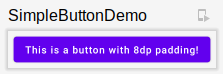
fun SimpleButtonDemo() {
MaterialTheme {
SimpleButton("This is a button with 8dp padding!", 8.dp) {
Log.d("SimpleButton", "You clicked the button!")
}
}
}
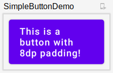
For a dev12 build of Compose and Android Studio 4.1 Canary 10, we get
a preview like this one:
Most of the places where I have seen @Preview demonstrated use @Preview like
that, with no properties. But, @Preview does have properties,
and Android Studio 4.1 Canary 10 honors some of them.
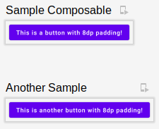
name
This controls the name that appears over the preview. This is particularly useful when
you have more than one @Preview in the current Kotlin file:
@Preview(
  name = "Sample Composable"
)
@Composable
fun SimpleButtonDemo() {
  MaterialTheme {
    SimpleButton("This is a button with 8dp padding!", 8.dp) {
      Log.d("SimpleButton", "You clicked the button!")
    }
  }
}


@Preview(
  name = "Another Sample"
)
@Composable
fun SimpleButtonDemo2() {
  MaterialTheme {
    SimpleButton("This is another button with 8dp padding!", 8.dp) {
      Log.d("SimpleButton", "You clicked the button!")
    }
  }
}
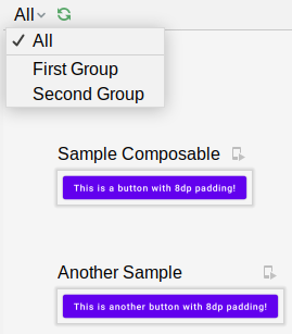
group
If you have a lot of @Preview functions, you can use the group annotation to
set up filtering:
@Preview(
  name = "Sample Composable",
  group = "First Group"
)
@Composable
fun SimpleButtonDemo() {
  MaterialTheme {
    SimpleButton("This is a button with 8dp padding!", 8.dp) {
      Log.d("SimpleButton", "You clicked the button!")
    }
  }
}


@Preview(
  name = "Another Sample",
  group = "Second Group"
)
@Composable
fun SimpleButtonDemo2() {
  MaterialTheme {
    SimpleButton("This is another button with 8dp padding!", 8.dp) {
      Log.d("SimpleButton", "You clicked the button!")
    }
  }
}
Now, a menu appears at the top of the preview pane, allowing you to select just one group’s worth of previews, or “All” to show all the previews:
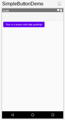
showDecoration
In earlier Android Studio builds (perhaps back in the 4.0 canary builds), there
had been a checkbox in the preview pane to determine whether the preview was
just the composable or had that composable wrapped in a fake activity. That
has now moved to a showDecoration property. If you set that to true:
@Preview(
  showDecoration = true
)
…you get the composable-in-a-fake-activity preview:
widthDp and heightDp
You can force the preview to use less space using widthDp and heightDp:
@Preview(
  widthDp = 160
)
Here, we constrain the width to 160dp, and so our button caption wraps:
Other Properties
-
apiLevelpresumably refers to platform API levels, and it is supposed to use that API level when rendering the preview, though it is unclear what the actual effects would be on a composable -
fontScaletakes a float (e.g.,1.5f) and uses that to increase the font size for rendered text, as if the user changed the font scale in Settings to that value -
localeswitches the preview to another locale, presumably pulling in string resources to match -
showBackgroundandbackgroundColorare supposed to let you control the background behind the composable, but this does not appear to be working -
uiModeallows you to specify a mode akin to theuiModeonConfiguration, for things like night mode, watch/car/TV/appliance mode, etc.
As with everything in Compose and canary Studio builds, change is the only constant.
So, do not be surprised if @Preview properties shift with future dev builds and
their support in Studio to vary. But these will help you manage a library of
previews and experiment with different scenarios directly from the IDE.