Nested PreferenceScreens + Honeycomb = Ugly
Android’s PreferenceScreen system for preference UIs is
rather nice. However, there is one substantial issue with
its appearance on Android 3.0: nested PreferenceScreen
elements.
If you put a PreferenceScreen inside another PreferenceScreen,
you create a “drill-down” interface. When the user taps on the
entry on the outer PreferenceScreen, the UI shifts to a whole
new PreferenceScreen showing the inner one’s items. This
is a nice way to organize a long list of preferences, so they
are not just one screen, scaring the user with their breadth.
However, in Honeycomb, not all PreferenceScreen UIs are
created equal.
Here is an outer PreferenceScreen as rendered on a XOOM:
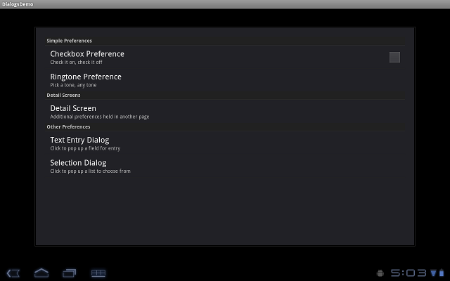
This is the look of a PreferenceFragment in the new
Honeycomb style.
However, if you click on the “Detail Screen” element to bring
up the inner PreferenceScreen, you get this:
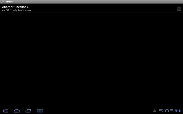
This is the look of a classic Android PreferenceScreen.
While these screenshots were taken on a project that did not have android:targetSdkVersion=”11”, there is no change in this area even if that is specified.
The presumed workaround is to switch entirely to PreferenceFragment,
but since that is not backwards-compatible,
it will increase your app’s complexity. Another workaround is
to eliminate the inner PreferenceScreen and just put everything
in the top PreferenceScreen. This could either be done for
all versions, or possibly only for Honeycomb by having a different
version of your preference XML in res/xml-v11/.