The Basics of Bubbles
A bubble is an option for a conversation-style notification. It basically detaches the notification from the notification shade and has it be represented by a free-floating icon that, when tapped, will display a designated activity in a floating window. As a result, there are two main steps in enabling bubbles for a conversation:
- Setting up that activity for the floating window
- Teaching the notification that you want a bubble as an option
Crafting the Activity
There are two elements to a bubble:
- The actual bubble dot itself
- The content that is shown when the user taps on the bubble
That content is in the form of an Android activity.
The UI
Since this is an activity, you have access to the full range of Android UI options. There are no known technical limitations, so if you want to use a SurfaceView or WebView or whatever, you should be fine.
However, do bear in mind that your activity is likely to be smaller than the full screen height. Also, while it is possible for that activity to start other activities, those by default will remain in the bubble’s window, forming its own back stack.
You are not technically restricted to simple UIs like those of app widgets, slices, and wearables. However, a bubble activity still should err on the side of simplicity, particularly while users are getting used to how bubbles look and operate.
The Manifest Entry
As with any activity, the bubble content activity will have an <activity> element in the manifest.
The documentation states that the <activity> must have three key attributes:
-
android:allowEmbedded="true", to say that this activity can be embedded in some other UI -
android:documentLaunchMode="always", to say that if there is aUriassociated with the activity, differentUrivalues will result in different tasks and separate activity instances -
android:resizeableActivity="true", to say that the activity window can be resized at will by the user
The documentation claims that if these requirements are not met, then your requested bubble will not be created and you wind up with a plain Notification instead. In reality, none of these are required for the bubble to appear.
In the BubbleConversation module, we have a BubbleActivity that we want to display as the bubble content. As a result, we put those three attribute values on the BasicBubble <activity> element:
    <activity
      android:name=".BubbleActivity"
      android:allowEmbedded="true"
      android:documentLaunchMode="always"
      android:resizeableActivity="true" />
BubbleActivity simply loads a layout with a Switch widget to indicate whether or not you like bubbles:
<?xml version="1.0" encoding="utf-8"?>
<androidx.constraintlayout.widget.ConstraintLayout
  xmlns:android="http://schemas.android.com/apk/res/android"
  xmlns:app="http://schemas.android.com/apk/res-auto"
  xmlns:tools="http://schemas.android.com/tools"
  android:layout_width="match_parent" android:layout_height="match_parent">

  <Switch
    android:id="@+id/switch1"
    android:layout_width="wrap_content"
    android:layout_height="wrap_content"
    android:layout_marginBottom="8dp"
    android:layout_marginEnd="8dp"
    android:layout_marginStart="8dp"
    android:layout_marginTop="8dp"
    android:checked="true"
    android:switchTextAppearance="@style/TextAppearance.AppCompat.Large"
    android:text="I Like Bubbles!"
    app:layout_constraintBottom_toBottomOf="parent"
    app:layout_constraintEnd_toEndOf="parent"
    app:layout_constraintStart_toStartOf="parent"
    app:layout_constraintTop_toTopOf="parent" />
</androidx.constraintlayout.widget.ConstraintLayout>Note that the Switch does not actually do anything. But, feel free to toggle it, if you like!
Requesting the Bubble
To show the bubble, you need to display a conversation notification that has BubbleMetadata attached to it.
NotificationCompat.Builder has a setBubbleMetadata() method that we can use to request a bubble for our Notification. There is a corresponding NotificationCompat.BubbleMetadata class, with a Builder, that we can use to create that metadata to supply to setBubbleMetadata().
This code snippet illustrates setting up the metadata, as part of setting up the conversation notification as seen earlier in this chapter:
  private fun buildBubbleNotification(appContext: Context, showExpanded: Boolean = false): Notification {
    val pi = PendingIntent.getActivity(
      appContext,
      0,
      Intent(appContext, BubbleActivity::class.java),
      PendingIntent.FLAG_UPDATE_CURRENT
    )

    val bubble = NotificationCompat.BubbleMetadata.Builder()
      .setDesiredHeight(400)
      .setIcon(IconCompat.createWithResource(appContext, R.drawable.ic_two))
      .setIntent(pi)
      .apply { if (showExpanded) setAutoExpandBubble(true); setSuppressNotification(true) }
      .build()

    val shortcutInfo = ShortcutInfoCompat.Builder(this, SHORTCUT_ID)
      .setLongLived(true)
      .setShortLabel("Settings")
      .setIntent(Intent(Settings.ACTION_SETTINGS))
      .setIcon(IconCompat.createWithResource(this, R.drawable.ic_one))
      .build()

    ShortcutManagerCompat.pushDynamicShortcut(this, shortcutInfo)

    val builder = NotificationCompat.Builder(
      appContext,
      CHANNEL_WHATEVER
    )
      .setSmallIcon(R.drawable.ic_notification)
      .setContentTitle("Um, hi!")
      .setBubbleMetadata(bubble)
      .setShortcutInfo(shortcutInfo)

    val person = Person.Builder()
      .setBot(true)
      .setName("A Test Bot")
      .setImportant(true)
      .build()

    val style = NotificationCompat.MessagingStyle(person)
      .setConversationTitle("A Fake Chat")

    style.addMessage("Want to chat?", System.currentTimeMillis(), person)
    builder.setStyle(style)

    return builder.build()
  }
There are three key methods on NotificationCompat.BubbleMetadata.Builder:
-
setDesiredHeight()indicates how much vertical space you want for your bubble content, measured indp. Note that this is a request, and your actual height may be larger or smaller than what you request. -
setIcon()eventually will let you specify an icon for the bubble itself. Note that your launcher icon will appear superimposed on the bubble icon. As a result, using the launcher icon as the bubble icon is atypical, but we are doing that here anyway. -
setIntent()provides thePendingIntentto start the activity that is your bubble content. In theory, thisPendingIntentcould be one for a service or receiver instead of an activity, though this may give you undesired results.
If showExpanded is true, we also call two additional builder methods:
-
setAutoExpandBubble(), to indicate that we want the bubble to show up in full, not just as a simple bubble -
setSuppressNotification(), to indicate that we do not want the actualNotificationto appear if the bubble is displayed — the bubble alone is all that we need
The resulting Notification can be displayed as normal:
  private fun showBubble(appContext: Context, showExpanded: Boolean = false) {
    NotificationManagerCompat.from(appContext).let { mgr ->
      mgr.createNotificationChannel(
        NotificationChannel(
          CHANNEL_WHATEVER,
          "Whatever",
          NotificationManager.IMPORTANCE_DEFAULT
        )
      )

      mgr.notify(NOTIF_ID, buildBubbleNotification(appContext, showExpanded))
    }
  }
The UX
As was noted earlier, there is an icon in the lower-left of a conversation notification that, when tapped, will bring up the bubble. Future uses of bubbles by your notifications for the same channel, by default, will bring up the bubble icon (or the expanded bubble) immediately.
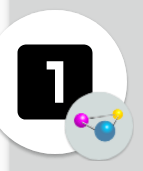
In the collapsed form, the bubble consists of the shortcut icon with your app’s launcher icon superimposed upon it:
The bubble itself can be dragged around the screen, though it will always gravitate toward one of the sides. This allows the user to reposition it to not obscure something of importance.
Tapping the bubble itself expands it:
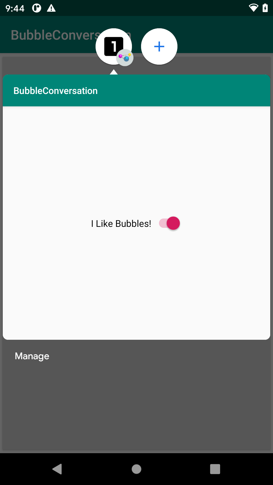
You go directly to this expanded state if you use setAutoExpandBubble(true) in your BubbleMetadata.Builder.
Despite the android:resizeableActivity="true" attribute in the manifest, the system UI does not seem to allow the user to resize or move the bubble content.
The user can:
- Tap outside of the expanded view to collapse it back into a bubble
- Get rid of the bubble by dragging it to the bottom-center of the screen, over an X icon that appears while dragging
- Click the “Manage” button on the lower edge, to bring up a small menu of options for the user to configure the behavior of bubbles from your app
- Click the plus icon in a circle that appears next to your bubble above your activity, to do… something apparently with recent bubbles (this has little documentation)
Prev Table of Contents Next
This book is licensed under the Creative Commons Attribution-ShareAlike 4.0 International license.