TextView: Assigning Labels
Arguably, the simplest widget is the label, referred to in Android as a TextView. Like in most GUI toolkits, labels are bits of text that are not editable directly by users. Typically, they are used to identify adjacent widgets (e.g., a “Name:” label before a field where one fills in a name) or display other text of relevance to users (e.g., messages in pop-up dialog).
As with any widget, you can create instances of TextView in your Java or Kotlin code by invoking a constructor, then use setText() methods to set the text to be displayed by the TextView. However, for ordinary UIs, typically you will use XML layout resources — in there, you can add a TextView element to the layout, with an android:text attribute to set the text of the label itself.
A Sample TextView
Our first sample app — SimpleText — is even simpler than the “Hello, World” ones from earlier in the book. The activity_main layout just has a TextView in it:
<?xml version="1.0" encoding="utf-8"?>
<TextView android:id="@+id/hello"
  xmlns:android="http://schemas.android.com/apk/res/android"
  android:layout_width="wrap_content"
  android:layout_height="wrap_content"
  android:padding="@dimen/hello_padding"
  android:text="@string/hello"
  android:textSize="@dimen/hello_size"
  android:textStyle="bold" />
A TextView displays some text, set by the android:text attribute. Because of the wrap_content values for width and height, the size of this TextView will be determined by:
- The text we are putting in it (
android:text) - The font size of that text (
android:textSize) - The font style of that text (
android:textStyle) - The padding that we put on it (
android:padding)
The SamplerJ/SimpleText edition of MainActivity just displays this layout, via setContentView():
package com.commonsware.jetpack.samplerj.simpletext;

import androidx.appcompat.app.AppCompatActivity;
import android.os.Bundle;

public class MainActivity extends AppCompatActivity {
  @Override
  protected void onCreate(Bundle savedInstanceState) {
    super.onCreate(savedInstanceState);
    setContentView(R.layout.activity_main);
  }
}
…while the Sampler/SimpleText edition does the same thing, but in Kotlin instead of Java:
package com.commonsware.jetpack.sampler.simpletext

import androidx.appcompat.app.AppCompatActivity
import android.os.Bundle

class MainActivity : AppCompatActivity() {
  override fun onCreate(savedInstanceState: Bundle?) {
    super.onCreate(savedInstanceState)
    setContentView(R.layout.activity_main)
  }
}
Android Studio Graphical Layout Editor
The TextView widget is available in the “Common” category of the Palette in the Android Studio graphical layout editor:
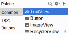
(it also appears in the “Text” category)
If you want to add a TextView to a layout, just drag the TextView from the Palette into a layout file in the main editing area to add the widget to the layout. Or, drag it over the top of some container you see in the Component Tree pane of the editor to add it as a child of that specific container.
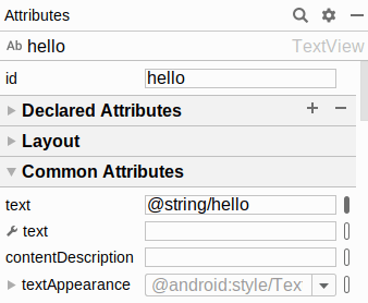
Clicking on the new TextView will set up the Attributes pane with the various attributes of the widget, ready for you to change as needed.
Editing the Text
The “Text” attribute will allow you to choose or define a string resource to serve as the text to be displayed:
The “text” with a wrench icon allows you to provide a separate piece of text that will show up in the preview, but not be used by your app at runtime.
You can either type a literal string right in the Attributes pane row, or you can click the “O” button to the right of the field to pick a string resource:
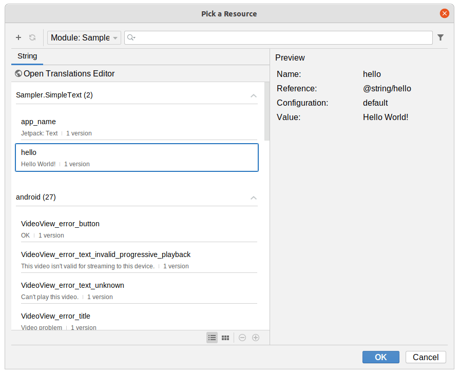
You can highlight one of those resources and click “OK” to use it. Or, towards the upper-left of that dialog, there is an “+” drop-down. When viewing string resources, that drop-down will offer “String Resource File” and “String Value” options. Choosing the “String Value” option will allow you to define a new string resource via another dialog:
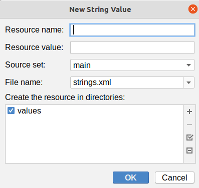
You can give your new string resource a name, the actual text of the string itself, the filename in which the string resource should reside (strings.xml by default), and which values/ directory the string should go into (values by default). You will also choose the “source set” — for now, that will just be main. Once you accept the dialog, your new string resource will be applied to your TextView.
In the SimpleText projects, the TextView has an android:text attribute set to the @string/hello string resource.
Editing the ID
The “id” attribute will allow you to change the android:id value of the widget:
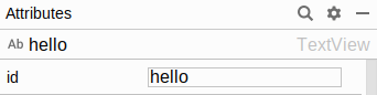
The value you fill in here is what goes after the @+id/ portion (e.g., textView2). This works for all widgets, not just TextView.
In the SimpleText projects, the TextView has hello for its ID field contents, which results in android:id="@+id/hello" in the XML.
Notable TextView Attributes
TextView has numerous other attributes of relevance for labels, such as:
-
android:typefaceto set the typeface to use for the label (e.g.,monospace) -
android:textStyleto indicate that the typeface should be made bold (bold), italic (italic), or bold and italic (bold_italic) -
android:textColorto set the color of the label’s text, in RGB hex format (e.g.,#FF0000for red), ARGB hex format (e.g.,#88FF0000for a translucent red), or as a reference to a color resource (e.g.,@color/colorAccent)
These attributes, like most others, can be modified through the Attributes pane, though many of these are in the “All Attributes” section. The SimpleText app sets the textSize, textStyle, and padding attributes.
Prev Table of Contents Next
This book is licensed under the Creative Commons Attribution-ShareAlike 4.0 International license.