Introducing the Graphical Layout Editor
If you open a layout resource in Android Studio, you will see one of two perspectives: XML, or a drag-and-drop graphical editor.
Towards the upper-right of the layout resource editing tab, you will see that it has a few toolbar buttons:
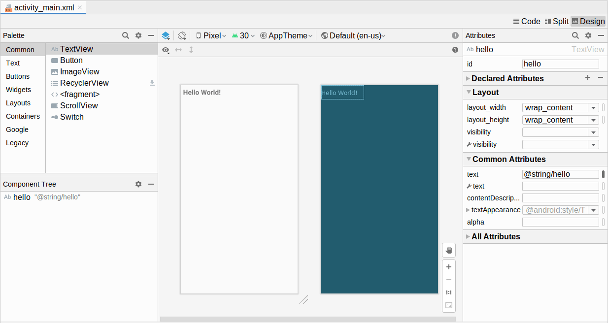
One will be selected at any point in time. The “Design” one represents the graphical layout editor:
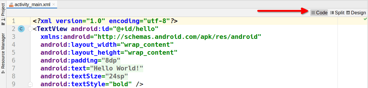
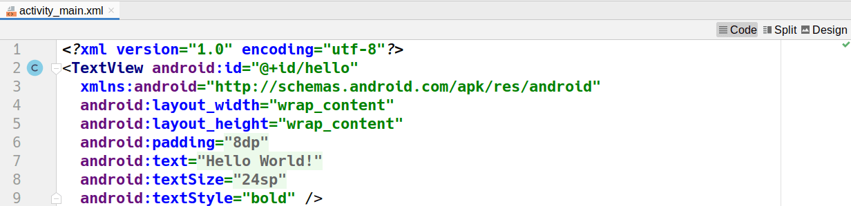
The “Code” one allows you to edit the raw XML that is the actual content of the layout resource:
The “Split” one gives you both the text editor plus parts of the graphical layout editor:
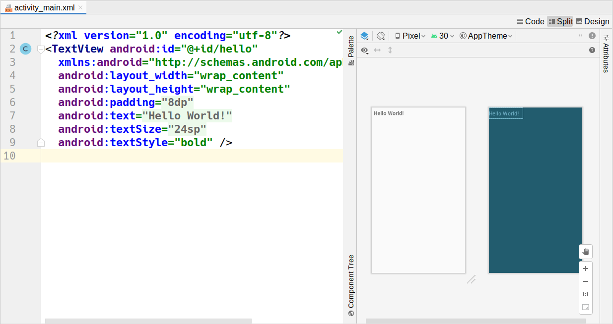
Clicking on items in the preview will select the corresponding XML element in the text editor.
The XML editor is very useful but is also very typical: it offers basic editing with some amount of auto-completion to reduce the amount of typing that you need. If you have done software development using other IDEs or editors, the XML editor in Android Studio should be akin to what you are used to.
The graphical editor also resembles those used in IDEs for decades. However, there has been a bit more variation in how IDEs set up those editors, and Android Studio has its own approach to this sort of tool. So, with that in mind, let’s review what it offers.
Palette
The upper-left side of the graphical layout editor is the Palette tool:
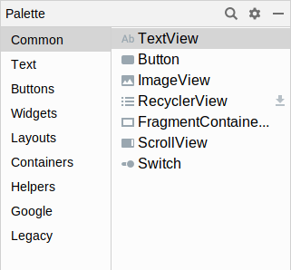
This lists all sorts of widgets and containers that you can drag and drop. They are divided into categories (“Widgets”, “Text”, “Layouts”, etc.) with many options in each. A few are not strictly widgets or containers but rather other sorts of XML elements that you can have in a layout resource (e.g., <fragment>, <requestFocus>). Some — such as the RecyclerView shown in the above screenshot — are from libraries and may have a “download” icon adjacent to them to help illustrate that.
As we cover how to use the graphical layout editor, we will see how to create and configure several of these widgets, containers, and other items.
Preview
The main central area of the graphical layout editor consists of two perspectives on your layout resource contents. The one on the left or top is a preview of what your UI should resemble, if this layout were used for the UI of an activity:
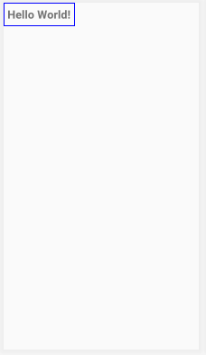
This pours your layout resource contents into a preview frame that has aspects of a regular Android device, such as the navigation bar at the bottom and the status bar at the top.
If you drag items out of the Palette and drop them into the preview area, they will be added to your layout resource.
Blueprint
To the right of the preview area (or below it) is the blueprint view. This also visually depicts your layout resource. However, rather than showing you a preview of what your UI might look like, it visually represents what widget and container classes you are using. And, for some types of containers, it will show some of the sizing and positioning rules that you are using for children of that container:
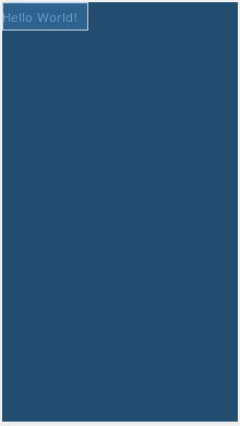
For a trivial layout resource, the blueprint view does not show you much. It will become more useful with more complex layout resources.
Preview Toolbar

From left to right, the toolbar contains:
- A drop-down to toggle whether you see the preview, the blueprint, or both
- A toggle to control whether you are seeing the layout as applied to portrait or landscape perspectives
- A drop-down to choose what device size and resolution should be used for the preview, culled from your emulator images and the available device definitions
- A drop-down to choose what API level should be used for the simulated UI of the preview
- A button to choose what theme to use for presenting the UI of the preview
- A button to choose what language to use for determining which of your string resources gets used in the preview
A couple of those — particularly the theme selector — pertain to topics that we will explore later in the book.
Component Tree
Towards the bottom-left corner is the component tree:
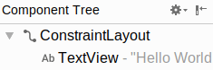
This gives you a full tree of all of the widgets and containers inside of this layout resource. It corresponds to the tree of XML elements in the layout resource itself.
Clicking on any item in the component tree highlights it in both the preview and blueprint views, plus it switches to that widget or container for the attributes pane.
Attributes
When a widget or container is selected — whether via the component tree, clicking on it in the preview, or clicking on it in the blueprint — the “Attributes” pane on the right will allow you to manipulate how that widget or container looks and behaves:
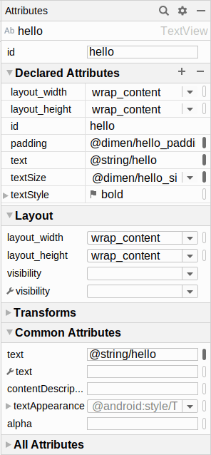
This is divided into sections. The “All Attributes” section, as the name suggests, lists all available attributes for this widget. The other sections highlight common subsets of the attributes. Each section can be expanded or collapsed via the triangle icon in the section header.
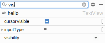
You can also click the magnifying glass icon in the toolbar of this pane to search for available attributes by name:
We will see what some of these attributes are and how to work with them over the course of the next few chapters.
Prev Table of Contents Next
This book is licensed under the Creative Commons Attribution-ShareAlike 4.0 International license.