Starting Simple: TextView and Button
Android offers a wide assortment of UI elements. Some are part of the Android SDK. Others come from third-party libraries. If the UI element is something commonplace, seen in multiple platforms or GUI environments, then it is likely that Android has an analogue of it somewhere.
But, as the saying goes, we must learn to walk before we can run.
So, in this chapter, we will explore the basics of Android’s widget-based UI system by looking at two extremely common widgets: TextView and Button.
First, Some Terminology
Let’s start off by defining some terms as they will be used in Android app development — and, by extension, in this book.
Widgets
Wikipedia has a nice definition of a widget:
A graphical widget (also graphical control element or control) in a graphical user interface is an element of interaction, such as a button or a scroll bar. Controls are software components that a computer user interacts with through direct manipulation to read or edit information about an application.
(quote from the 14 May 2020 version of the page)
Take, for example, this Android screen:
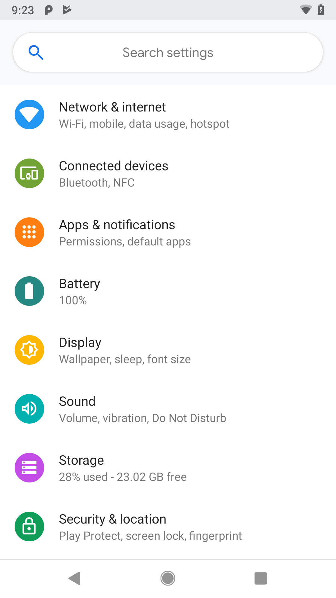
Here, we see:
- a vertically-scrolling list, with rows containing two pieces of text and an icon
- a search field, with a magnifying glass icon and a space to type in a search term, contained in a rounded rectangle
Everything listed above is made of widgets. The user interface for most Android screens is made up of one or more widgets.
This does not mean that you cannot do your own drawing. In fact, all the existing widgets are implemented via low-level drawing routines, which you can use for everything from your own custom widgets to games.
However, for most non-game applications, your Android user interface will be made up of several widgets.
From a coding standpoint, widgets extend from a base class named android.view.View.
Containers
Containers are ways of organizing multiple widgets into some sort of structure. Widgets do not naturally line themselves up in some specific pattern — we have to define that pattern ourselves.
In most GUI toolkits, a container is deemed to have a set of children. Those children are widgets, or sometimes are other containers. Each container has its basic rule for how it lays out its children on the screen, possibly customized by requests from the children themselves.
Android supplies a handful of containers, designed to handle most common scenarios. However, we will use one most of the time: ConstraintLayout. This particular container gives us a flexible set of rules to decide where to place widgets within the screen. We will explore ConstraintLayout in an upcoming chapter.
From a coding standpoint, containers extend from a base class called android.view.ViewGroup. ViewGroup itself inherits from View, and so (usually) things that we can do to a widget we can also do to a container.
Attributes
Widgets have attributes that describe how they should look and behave. In a layout resource, these are literally XML attributes on the widget’s element in the file. Usually, there are corresponding getter and setter methods for manipulating this attribute at runtime from your Java/Kotlin code.
For example, widgets and containers have a “visibility” attribute. This is set by:
-
android:visibilityattribute in a layout resource -
setVisibility()in Java - Assigning a value to the
visibilityproperty in Kotlin
If you visit the JavaDocs for a widget, such as the JavaDocs for TextView, you will see an “XML Attributes” table near the top. This lists all of the attributes defined uniquely on this class, and the “Inherited XML Attributes” table that follows lists all those that the widget inherits from superclasses. Of course, the JavaDocs also list the fields, constants, constructors, and public/protected methods that you can use on the widget itself.
This book does not attempt to explain each and every attribute on each and every widget. We will, however, cover a variety of popular widgets and the most commonly-used attributes on those widgets.
Widget IDs
Most widgets and containers in a layout resource will have an ID associated with them, by means of an android:id attribute. This serves two roles:
- It allows you to reference that widget from within the layout file, for relative positioning rules (e.g., put this
Buttonbelow that otherButton) - It allows you to reference that widget from Java/Kotlin code
For example, here is a TextView widget with an ID of @+id/hello:
<?xml version="1.0" encoding="utf-8"?>
<TextView android:id="@+id/hello"
  xmlns:android="http://schemas.android.com/apk/res/android"
  android:layout_width="wrap_content"
  android:layout_height="wrap_content"
  android:padding="@dimen/hello_padding"
  android:text="@string/hello"
  android:textSize="@dimen/hello_size"
  android:textStyle="bold" />
Usually we use @+id/... as the id value, where the ... represents your locally-unique name for the widget. For example, you might have a widget whose ID is @+id/postalCode or a container whose ID is @+id/addressInfo. You may find android:id values that lack the + sign (e.g., @id/postalCode) — usually this means that somewhere else in the same layout resource, there will be one for the same ID value, but with the + sign.
Size, Margins, and Padding
Widgets have some sort of size, since a zero-pixel-high, zero-pixel-wide widget is not especially user-friendly. Sometimes, that size will be dictated by what is inside the widget itself, such as a label (TextView) having a size dictated by the text in the label. Sometimes, that size will be dictated by the size of whatever holds the widget (a “container”, described in the next section), where the widget wants to take up all remaining width and/or height. Sometimes, that size will be a specific set of dimensions. We will see attributes like android:layout_height and android:layout_width that can be used by a widget to suggest sizing rules to its parent.
Let’s look again at that TextView:
<?xml version="1.0" encoding="utf-8"?>
<TextView android:id="@+id/hello"
  xmlns:android="http://schemas.android.com/apk/res/android"
  android:layout_width="wrap_content"
  android:layout_height="wrap_content"
  android:padding="@dimen/hello_padding"
  android:text="@string/hello"
  android:textSize="@dimen/hello_size"
  android:textStyle="bold" />
Here, we have both android:layout_height and android:layout_width set to wrap_content. wrap_content tells Android “please size this based on whatever is inside of it”. For example, with a label (TextView), “whatever is inside of it” is the text that should be displayed. For a container (e.g., ConstraintLayout), “whatever is inside of it” is the set of children that it manages.
Widgets can have margins. As with CSS, margins provide separation between a widget and anything adjacent to it (e.g., other widgets, edges of the screen). Margins are designed to help prevent widgets from running right up next to each other, so they are visually distinct. We will see attributes like android:layout_margin for specifying margins.
Widgets can have padding. As with CSS, padding provides separation between the contents of a widget and the widget’s edges. This is mostly used with widgets that have some sort of background, like a button, so that the contents of the widget (e.g., button caption) does not run right into the edges of the button, once again for visual distinction. We will see attributes like android:padding for specifying padding.
Hey, What Are Those @dimen Things?
You will notice that the android:padding attribute has a value of @dimen/hello_padding. That is a reference to a dimension resource. Like string and color resources, dimension resources reside in files in res/values/, typically named dimens.xml. There, you give the dimension a name and a corresponding value:
<?xml version="1.0" encoding="utf-8"?>
<resources>
  <dimen name="hello_size">24sp</dimen>
  <dimen name="hello_padding">8dp</dimen>
</resources>Here, we have two dimension resources, hello_size and hello_padding.
The value of a dimension resource is made up of two pieces:
- An integer or floating-point number, and
- A unit of measure
hello_padding is defined as 8dp. dp is short for “density-independent pixels”. There are 160 dp in an inch. dp is the typical unit of measure for most things in Android.
However, hello_size is 24sp. sp is short for “scaled pixels”. One sp is the same size as one dp for the default font scale. However, users can go into the Settings app and change their font scale, to make text bigger or smaller. sp takes that into account. So, if you use sp dimensions for your text size — say, in a TextView widget — your text will also adjust based on the user’s chosen font scale.
There are other units of measure that you could use but are almost never used:
-
infor inches -
mmfor millimeters -
pxfor hardware pixels
In particular, trying to use px for a dimension will result in compiler warnings. Using px does not take screen density differences into account, so a dimension measured in px will be different sizes on different devices. This is almost never what you want.
Prev Table of Contents Next
This book is licensed under the Creative Commons Attribution-ShareAlike 4.0 International license.