Creating an App Icon with the Asset Studio
If you right-click over pretty much any directory in the Android Studio tree, the context menu will have an “Image Asset” option. This is also available from File > New > Image Asset. This brings up the Asset Studio, to help you to assemble icons.
By default, the Asset Studio has its “Icon Type” drop-down set for “Launcher Icons (Adaptive and Legacy)”, which is how you set up an app icon nowadays:
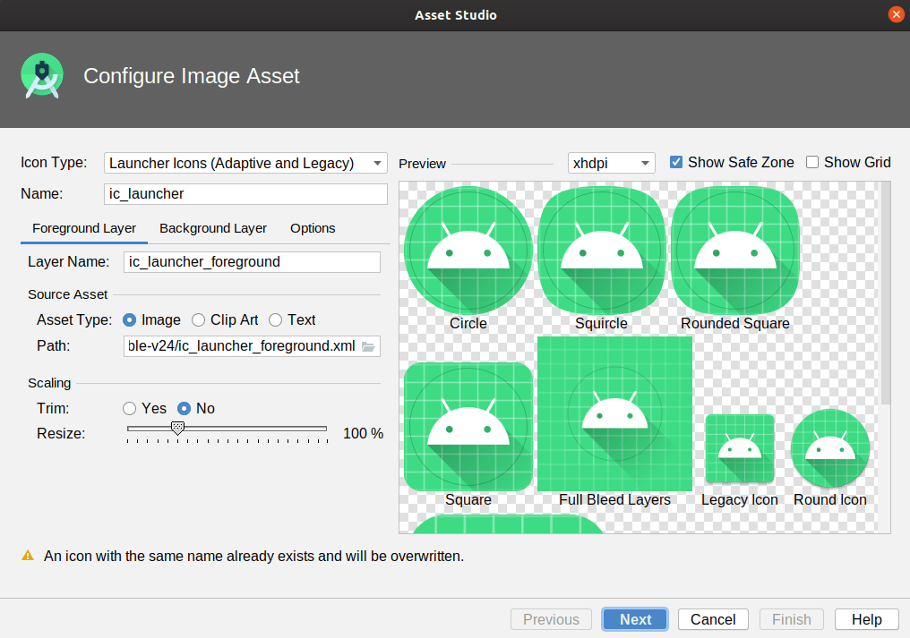
The overall name for your launcher icon is found in the Name field, above the tabs. The default is ic_launcher, and unless you have a good reason to change it, you are best served by leaving it alone.
Foreground Layer
What you would ordinarily think of as your icon is what Android Studio and Android 8.0+ refer to as the “Foreground Layer”. The Asset Studio starts on the Foreground Layer tab for you to configure this layer.
Your icon can come from three main sources:
- Some image of your own design, which you would load into the Foreground Layer tab by selecting the Image radio button, then clicking the folder button inside the Path field, to browse your development machine and find that image
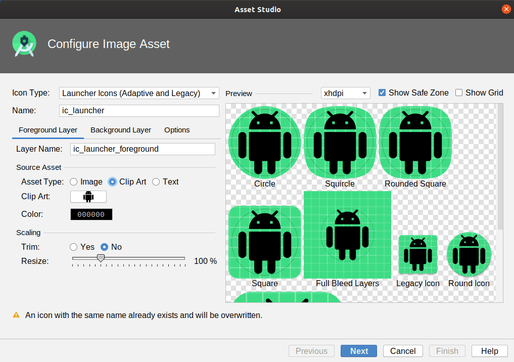
- A piece of canned clip art, which you would choose by clicking on the “Clip Art” radio button, clicking the “Clip Art” button to choose the image, and clicking the Color button to choose a color to apply to that image:
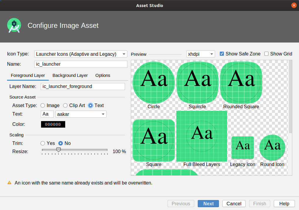
- A letter or two, which you would choose by clicking on the Text radio button, filling in 1-2 letters in the Text field, choosing a font from your development machine in the adjacent drop-down, and clicking the Color button to choose a color to apply to the font:
For all three of these, you can:
- Choose the name to use for this image, in the “Layer Name” field
- Choose, via the Trim radio buttons, whether to remove all transparent space from the edges of the image (“Yes”) or not (“No”)
- Resize the image from its default size
That latter choice is particularly important, as you need to keep your foreground layer content within the “safe zone”. That shows up in the previews as a dark gray circle. So long as your foreground layer is in the safe zone, you should not have to worry about anything accidentally cutting off part of the layer when it renders your app icon.
Background Layer
In the preview area, by default, you will see a green grid behind your foreground layer. That is the default background layer. If you would like to use something else, click the “Background Layer” tab:
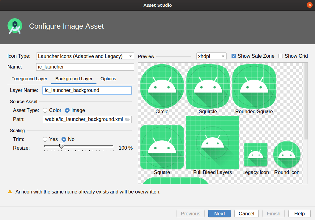
Your two main options are:
- a flat color
- an image of your choosing (akin to the foreground, where you click the folder button inside the Path field to pick the background image)
The background needs to be designed to be cropped into a variety of shapes, such as those shown in the preview (circle, various rounded forms of squares, etc.). Hence, outside of flat colors, typical backgrounds will be gradients or simple patterns, such as the default grid.
Options
On Android 8.0+ devices, the foreground layer, background layer, and device-chosen shape (e.g., squircle) combine to create your app icon.
On older devices, the app icon is whatever you choose it to be, where the Options tab helps you decide what that is:
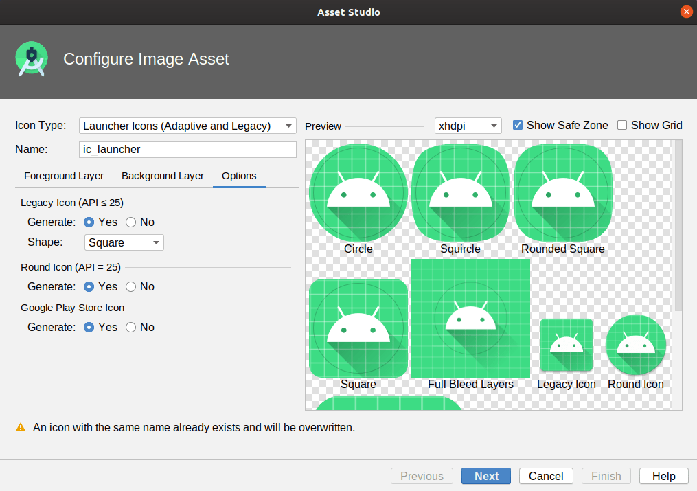
The most important legacy option is the “Legacy Icon (API <= 25)” section. If your minSdkVersion is below 26, this will be the icon rendition that will be used as your app icon by default. The Asset Studio will merge your foreground and background layers itself, then apply your selected shape from the drop-down (e.g., square).
For Android 7.1 devices, you can also opt to have the Asset Studio create a separate round icon, that you can declare in your manifest, as will be seen later in this chapter.
If you are going to be distributing your app through the Play Store, you can also generate a Play Store rendition of your icon. This is reminiscent of the legacy icon, but at a higher resolution.
Generating the Icon
Once you have adjusted your app icon via the three tabs, click Next at the bottom of the Asset Studio wizard. This will bring up the final wizard page, showing you what will be generated for you by the wizard:
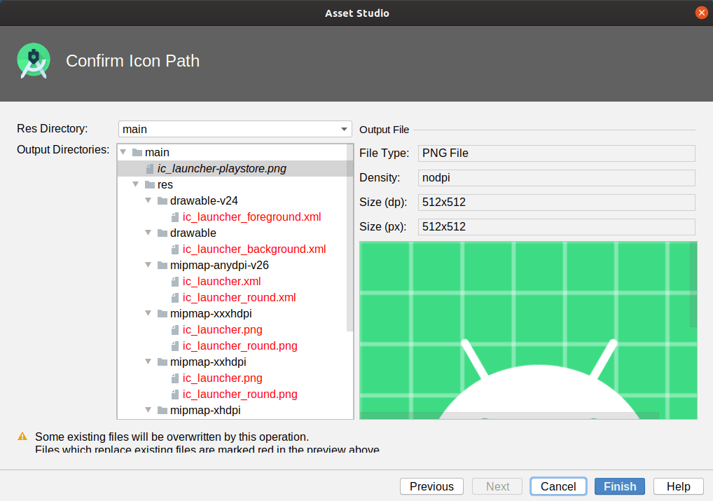
The Output Directories tree shows you each file that will be created or replaced. Those that show up in red are ones that will be replaced; ones that show up in black are new files. Typically, unless you changed the icon or layer names, most of the files will be replacements for files that exist already.
Some of these files will be typical bitmap-style resources. Some are vector drawables, a concept that we will explore in an upcoming chapter.
Using In Your Manifest
Then, in your manifest, you can have an android:icon attribute on the <application> element to associate your icon with your app. If you did not change the names of the icon, then your manifest should already have the appropriate attribute values.
<?xml version="1.0" encoding="utf-8"?>
<manifest package="com.commonsware.myapplication"
  xmlns:android="http://schemas.android.com/apk/res/android">

  <application
    android:allowBackup="true"
    android:icon="@mipmap/ic_launcher"
    android:label="@string/app_name"
    android:roundIcon="@mipmap/ic_launcher_round"
    android:supportsRtl="true"
    android:theme="@style/AppTheme">
    <activity android:name=".MainActivity">
      <intent-filter>
        <action android:name="android.intent.action.MAIN" />

        <category android:name="android.intent.category.LAUNCHER" />
      </intent-filter>
    </activity>
  </application>

</manifest>
You can also have an android:roundIcon attribute. This is for the Android 7.1-specific scenario of having a dedicated round icon resource. If you elected to have Android Studio create a round icon for you, ensure that your <application> element has an android:roundIcon attribute that points to the round icon resource (e.g., @mipmap/ic_launcher_round).
Prev Table of Contents Next
This book is licensed under the Creative Commons Attribution-ShareAlike 4.0 International license.