Compound Buttons
The Android SDK has a CompoundButton class that represents a widget that can be clicked to toggle a “checked” state. CompoundButton itself is an abstract class, but there are a few subclasses of CompoundButton of interest to Android app developers.
Switch
For a simple widget to show a checked or unchecked state, the modern approach is to use a Switch.
Switch extends CompoundButton, which in turn inherits from TextView. As a result, you can use TextView properties like android:textColor to format the widget, in addition to android:text to set the caption that should appear adjacent to the actual “switch” UI.
Within your Java/Kotlin code, you can call:
-
isChecked()to determine if the checkbox has been checked -
setChecked()to force the checkbox into a checked or unchecked state -
toggle()to toggle the checkbox as if the user clicked upon it, inverting whatever its current state is
Also, you can register a listener object (in this case, an instance of OnCheckedChangeListener) to be notified when the state of the checkbox changes.
Our sample app has an Switch named swytch:
    <Switch
      android:id="@+id/swytch"
      android:layout_width="wrap_content"
      android:layout_height="wrap_content"
      android:layout_marginTop="@dimen/margin_row"
      android:text="@string/switch_caption"
      app:layout_constraintEnd_toEndOf="parent"
      app:layout_constraintStart_toStartOf="parent"
      app:layout_constraintTop_toBottomOf="@id/button" />
This appears beneath the ImageButton.
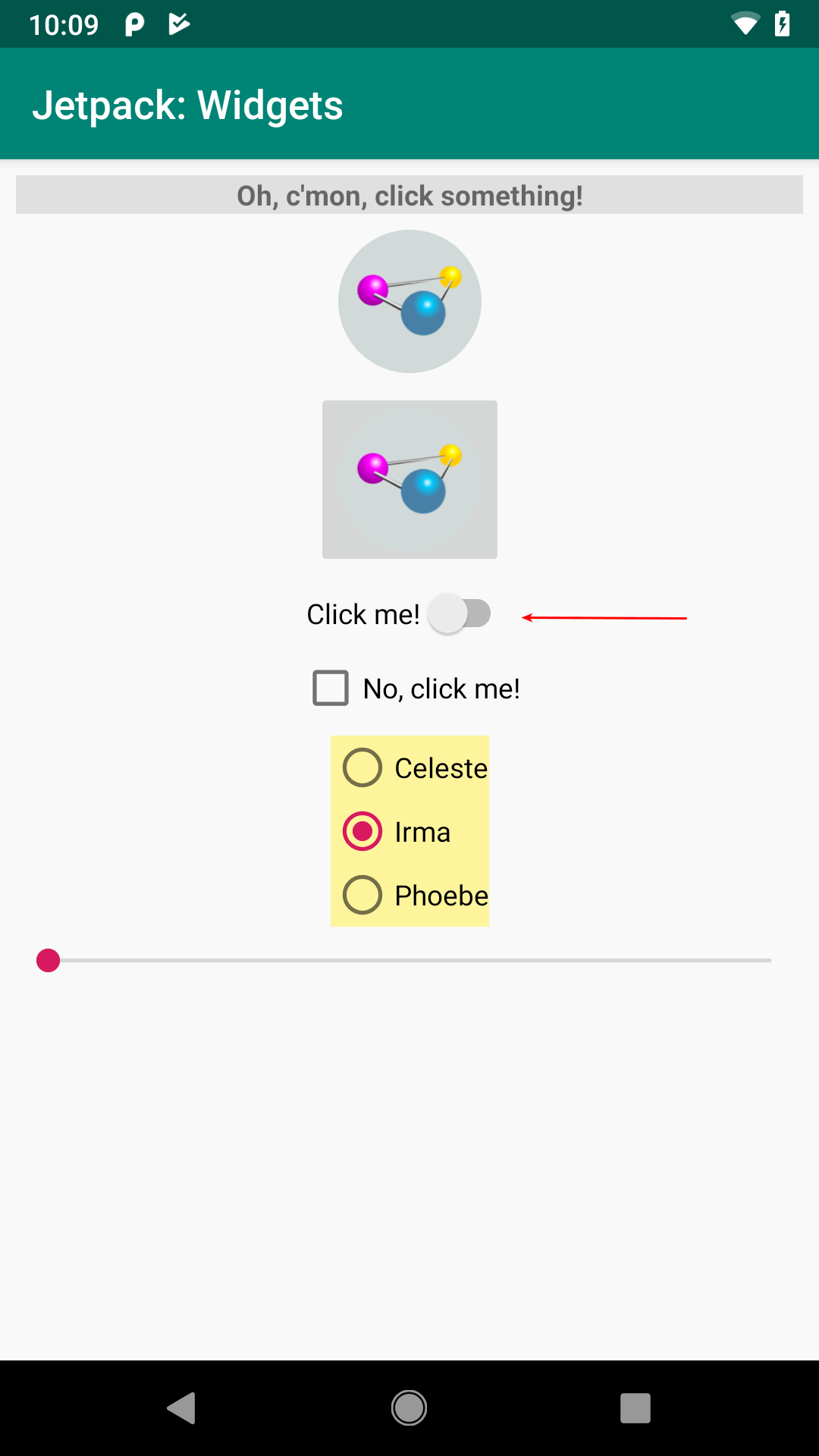
FormWidgets Sample, with
Switch Highlighted
In our case, initially it is unchecked, but the user can tap on it to check it:
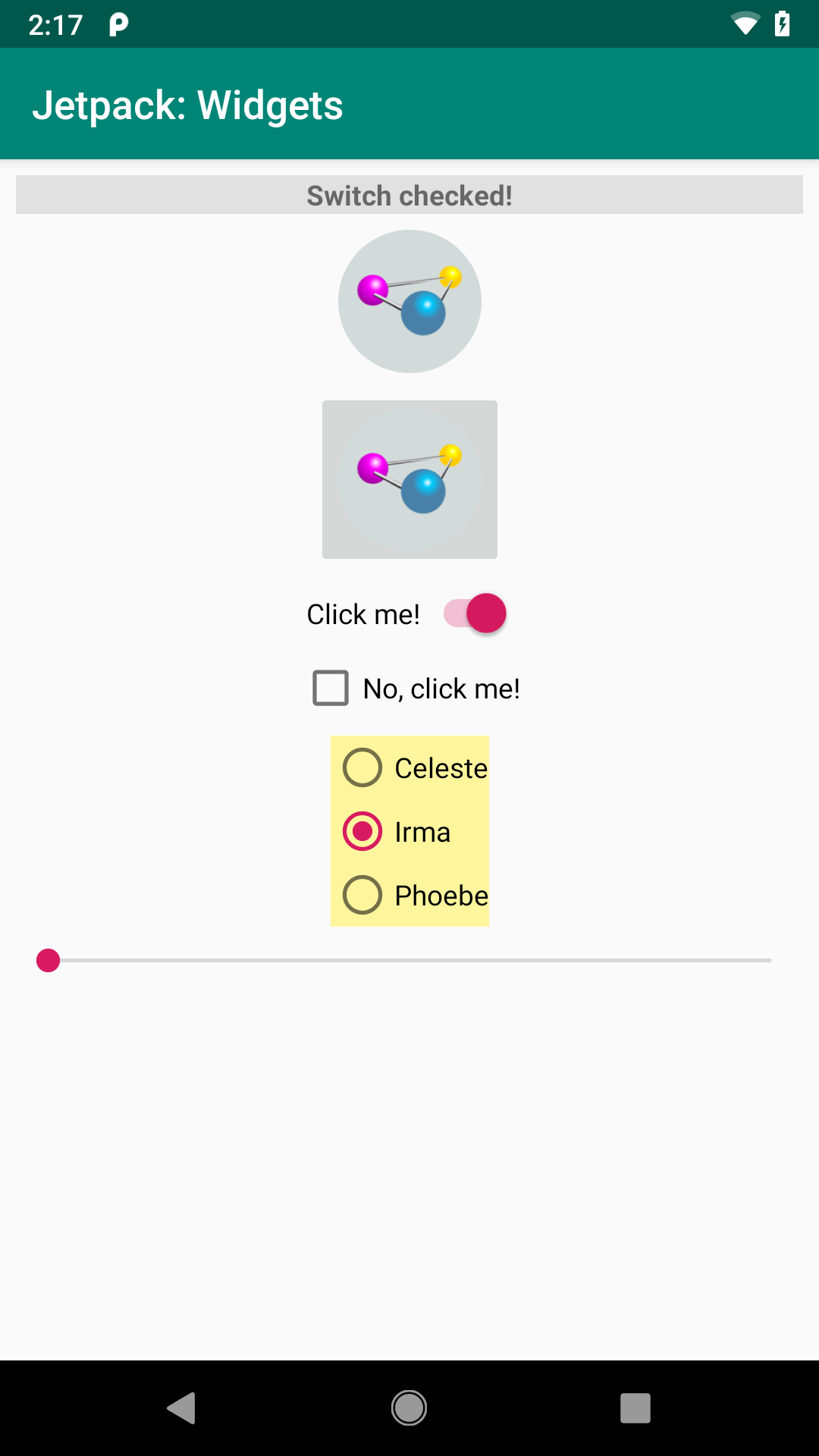
FormWidgets Sample, with
Switch Checked
Android Studio Graphical Layout Editor
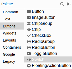
The Switch widget can be found in the “Buttons” portion of the Palette in the Android Studio Graphical Layout editor:
Switch Highlighted
You can drag one into the layout and configure it as desired using the Attributes pane. Mostly the attributes match those of TextView and Button.
Reacting to Events
The primary event listener for any form of CompoundButton is for changes in the checked state. You can register a CompoundButton.OnCheckedChangeListener via setOnCheckedChangeListener() from Java:
    binding.swytch.setOnCheckedChangeListener((v, isChecked) ->
      log(isChecked ? R.string.switch_checked : R.string.switch_unchecked));
…or Kotlin:
    binding.swytch.setOnCheckedChangeListener { _, isChecked ->
      log(if (isChecked) R.string.switch_checked else R.string.switch_unchecked)
    }
In this case, our lambda expressions are converted into instances of OnCheckedChangeListener, with the lambda expression bodies forming the implementation of the onCheckedChanged() function. That function gets passed two parameters:
- The
CompoundButtonwhose checked state changed, and - A
Booleanreflecting whether the new state is checked or unchecked
In our case, we just use that Boolean to choose which of two string resources to pass to log(), using the ternary operator in Java and an if expression in Kotlin.
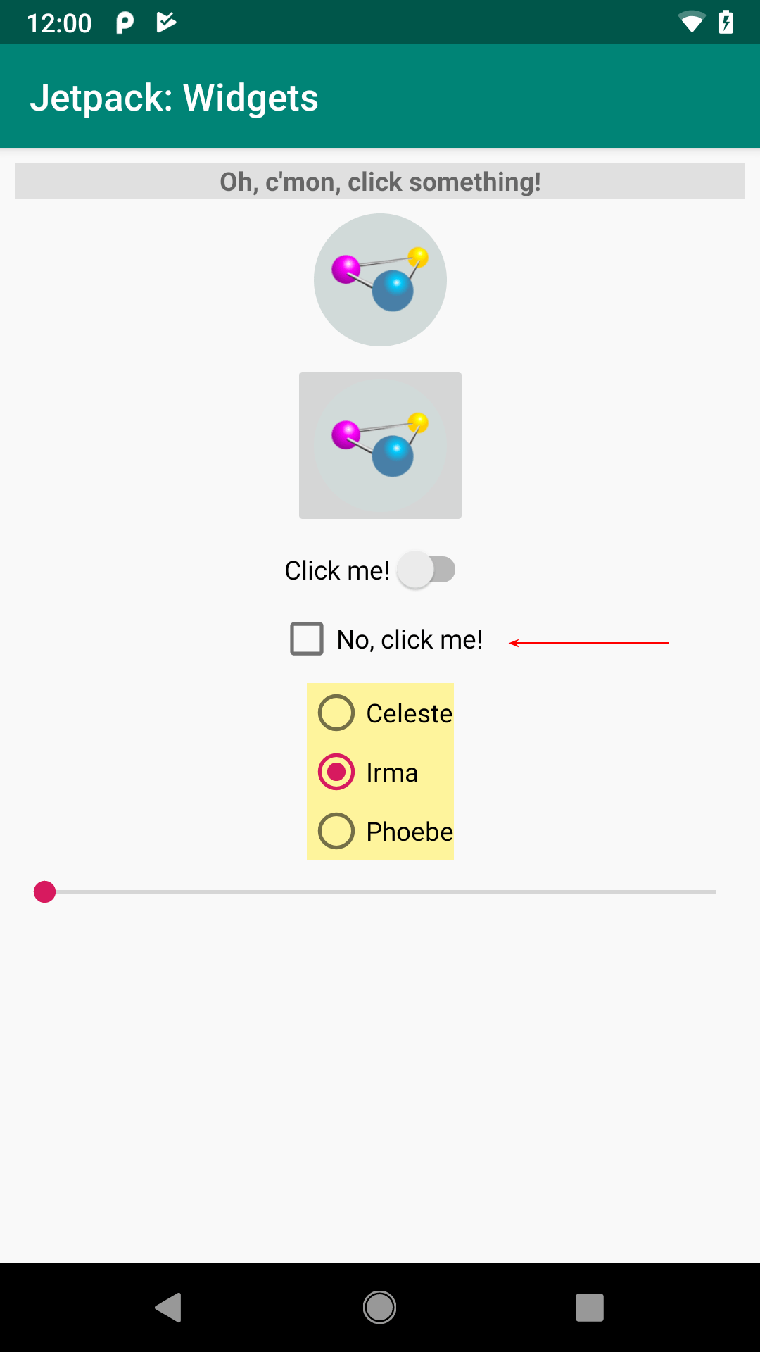
Hey, You Have a Typo in android:id!
You may have noticed that the android:id value for the Switch is swytch. Considering that the ImageButton is button, you might expect that the Switch would be named switch.
However, this does not work. You cannot create a widget whose ID matches a Java keyword. switch is a Java keyword, so we cannot use switch as a widget ID. Similarly, we cannot have widgets with an ID of if, else, or return.
CheckBox
If you would prefer something that looks more like a classic checkbox, the Android SDK has CheckBox. It too is a subclass of CompoundButton and can be used interchangeably with Switch.
Our sample app has a CheckBox named checkbox:
    <CheckBox
      android:id="@+id/checkbox"
      android:layout_width="wrap_content"
      android:layout_height="wrap_content"
      android:layout_marginTop="@dimen/margin_row"
      android:text="@string/checkbox_caption"
      app:layout_constraintEnd_toEndOf="parent"
      app:layout_constraintStart_toStartOf="parent"
      app:layout_constraintTop_toBottomOf="@id/swytch" />
This appears beneath the Switch:
FormWidgets Sample, with
CheckBox Highlighted
Once again, in our case it is unchecked by default, but the user can tap on it to check it:
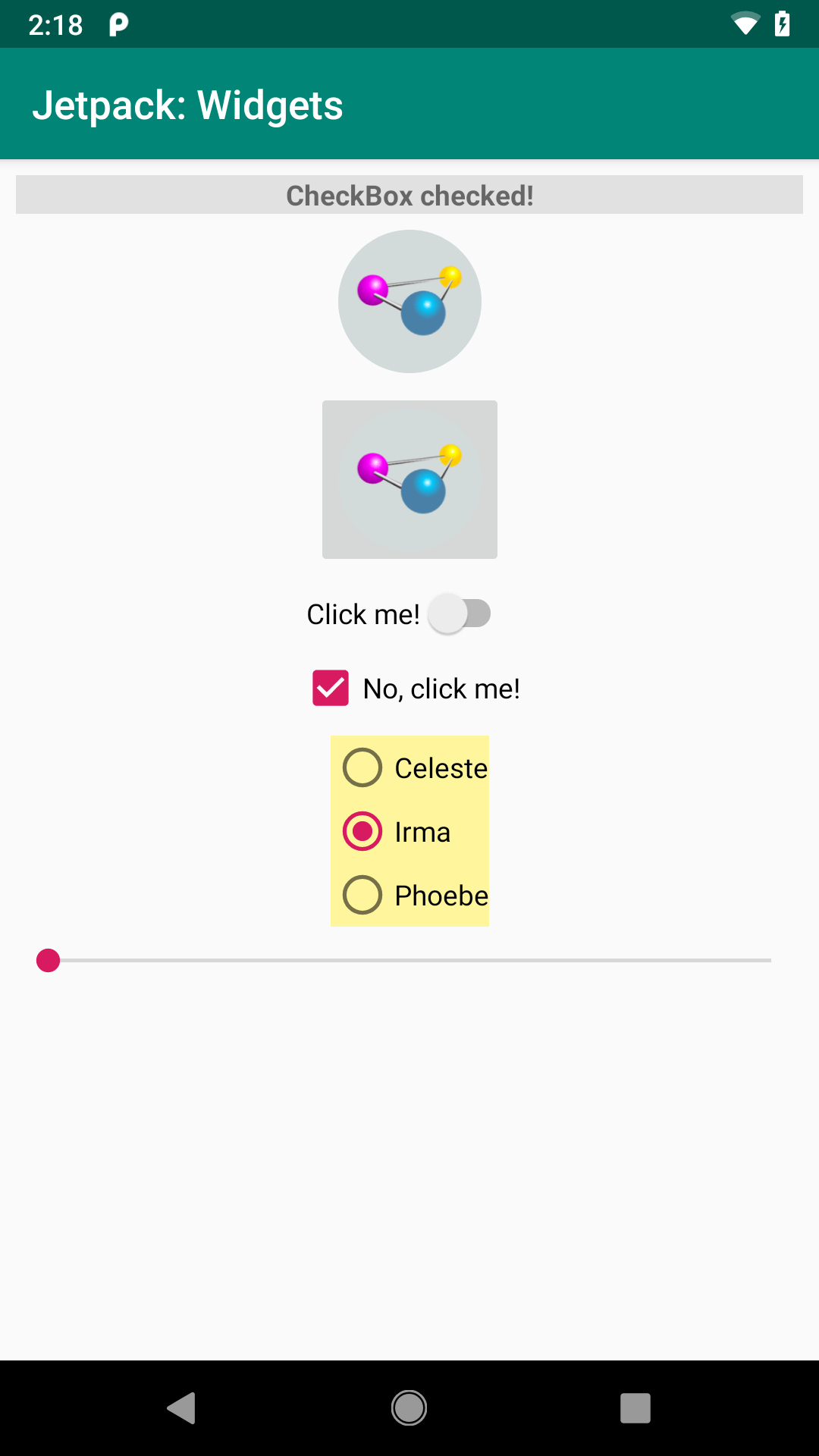
FormWidgets Sample, with
CheckBox Checked
Android Studio Graphical Layout Editor
The CheckBox widget can be found in the “Buttons” portion of the Palette in the Android Studio Graphical Layout editor:
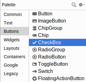
CheckBox Highlighted
You can drag one into the layout and configure it as desired using the Attributes pane. As CheckBox inherits from TextView, most of the settings are the same as those you would find on a regular TextView.
Reacting to Events
As with Switch, you can register a CompoundButton.OnCheckedChangeListener on a CheckBox using setOnCheckedChangeListener():
    binding.checkbox.setOnCheckedChangeListener((v, isChecked) ->
      log(isChecked ? R.string.checkbox_checked : R.string.checkbox_unchecked));
    binding.checkbox.setOnCheckedChangeListener { _, isChecked ->
      log(if (isChecked) R.string.checkbox_checked else R.string.checkbox_unchecked)
    }
RadioButton and RadioGroup
As with other implementations of radio buttons in other toolkits, Android’s radio buttons are two-state, like checkboxes, but can be grouped such that only one radio button in the group can be checked at any time. RadioButton is another form of CompoundButton and, on its own, works like Switch and CheckBox.
Most times, you will want to put your RadioButton widgets inside of a RadioGroup. The RadioGroup is a LinearLayout that indicates a set of radio buttons whose state is tied, meaning only one button out of the group can be selected at any time. If you assign an android:id to your RadioGroup in your layout resource, you can access the group from your Java/Kotlin code and invoke:
-
check()to check a specific radio button via its ID (e.g.,group.check(R.id.radio1)) -
clearCheck()to clear all radio buttons, so none in the group are checked -
getCheckedRadioButtonId()to get the ID of the currently-checked radio button (or-1if none are checked)
Note that the radio button group is initially set to be completely unchecked at the outset. To preset one of the radio buttons to be checked, use either setChecked() on the RadioButton or check() on the RadioGroup. Alternatively, you can use the android:checked attribute on one of the RadioButton widgets in the layout file.
Our sample app has a RadioGroup named radioGroup, containing three RadioButton widgets:
    <RadioGroup
      android:id="@+id/radioGroup"
      android:layout_width="wrap_content"
      android:layout_height="wrap_content"
      android:layout_marginTop="@dimen/margin_row"
      android:background="@color/radiogroup_background"
      app:layout_constraintEnd_toEndOf="parent"
      app:layout_constraintStart_toStartOf="parent"
      app:layout_constraintTop_toBottomOf="@id/checkbox">

      <RadioButton
        android:id="@+id/radioButton1"
        android:layout_width="wrap_content"
        android:layout_height="wrap_content"
        android:text="@string/radiobutton1_caption" />

      <RadioButton
        android:id="@+id/radioButton2"
        android:layout_width="wrap_content"
        android:layout_height="wrap_content"
        android:checked="true"
        android:text="@string/radiobutton2_caption" />

      <RadioButton
        android:id="@+id/radioButton3"
        android:layout_width="wrap_content"
        android:layout_height="wrap_content"
        android:text="@string/radiobutton3_caption" />
    </RadioGroup>
They appear beneath the CheckBox:
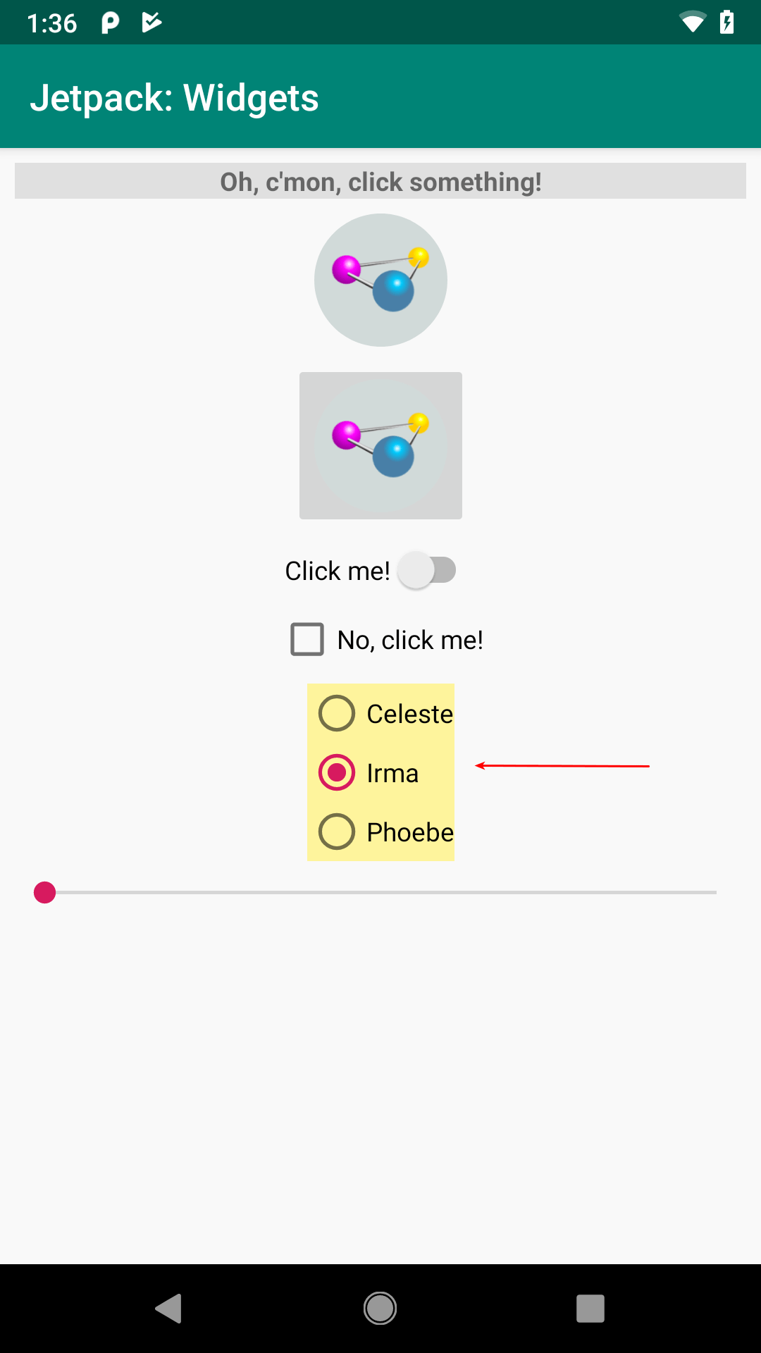
FormWidgets Sample, with
RadioGroup Highlighted
The RadioGroup is given a pale yellow background via android:background="@color/radiogroup_background" so you can better see its boundaries. The three RadioButton widgets differ in ID, caption, and whether they are checked (the middle one has android:checked="true" to pre-select it).
RadioGroup inherits from LinearLayout, which lays its children out one after the next. By default, that is in a column, but you can use android:orientation="horizontal" to make them form a row.
Android Studio Graphical Layout Editor
The RadioGroup container and RadioButton widget can be found in the “Buttons” portion of the Palette in the Android Studio Graphical Layout editor:
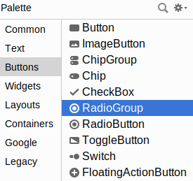
RadioGroup Highlighted
Dragging a RadioGroup into the preview gives you a box into which you can drag other widgets, such as the RadioButton.
Reacting to Events
It is possible to register the same sort of CompoundButton.OnCheckedChangeListener objects on RadioButton, as it too is a CompoundButton. More often, though, it is simpler to react to events on the RadioGroup, as you only need to register one listener, rather than one per RadioButton.
RadioGroup also has a setOnCheckedChangeListener() function. However, it takes a RadioGroup.OnCheckedChangeListener implementation, which is slightly different from CompoundButton.OnCheckedChangeListener. Your onCheckedChanged() function is passed:
- The
RadioGroupthat the user interacted with, and - The widget ID of the
RadioButtonthat changed
You are not given a Boolean for the new state of that RadioButton, though. That is because you are always called for the newly-checked RadioButton, and so it is always checked. Your onCheckedChanged() function is not called for the RadioButton that may have been unchecked as a result of the user checking another RadioButton.
In the SamplerJ edition of MainActivity, we use a Java method reference to have an onRadioGroupChange() function on MainActivity be called whenever the user checks a RadioButton in the RadioGroup:
binding.radioGroup.setOnCheckedChangeListener(this::onRadioGroupChange);
There, we examine the ID of the newly-checked RadioButton and log() a different string resource for each:
  private void onRadioGroupChange(RadioGroup group, int checkedId) {
    @StringRes int msg;

    if (checkedId == R.id.radioButton1) {
      msg = R.string.radiobutton1_checked;
    }
    else if (checkedId == R.id.radioButton2) {
      msg = R.string.radiobutton2_checked;
    }
    else {
      msg = R.string.radiobutton3_checked;
    }

    log(msg);
  }
The Kotlin code in the Sampler edition of MainActivity uses a when expression to log() the desired string resource:
    binding.radioGroup.setOnCheckedChangeListener { _, checkedId ->
      log(
        when (checkedId) {
          R.id.radioButton1 -> R.string.radiobutton1_checked
          R.id.radioButton2 -> R.string.radiobutton2_checked
          else -> R.string.radiobutton3_checked
        }
      )
    }
Prev Table of Contents Next
This book is licensed under the Creative Commons Attribution-ShareAlike 4.0 International license.