More Complex Forms
Let’s look at a bit more elaborate example, found in the ConstraintForm modules of the Java and Kotlin projects.
What We Want
We want to have a form that collects the first and last name of a person, with a Button to submit the form. We are not reacting to that button click — the purpose of this sample is to see how the form is constructed.
This seems straightforward enough. For example, we can have a ConstraintLayout that collects the first name and last name in two rows, with the Button below the last name row.
However, if we limit ourselves to the sort of ConstraintLayout anchoring rules that we have seen above, we would wind up with a layout that looks like this:
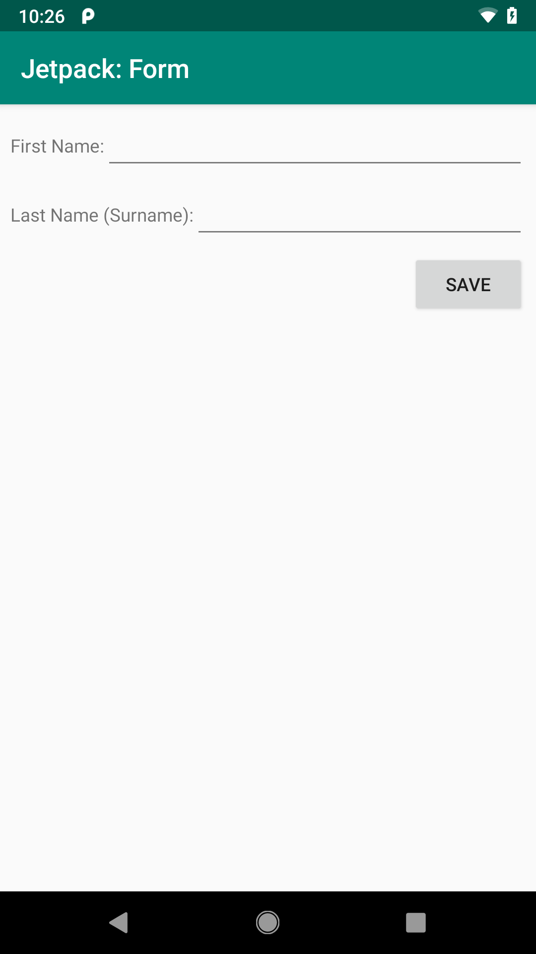
This works, but it would be nicer if we had columns for the labels and the fields:
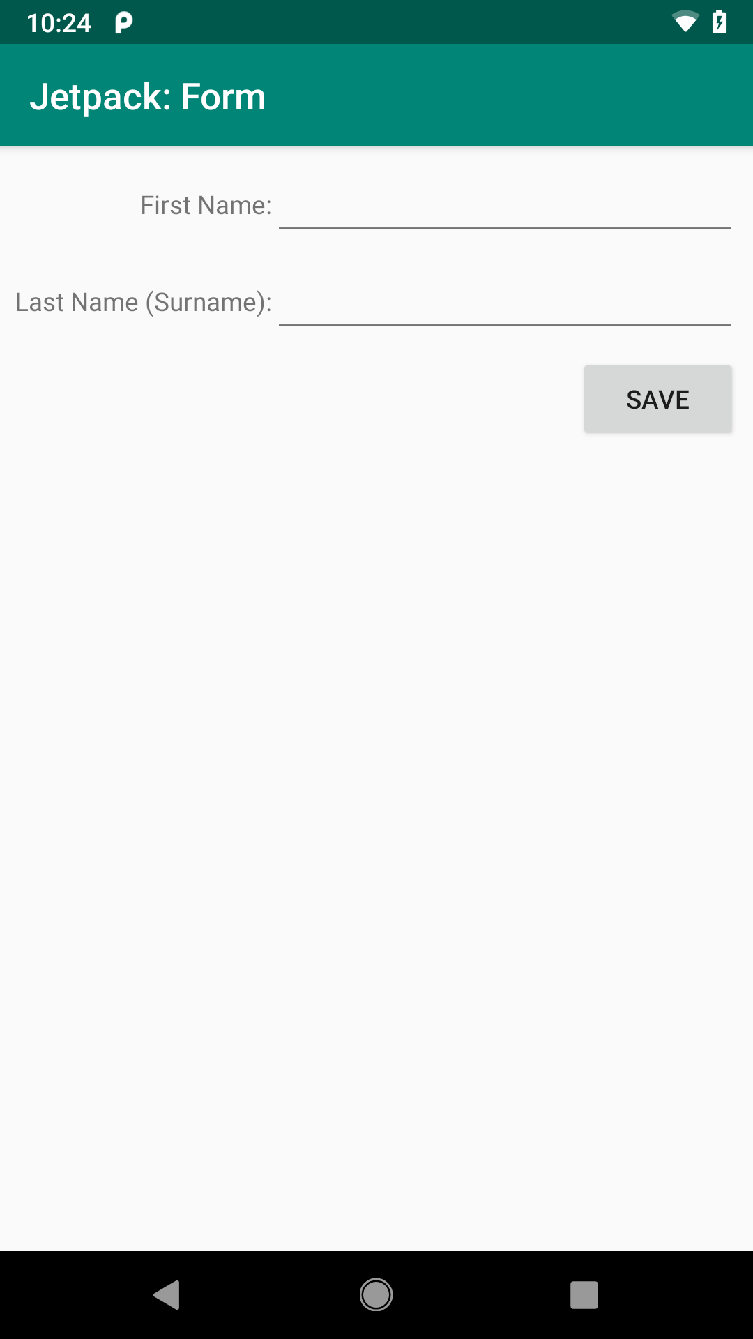
Fortunately, ConstraintLayout offers some features for helping us get this sort of look.
How We Get There
Our layout is more complex than the earlier example, owing in part to having five children of the ConstraintLayout: two TextView widgets, two EditText widgets, and a Button:
<?xml version="1.0" encoding="utf-8"?>
<androidx.constraintlayout.widget.ConstraintLayout
  xmlns:android="http://schemas.android.com/apk/res/android"
  xmlns:app="http://schemas.android.com/apk/res-auto"
  android:layout_width="match_parent"
  android:layout_height="match_parent"
  android:padding="@dimen/container_padding">

  <androidx.constraintlayout.widget.Barrier
    android:id="@+id/barrier"
    android:layout_width="wrap_content"
    android:layout_height="wrap_content"
    android:layout_marginStart="@dimen/margin_barrier"
    android:layout_marginEnd="@dimen/margin_barrier"
    app:barrierDirection="end"
    app:constraint_referenced_ids="labelFirst,labelLast" />

  <TextView
    android:id="@+id/labelFirst"
    android:layout_width="wrap_content"
    android:layout_height="wrap_content"
    android:labelFor="@id/firstName"
    android:text="@string/label_first"
    app:layout_constraintEnd_toStartOf="@id/barrier"
    app:layout_constraintBaseline_toBaselineOf="@id/firstName"
    app:layout_constraintHorizontal_bias="1.0"
    app:layout_constraintStart_toStartOf="parent" />

  <EditText
    android:id="@+id/firstName"
    android:layout_width="0dp"
    android:layout_height="wrap_content"
    android:inputType="textPersonName"
    app:layout_constraintEnd_toEndOf="parent"
    app:layout_constraintStart_toEndOf="@id/barrier"
    app:layout_constraintTop_toTopOf="parent" />

  <TextView
    android:id="@+id/labelLast"
    android:layout_width="wrap_content"
    android:layout_height="wrap_content"
    android:labelFor="@id/lastName"
    android:text="@string/label_last"
    app:layout_constraintEnd_toStartOf="@id/barrier"
    app:layout_constraintBaseline_toBaselineOf="@id/lastName"
    app:layout_constraintHorizontal_bias="1.0"
    app:layout_constraintStart_toStartOf="parent" />

  <EditText
    android:id="@+id/lastName"
    android:layout_width="0dp"
    android:layout_height="wrap_content"
    android:inputType="textPersonName"
    android:layout_marginTop="@dimen/margin_row"
    app:layout_constraintEnd_toEndOf="parent"
    app:layout_constraintStart_toEndOf="@id/barrier"
    app:layout_constraintTop_toBottomOf="@id/firstName" />

  <Button
    android:id="@+id/button"
    android:layout_width="wrap_content"
    android:layout_height="wrap_content"
    android:text="@string/save_caption"
    android:layout_marginTop="@dimen/margin_row"
    app:layout_constraintEnd_toEndOf="parent"
    app:layout_constraintTop_toBottomOf="@id/lastName" />

</androidx.constraintlayout.widget.ConstraintLayout>If you look at that XML, there are six child elements of the ConstraintLayout — we will explore that sixth one shortly.
Naming the Widgets
Each of the widgets gets a fairly simple android:id:
-
firstNameandlastNamefor the twoEditTextwidgets -
firstLabelandlastLabelfor the twoTextViewwidgets -
buttonfor theButton
Since we are not doing anything with these widgets from our Java/Kotlin code, the widget IDs are purely for internal use within this layout resource.
Barrier: You Shall Not Pass
The sixth child of the ConstraintLayout is a Barrier. Barrier is one of a couple of options with ConstraintLayout for creating a virtual anchor point: a place for you to reference in layout anchoring rules that is not itself a widget in the layout.
Specifically, this Barrier has:
app:barrierDirection="end"app:constraint_referenced_ids="labelFirst,labelLast"
Here, the “barrier direction” indicates where the barrier is established relative to the widgets referenced in the app:constraint_referenced_ids attribute. In our case, the end for app:barrierDirection means “put this Barrier at the end position of the child that is farthest from the start position”. Both of the TextView widgets are set up to start from the start edge of the ConstraintLayout and take up as much room as their content requires (android:layout_width="wrap_content"). As a result, the Barrier is placed at the end of whichever of those two TextView widgets is longest. In the sample app, that is the second label, which uses Last Name (Surname): as the caption (courtesy of @string/label_last). So, the Barrier is placed where the labelLast TextView ends.
We then set up the firstName and lastName widgets to have their start position be where the Barrier is, via app:layout_constraintStart_toEndOf="@id/barrier". This is why both fields have the same starting position, and that position is determined by the longest of the labels.
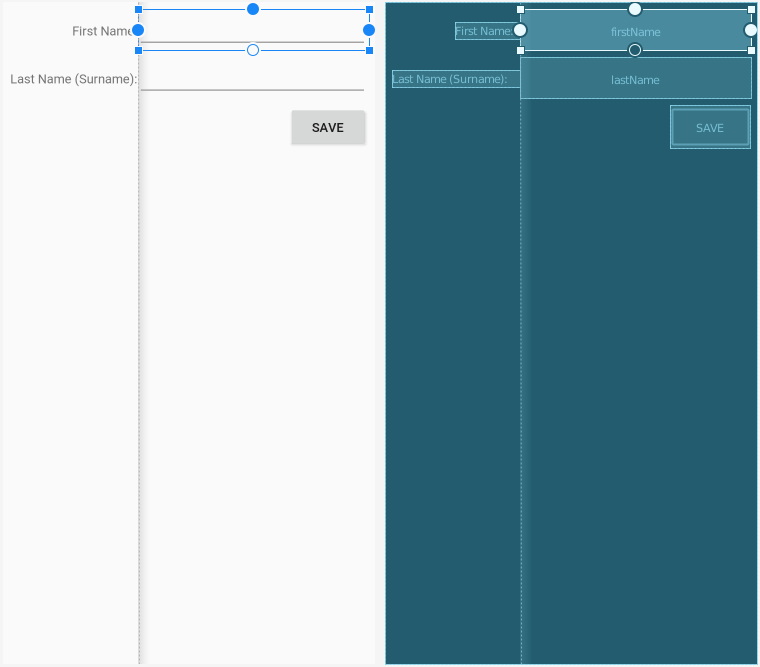
Barrier
As a result, our four main widgets — the two labels and the two fields — are organized into two columns, where the width of the first column is determined by the width of the labels inside of it.
Your Position Shows Some Bias
Our two labels do not have the same width. The labelLast text was set up to be excessively long to illustrate this.
By default, if we just anchored the labels to the start edge of the ConstraintLayout, their text would wind up on that edge. That is a bit awkward, though, in that our labelFirst text would wind up relatively far away from its associated field.
To address this, our layout has each label do two things:
- Constrain both the
startandendedges, where theendis anchored to theBarrierviaapp:layout_constraintEnd_toStartOf="@id/barrier" - Shove the text to the
endside viaapp:layout_constraintHorizontal_bias="1.0"
Bias, in terms of ConstraintLayout, means “if there is extra room, slide the widget in this direction along the axis”. The default bias is 0.5, meaning that the widget is centered in the available space. For the horizontal axis, 0.0 means “slide the widget all the way towards the start side” and 1.0 means “slide the widget all the way towards the end side”.
By having the label end at the Barrier and having its associated field start at the Barrier, we ensure that the label and the field are close together.
Declaring the Rows
In terms of the rows, the fields drive the vertical positioning:
- The top of
firstNameis anchored to the top of theConstraintLayoutviaapp:layout_constraintTop_toTopOf="parent" - The top of
lastNameis anchored to the bottom offirstNameviaapp:layout_constraintTop_toBottomOf="@id/firstName" - The top of
buttonis anchored to the bottom oflastNameviaapp:layout_constraintTop_toBottomOf="@id/lastName" - The labels have their baselines aligned with their associated fields
In addition:
- Each label has
android:labelForset, pointing to its associated field, for the benefit of screen readers and other assistive technologies - The
Buttonhasapp:layout_constraintEnd_toEndOf="parent"and nostart-side anchor, so it will be flush on the end side of theConstraintLayout
Prev Table of Contents Next
This book is licensed under the Creative Commons Attribution-ShareAlike 4.0 International license.