Simple Rows with ConstraintLayout
The ConstraintRow sample module in the Sampler and SamplerJ projects is very similar to the SimpleText sample. The layout now has a ConstraintLayout wrapped around a TextView and a Button.
The XML
Our root element is now <androidx.constraintlayout.widget.ConstraintLayout>:
<?xml version="1.0" encoding="utf-8"?>
<androidx.constraintlayout.widget.ConstraintLayout
  xmlns:android="http://schemas.android.com/apk/res/android"
  xmlns:app="http://schemas.android.com/apk/res-auto"
  android:layout_width="match_parent"
  android:layout_height="match_parent"
  android:padding="@dimen/container_padding">

  <TextView android:id="@+id/label"
    android:layout_width="wrap_content"
    android:layout_height="wrap_content"
    android:text="@string/label_caption"
    app:layout_constraintBaseline_toBaselineOf="@id/button"
    app:layout_constraintStart_toStartOf="parent" />

  <Button
    android:id="@+id/button"
    android:layout_width="0dp"
    android:layout_height="wrap_content"
    android:text="@string/button_caption"
    app:layout_constraintTop_toTopOf="parent"
    app:layout_constraintStart_toEndOf="@id/label"
    app:layout_constraintEnd_toEndOf="parent"/>

</androidx.constraintlayout.widget.ConstraintLayout>We give that ConstraintLayout a height and width of match_parent, which indicates that this widget or container should fill up the available space of its parent container. In this case, the “parent” is a container that occupies most of the space on the screen, so the ConstraintLayout will fill that space. We also give the ConstraintLayout padding on all four sides, so the contents of the ConstraintLayout will be inset from the edges by however much @dimen/container_padding calls for (8dp in this case).
There are two XML elements that are contained in the ConstraintLayout: our TextView and our Button. Both have IDs, sizes, and captions (via android:text). However, both also have anchoring rules, indicating where the widgets should be positioned within the ConstraintLayout.
The TextView has app:layout_constraintStart_toStartOf="parent". All attributes starting with app:layout_constraint are rules for children of ConstraintLayout. app:layout_constraintStart_toStartOf="parent" says:
- We are trying to constrain the “start” edge of the widget (
constraintStart), where the “start” edge is on the left for left-to-right languages and on the right for right-to-left languages - We are trying to anchor that edge to the start edge of something else (
toStartOf) - The “something else” is the
ConstraintLayoutitself ("parent")
So, app:layout_constraintStart_toStartOf="parent" will anchor the start edge of the TextView to the start side of the ConstraintLayout.
Similarly, the Button has:
-
app:layout_constraintTop_toTopOf="parent"to anchor the top of theButtonto the top of theConstraintLayout -
app:layout_constraintEnd_toEndOfto anchor the “end” of theButtonto the “end” of theConstraintLayout, where “end” is on the right for left-to-right languages and on the left for right-to-left languages
The TextView also has app:layout_constraintBaseline_toBaselineOf="@id/button". Here, “baseline” refers to the invisible line that text appears to “sit” upon. A TextView — and any subclasses, like Button — has a baseline. Here, we are anchoring the baseline of the TextView to the baseline of the Button, so wherever the Button winds up, the TextView will have a matching vertical position. The "@id/button" ties into the @+id/button declared in the android:id attribute of the Button, so the ConstraintLayout knows what widget is the target of this anchoring rule.
The Button also has app:layout_constraintStart_toEndOf="@id/label". This says that we want to anchor the start edge of the Button to the end edge of the TextView (whose android:id value is @+id/label).
The Button has an unusual android:layout_width value: 0dp. Normally, this would mean a width of zero dp, which would be a bit short. For a child of ConstraintLayout, though, 0dp means “the width is determined by the horizontal constraints”. In the case of the Button:
- The start edge is anchored to the end edge of the
TextView - The end edge is anchored to the end edge of the
ConstraintLayout
As a result, with a width of 0dp, the Button will be stretched to fill the space between those two anchor positions. If instead the width were wrap_content, the Button width would be determined by its caption, and it would be centered in between those two anchor positions.
The Android Studio Graphical Layout Editor
If you click on a widget in the ConstraintLayout in the blueprint view, that view will show squares on the corners and circles centered on the edges:
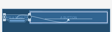
The squares are resize handles. Most likely, you have seen this pattern before, whether in IDEs, drawing tools, or other programs. You would use this resizing approach if you wanted a fixed size for the widget. Later switching to using dimension resources, rather than hard-coded values, for the size values would be a good idea. You can also change the width and height through the Attributes pane.
The circles are more important, as they allow you to define the constraints, by dragging a circle to some anchor point:
You can drag the circle to an equivalent circle on another widget or to the edges of the ConstraintLayout, to establish an anchoring rule between those two points. That rule is represented by an arrow connecting the two widgets, with the start and end of the arrow showing the sides that were constrained.
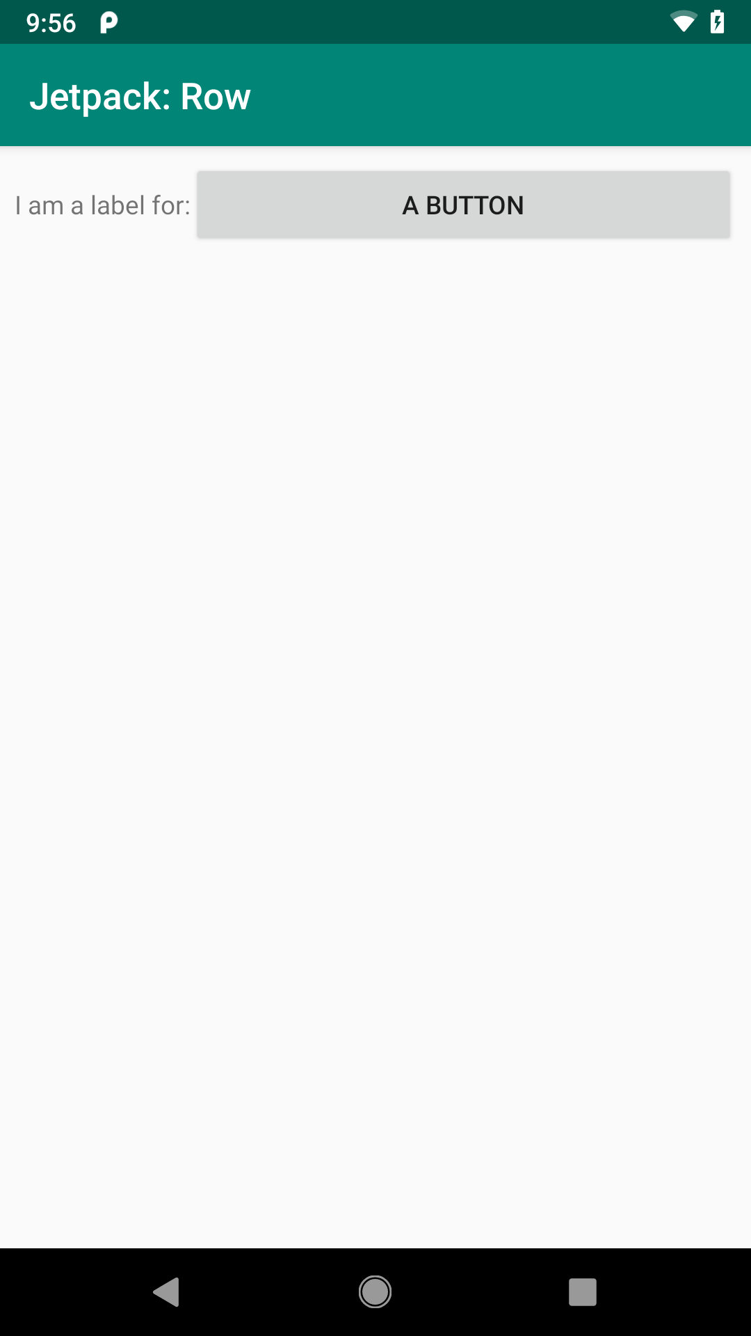
The Result
If you run either edition of the ConstraintRow sample, you will see the result matches the graphical layout editor and what we asked for in the XML attributes:
- The
TextViewis aligned on the start edge of the screen and is vertically aligned with the baseline of theButton - The
TextViewtakes up its “natural” space based upon its caption - The
Buttonfills the space between theTextViewand the end edge of the screen - The
Buttonis aligned with the top of the screen - Everything is inset
8dpfrom the edges
Prev Table of Contents Next
This book is licensed under the Creative Commons Attribution-ShareAlike 4.0 International license.