A Deep Dive Into MVI
The preceding chapter introduced Model-View-Intent (MVI) as a GUI architecture pattern… without any code.
This chapter will look at a concrete implementation of MVI, so you can see how it works. Note, though, that all of these GUI architectures are fairly malleable, and so this chapter’s approach may differ somewhat from other MVI implementations.
What the Sample App Does
A popular app category is a to-do list. These track outstanding tasks that need to be done, usually with some sort of checkbox or other indicator to denote which ones have been completed. Some offer due dates, recurring tasks, or other features to make it easier for you to set up a roster of tasks that match your needs. Some synchronize with a Web service, so that you can view your to-do list in multiple places, such as both on your phone and from a desktop Web browser.
Google has published a long list of sample apps that use a to-do list as a way of exploring various GUI architectures. The ToDo/MVI sample project is not a fork of those, but rather a “cleanroom” implementation of a to-do list with similar functionality. That functionality is tied into three fragments: the to-do list roster, the viewer, and the editor.
The Roster
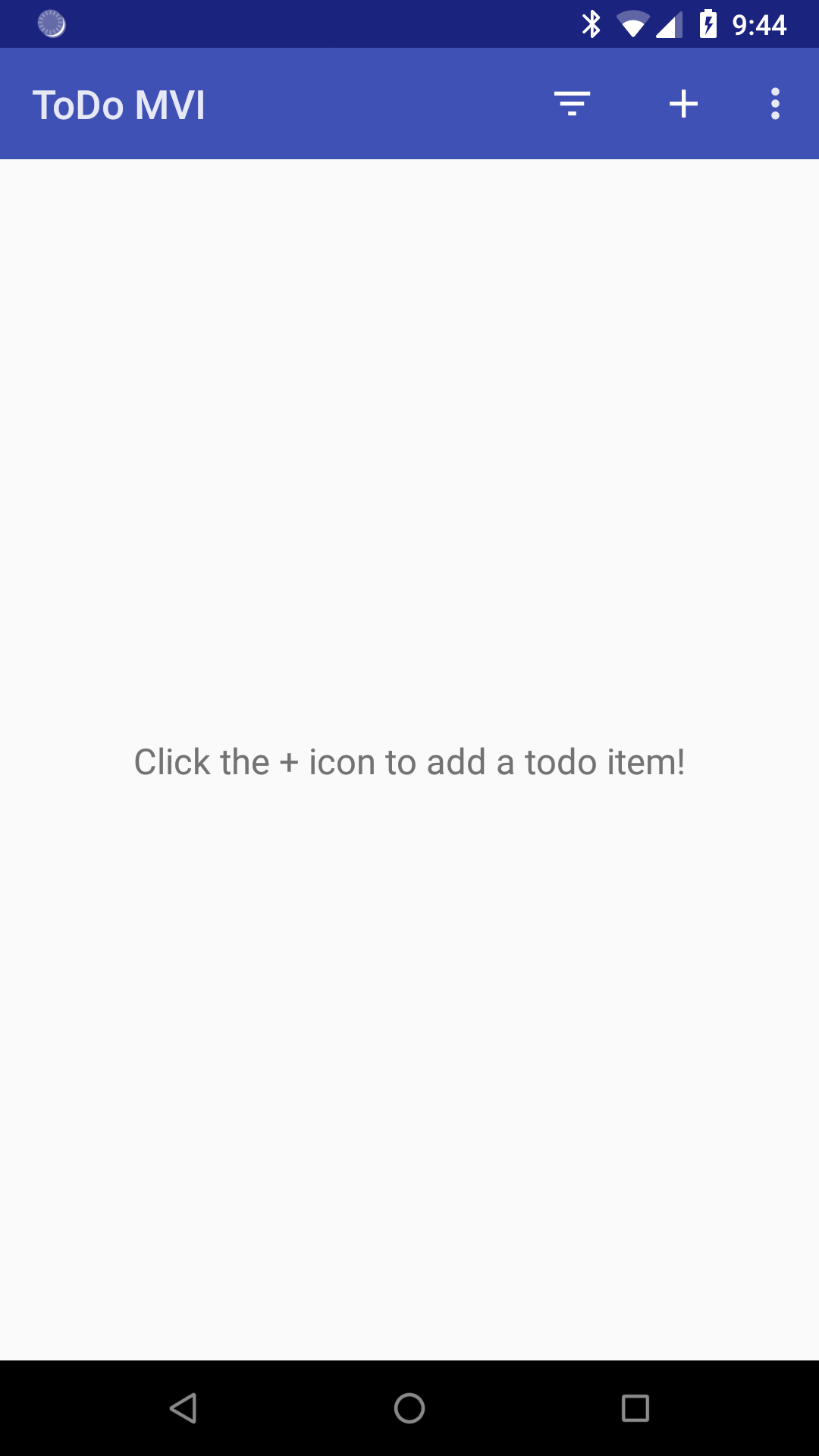
When initially launched, the app will show a roster of the recorded to-do items, if there are any. Hence, on the first run, it will show just an “empty view”, prompting the user to click the “add” action bar item to add a new item:
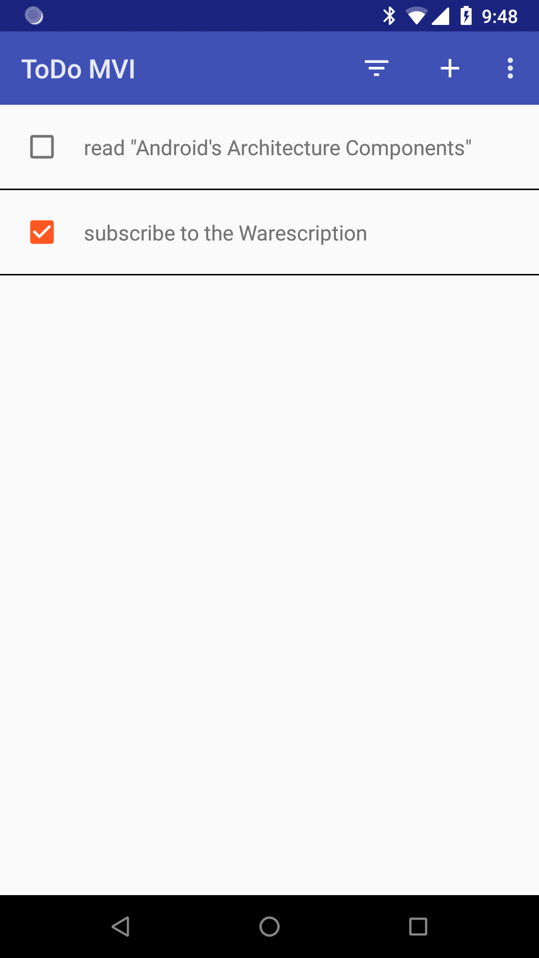
Once there are some items in the database, the roster will show those items, in alphabetical order by title, with a checkbox indicating whether or not they have been completed:
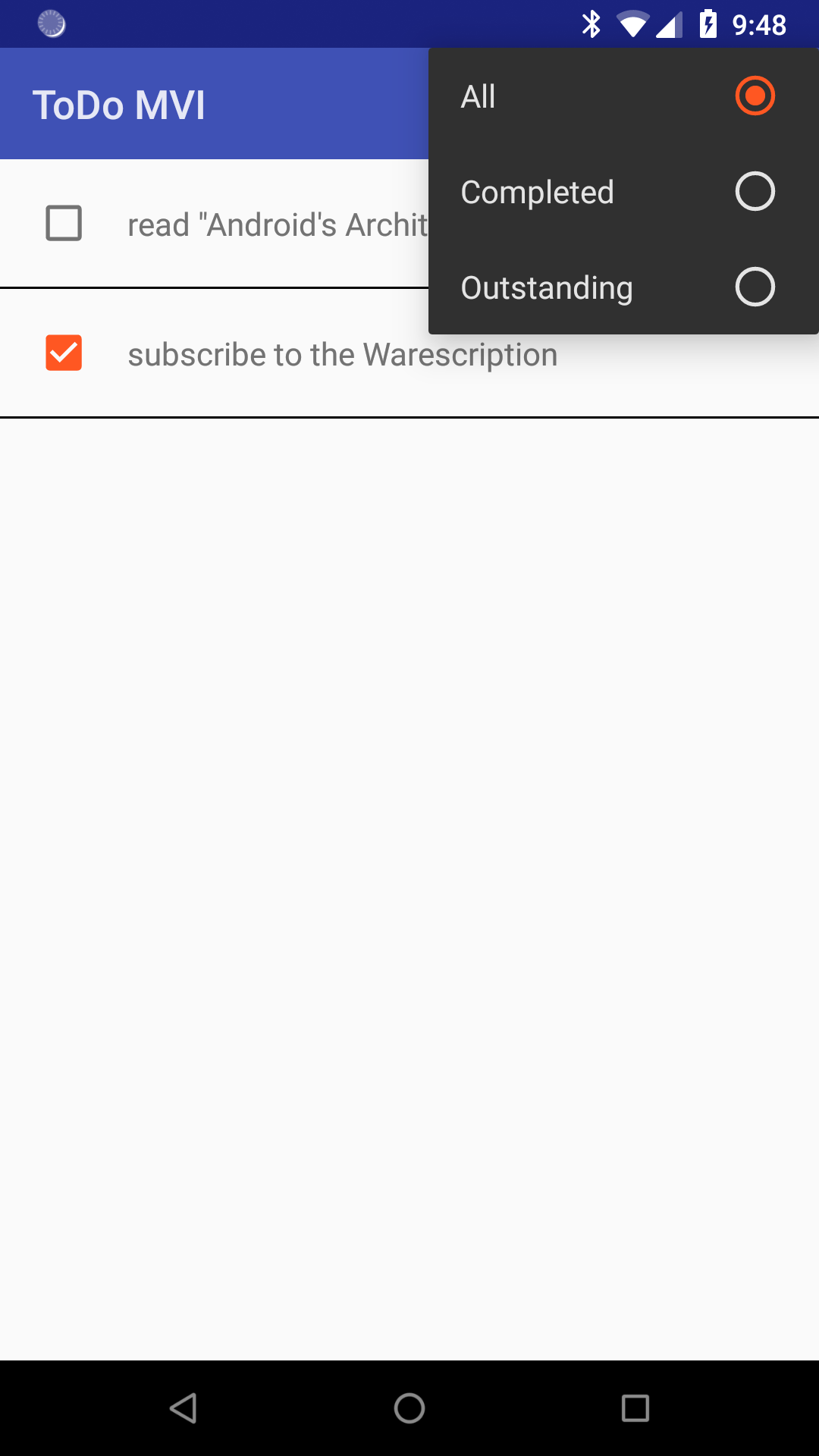
From here, the user can tap the checkbox to quickly mark an item as completed (or un-mark it if needed). A filter drop-down allows the user to toggle the list from showing all items, only those marked as completed, or only those still outstanding (i.e., not yet checked as completed):
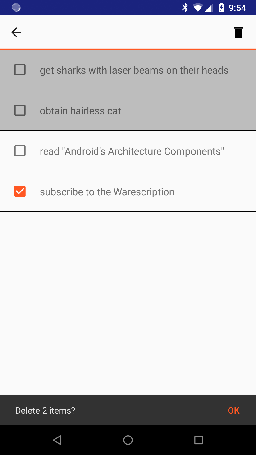
Long-pressing on an item switches the list into multiple-selection mode, where the user can then tap on items to build up a selection:
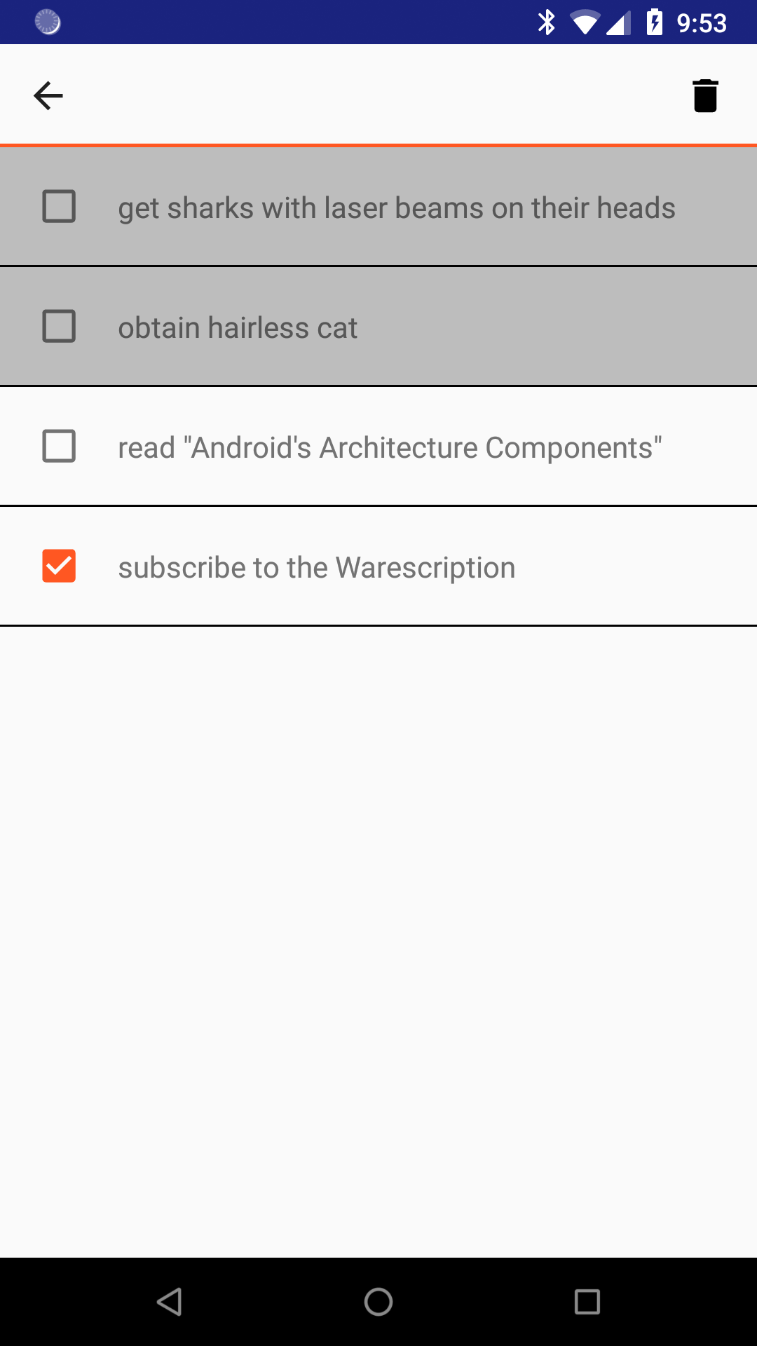
The “trash can” toolbar button will allow the user to delete the selected items, after confirmation:
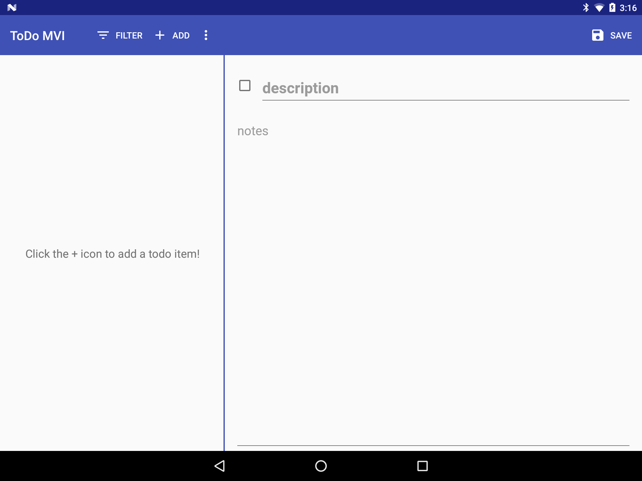
On a smaller-screen device, such as a phone, the roster will fill the screen. However, on larger-screen devices, the activity adopts the master-detail pattern and shows the viewer or editor fragment side-by-side with the roster:
The Viewer
A simple tap on an item in the roster brings up the viewer fragment, either alongside the roster on a larger screen or on its own on a smaller screen:
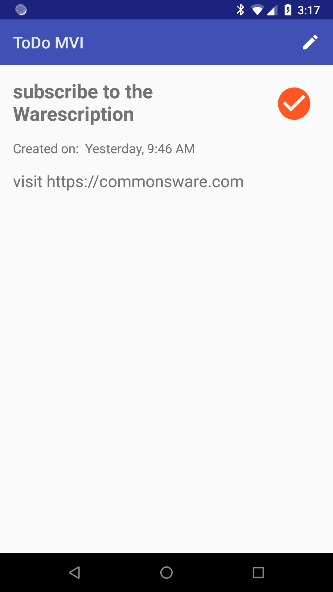
This just shows additional information about the item, including any notes the user entered to provide more detail than the simple description that gets shown in the roster. The checkmark icon will appear for completed items.
From here, the user can edit this item (via the “pencil” icon). The user can also swipe left and right to traverse the roster of items — this is particularly useful on a phone, to avoid the “ping-pong” effect of having to navigate back to the roster fragment just to view details of the next item.
The Editor
The editor is a simple form, either to define a new to-do item or edit an existing one. If the user taps on the “add” action bar item from the roster, the editor will appear blank, and submitting the form will create a new to-do item. If the user taps on the “edit” (pencil) action bar item from the viewer, the editor will have the existing item’s data, which can be altered and saved:
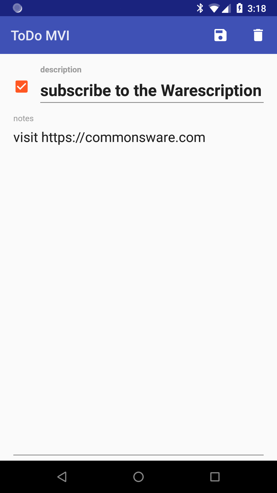
Clicking the “save” toolbar button will either add the new item or edit the item that the user requested to edit. For an edit, the “delete” toolbar button will be available and will allow the user to delete this specific item, after confirmation.
Prev Table of Contents Next
This book is licensed under the Creative Commons Attribution-ShareAlike 4.0 International license.