Tracking Our Load Status
There are three logical states that our RosterListFragment and its RecyclerView can be in:
- We have to-do items, and we are displaying them
- We do not have to-do items, because the user has not entered any, and so we should show the “empty” view to help guide the user
- We do not know whether we have to-do items or not, because we have not yet loaded them from the database
That third state is not being handled by the app. Instead, we treat “do not know” as being the same as “we do not have to-do items” — we show the “empty” view if our RosterListAdapter is empty, no matter why it is empty. Plus, it would be nice to show some sort of “loading” indicator while the data load is in progress… such as a ProgressBar.
So, in this tutorial, we will fix this. For most Android devices, and for shorter to-do lists, the difference will not be visible, as the data will load very rapidly. However, on slower devices, or with large to-do lists, the difference may be noticeable.
This is a continuation of the work we did in the previous tutorial. The book’s GitLab repository contains the results of the previous tutorial as well as the results of completing the work in this tutorial.
Step #1: Adjusting Our Layout
We need to make a couple of changes to the layout used by RosterListFragment.
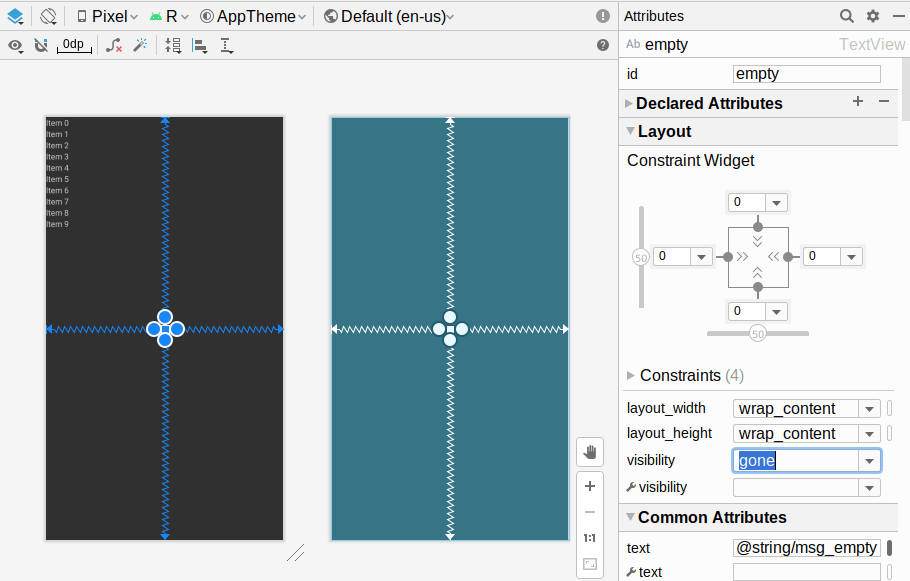
Open res/layout/todo_roster.xml in the IDE. In the design view, click on the empty TextView in the “Component Tree”. In the list of all attributes, find the visibility attribute, and set it to gone:
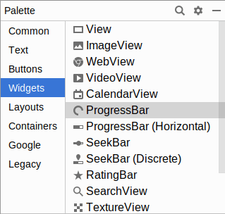
Next, choose the “Widgets” category in the “Palette” view. You will see two labeled “ProgressBar”, one with a circle and one that is an actual bar:
Typically, the circular ProgressBar is used for indefinite progress, where we do not know how long the work will take. The horizontal ProgressBar is more often used for cases where we can let the user know how far we have progressed.
In this case, the work is fairly atomic: either our data is loaded or it is not. We have no intermediate steps with which to provide progress updates, so we should use the circular indefinite ProgressBar.
However, we cannot drag and drop a widget into the preview area, since the preview is mostly our RecyclerView. The IDE will attempt to make our widget be a child of the RecylerView, and that does not work very well. Instead, drag the circular ProgressBar from the “Palette” and drop it on the ConstraintLayout entry in the “Component Tree” view. This will add it as a child to the ConstraintLayout, which is what we want.
Then, use the grab handles on the ProgressBar to set up constraints to all four edges of the ConstraintLayout. However, there is a decent chance that you will sometimes get a constraint that ties the ProgressBar to the items RecyclerView, instead of to the parent ConstraintLayout:
  <ProgressBar
    android:id="@+id/progressBar"
    style="?android:attr/progressBarStyle"
    android:layout_width="wrap_content"
    android:layout_height="wrap_content"
    app:layout_constraintBottom_toBottomOf="@+id/items"
    app:layout_constraintEnd_toEndOf="parent"
    app:layout_constraintStart_toStartOf="parent"
    app:layout_constraintTop_toTopOf="parent" />
Here, app:layout_constraintBottom_toBottomOf wound up being set to @+id/items instead of parent. The simplest thing to do is to change the XML manually, so that all four constraints are set to parent.
Also, change the widget’s ID to loading.
Prev Table of Contents Next
This book is licensed under the Creative Commons Attribution-ShareAlike 4.0 International license.