Step #8: Creating the Description Field
The other two things that the user should be able to edit here are the description and the notes. They should not be able to edit the created-on date — that is the date on which the to-do item was created, and so it should not change after creation. For the description and the notes, we will use EditText widgets.
Switch back to graphical designer in the layout editor. In the “Palette” pane, in the “Text” category, drag a “Plain Text” widget into the design area. Using the grab handles, set up constraints to:
- Tie the top and end sides of the
EditTextto the top and end sides of theConstraintLayout - Connect the start side of the
EditTextto the end side of theCheckBox

Next, change the “layout_width” attribute in the Attributes pane to match_constraint:

Then, in the “Layout” section of the “Attributes” pane, give it 8dp of margin on the top, start, and end sides, via the drop-downs.
Next, switch to the “Code” view, and change the android:id value for this <EditText> to be @+id/desc. Afterwards, switch back to the “Design” view.
If you look closely, you will see that our CheckBox is not very well aligned vertically with respect to the EditText:

Ideally, it would be vertically centered. To do that, re-drag a constraint from the top of the CheckBox to the top of the EditText. Then, create a similar constraint, from the bottom of the CheckBox to the bottom of the EditText

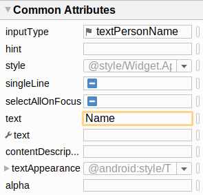
In the Attributes pane, the “Plain Text” widget that we dragged into the preview gave us an EditText set up with an “inputType” of textPersonName:

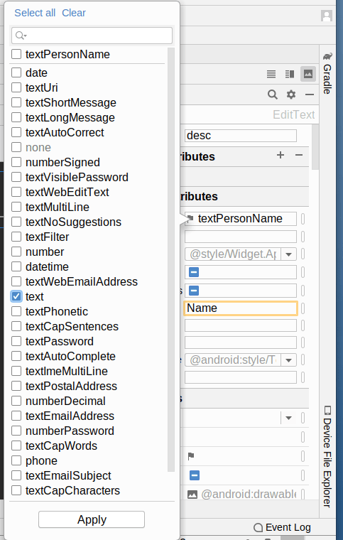
The android:inputType attribute provides hints to soft keyboards as to what we expect to use as input. For example, in languages where there is a distinction between uppercase and lowercase letters, textPersonName might trigger a switch to an uppercase keyboard for each portion of a name. In this case, we really want plain text, so click on the flag adjacent to textPersonName. Then, in the pop-up panel that appears, uncheck textPersonName and check text:

Then, click the “Apply” button in the popup to close that popup.
An EditText has an android:hint attribute. This provides some text that will appear in the field in gray when there is no actual text entered by the user in the field. Once the user starts typing, the hint goes away. This is used to save space over having a separate label or caption for the field. With that in mind, click the “O” button for the “hint” attribute in the Attributes pane. Create a new string resource using the drop-down menu. Give the resource a name of desc and a value of Description. Then, click OK to define the string resource and apply it to the hint.
Finally, clear out the “text” attribute, as we will set that at runtime.
At this point, the layout XML should resemble:
<?xml version="1.0" encoding="utf-8"?>
<androidx.constraintlayout.widget.ConstraintLayout
  xmlns:android="http://schemas.android.com/apk/res/android"
  xmlns:app="http://schemas.android.com/apk/res-auto"
  xmlns:tools="http://schemas.android.com/tools"
  android:layout_width="match_parent" android:layout_height="match_parent">

  <CheckBox
    android:id="@+id/isCompleted"
    android:layout_width="wrap_content"
    android:layout_height="wrap_content"
    android:layout_marginStart="8dp"
    app:layout_constraintBottom_toBottomOf="@+id/desc"
    app:layout_constraintStart_toStartOf="parent"
    app:layout_constraintTop_toTopOf="@+id/desc" />

  <EditText
    android:id="@+id/desc"
    android:layout_width="0dp"
    android:layout_height="wrap_content"
    android:layout_marginStart="8dp"
    android:layout_marginTop="8dp"
    android:layout_marginEnd="8dp"
    android:ems="10"
    android:hint="@string/desc"
    android:inputType="text"
    app:layout_constraintEnd_toEndOf="parent"
    app:layout_constraintStart_toEndOf="@+id/isCompleted"
    app:layout_constraintTop_toTopOf="parent" />
</androidx.constraintlayout.widget.ConstraintLayout>
Prev Table of Contents Next
This book is licensed under the Creative Commons Attribution-ShareAlike 4.0 International license.