Step #8: Showing the Created-On Date
The next bit of data to display is the date on which the to-do item was created. Also, we need to provide a label for the date, as otherwise the user may not realize what this date means.
First, let’s set up the label. In the graphical designer, drag another TextView into the layout. Drag the grab handles to set up constraints:
- On the start end of the label, to the start side of the
ConstraintLayout - On the top of the label, to the bottom of the
descTextView
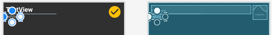
Give the widget an ID of labelCreated. And, in the “Layout” section of the “Attributes” pane, give it 8dp of top and start margin, via the drop-downs. Set layout_width and layout_height each to wrap_content.
To set the text to a fixed value, we can set up another string resource. However, the Attributes pane has two attributes that look like they set the text of the TextView:
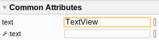
The one with the wrench icon sets up separate text to show when working in the design view of the layout resource editor. We want the other one, that sets the text for actual app — it has TextView as the value right now. Click the “O” button next to that field, and choose the drop-down option to create a new string resource. Give it a name of created_on and a value of “Created on:”. Clicking “OK” will close the dialog and assign that string resource to the TextView for the android:text attribute.
Then, find the textAppearance attribute in the “Attributes” pane and set its value to ?attr/textAppearanceHeadline2. As before, this delegates the design of the text to whatever our theme has for textAppearanceHeadline2.
However, while this is supposed to be sized like a secondary headline, that is not what AppCompat has. So, back over in res/values/styles.xml, add a new style resource:
  <style name="HeadlineTwoAppearance" parent="@style/TextAppearance.AppCompat.Medium">
  </style>
This HeadlineTwoAppearance simply inherits from TextAppearance.AppCompat.Medium. We could override other attributes here, but at the moment, we do not need any.
Then, add this attribute to Theme.ToDo:
<item name="textAppearanceHeadline2">@style/HeadlineTwoAppearance</item>
This indicates that the theme’s textAppearanceHeadline2 maps to our new HeadlineTwoAppearance style. And this gives us a better text size for our creation date.
Now, we can show the created-on date, next to our newly-created label.
Drag yet another TextView into the layout. Drag the grab handles to set up constraints:
- On the start side of this
TextView, to the end side of thelabelCreatedTextView - On the top of this
TextView, to the bottom of thedescTextView - On the end side of this
TextView, to the start side of the icon
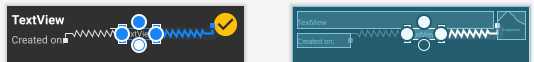
Then, set the “layout_width” to match_constraint (a.k.a., 0dp). Give the widget an ID of createdOn. Tn the “Layout” section of the “Attributes” pane, give it 8dp of top, start, and end margin, via the drop-downs. And, clear the contents of the “text” attribute, as we will fill that in at runtime.
Next, find the textAppearance attribute in the “Attributes” pane and set its value to ?attr/textAppearanceHeadline2, the same as we used for its label.
At this point, the XML of the layout resource should resemble:
<?xml version="1.0" encoding="utf-8"?>
<androidx.constraintlayout.widget.ConstraintLayout
  xmlns:android="http://schemas.android.com/apk/res/android"
  xmlns:app="http://schemas.android.com/apk/res-auto"
  xmlns:tools="http://schemas.android.com/tools"
  android:layout_width="match_parent" android:layout_height="match_parent">

  <ImageView
    android:id="@+id/completed"
    android:layout_width="@dimen/checked_icon_size"
    android:layout_height="@dimen/checked_icon_size"
    android:layout_marginTop="8dp"
    android:layout_marginEnd="8dp"
    android:contentDescription="@string/is_completed"
    android:tint="@color/colorAccent"
    app:layout_constraintEnd_toEndOf="parent"
    app:layout_constraintTop_toTopOf="parent"
    app:srcCompat="@drawable/ic_check_circle" />

  <TextView
    android:id="@+id/desc"
    android:layout_width="0dp"
    android:layout_height="wrap_content"
    android:layout_marginStart="8dp"
    android:layout_marginTop="8dp"
    android:layout_marginEnd="8dp"
    android:textAppearance="?attr/textAppearanceHeadline1"
    app:layout_constraintEnd_toStartOf="@+id/completed"
    app:layout_constraintStart_toStartOf="parent"
    app:layout_constraintTop_toTopOf="parent" />

  <TextView
    android:id="@+id/labelCreated"
    android:layout_width="wrap_content"
    android:layout_height="wrap_content"
    android:layout_marginStart="8dp"
    android:layout_marginTop="8dp"
    android:text="@string/created_on"
    android:textAppearance="?attr/textAppearanceHeadline2"
    app:layout_constraintStart_toStartOf="parent"
    app:layout_constraintTop_toBottomOf="@+id/desc" />

  <TextView
    android:id="@+id/createdOn"
    android:layout_width="0dp"
    android:layout_height="wrap_content"
    android:layout_marginStart="8dp"
    android:layout_marginTop="8dp"
    android:layout_marginEnd="8dp"
    android:textAppearance="?attr/textAppearanceHeadline2"
    app:layout_constraintEnd_toStartOf="@+id/completed"
    app:layout_constraintStart_toEndOf="@+id/labelCreated"
    app:layout_constraintTop_toBottomOf="@+id/desc" />
</androidx.constraintlayout.widget.ConstraintLayout>
Prev Table of Contents Next
This book is licensed under the Creative Commons Attribution-ShareAlike 4.0 International license.