Step #6: Adding the Completed Icon
Part of what we need to display is whether or not this to-do item is completed. In the roster rows, that was handled by the CheckBox. However, a CheckBox is a widget designed for input. We have two choices:
- We could use a
CheckBoxand allow the user to change the completion status from within theDisplayFragment - We could use something else to represent the current completion status, restricting the user to changing the status somewhere else
Since we are also going to allow the user to change the completion status from the fragment that allows editing of the whole ToDoModel, it seems reasonable to make DisplayFragment be display-only. We could still use a CheckBox and simply ignore any changes that the user makes in it, but that’s just rude.
Instead, let’s use an ImageView to display an icon for completed items, hiding it for items that are not completed.
To do this, first we should set up the icon artwork. Right-click over res/drawable/ in the project tree and choose “New” > “Vector Asset” from the context menu. This brings up the Vector Asset Wizard, that we used when creating the app bar item in an earlier tutorial.
There, click the “Clip Art” button and search for check:
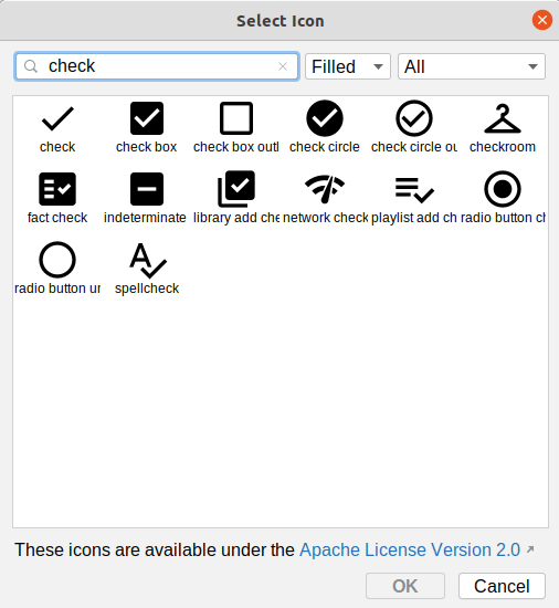
Choose the “check circle” icon and click “OK” to close up the icon selector. Then, change the name to ic_check_circle. Finally, click “Next” and “Finish” to close up the wizard and set up our icon.
If the icon selector did not open, that may be due to this Arctic Fox bug. Instead, just close up the Vector Asset wizard, and download this file into res/drawable instead. That is the desired icon, already set up for you.
Then, in the graphical designer for todo_display.xml, drag an ImageView from the “Common” category of the “Palette” into the layout. This immediately displays a dialog from which you can choose a resource to display:
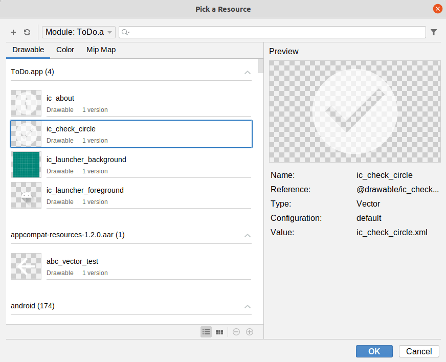
In the “app” section, choose the ic_check_circle resource that we just created, then click “OK” to close up the dialog.
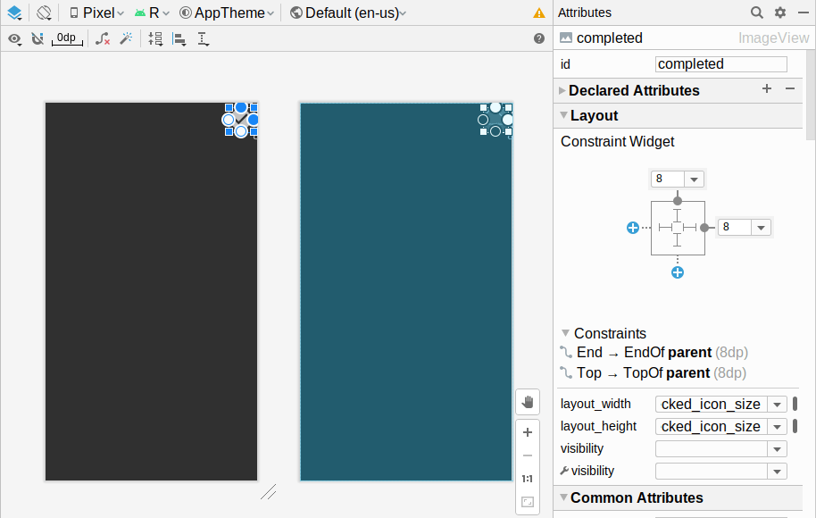
Add constraints to tie the top and end side of the ImageView to the top and end side of the ConstraintLayout. Then, in the Attributes pane, give the ImageView an “ID” of completed. And, in the “Layout” section, give it 8dp of top and end margin.
The icon is a bit small by default, at only 24dp. We can make it bigger by changing its width and height. We want it to be square, and we might want the size to be different on larger-screen devices. So, we should set up a dimension resource for a larger size, then apply it to both the width and the height.
To do that, click the “O” button to the right of the “layout_width” drop-down in the Attributes pane:

That brings up a dialog to choose a dimension resource:
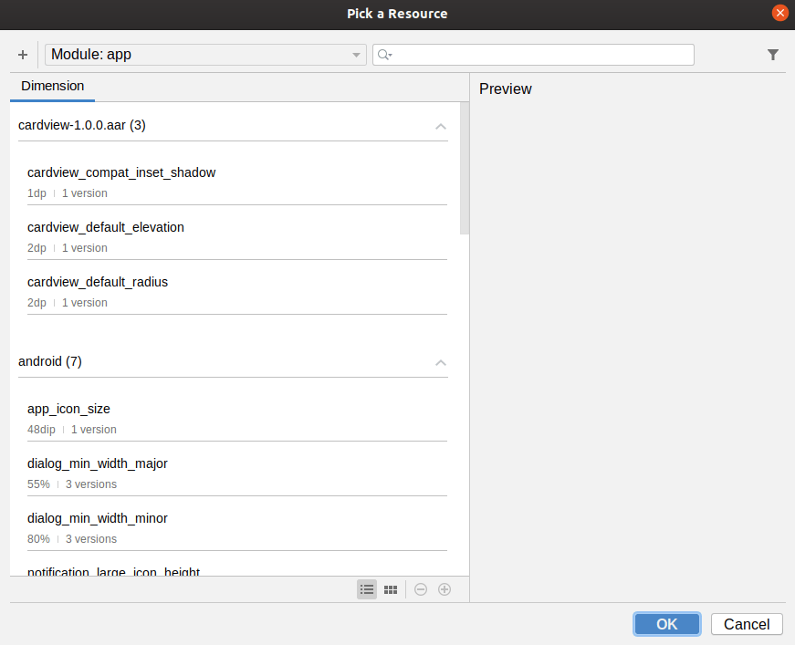
Click the + icon and choose “Dimension Value…” from the drop-down menu to bring up the new-resource dialog:
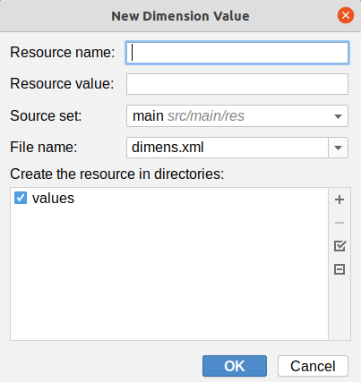
For the name, fill in checked_icon_size, and use 48dp for the value. Click “OK” to close up both dialogs and fill in that dimension. Then, click the “O” next to the “layout_height” drop-down in the Attributes pane, and choose the checked_icon_size dimension from the list. This will give you a larger icon, with both height and width set to 48dp:
For accessibility, it is good to supply a “content description” for an ImageView, which is some text to announce using a screen reader. To do that, in the “Common Attributes” section of the “Attributes” pane, click the “O” button next to the “contentDescription” field, to bring up a string resource chooser. Click the + icon and choose “String Value” from the drop-down menu to bring up the new string resource dialog. For the resource name, use is_completed, and for the resource value, use Item is completed. Click “OK” to close up both dialogs and apply this new string resource to the android:contentDescription attribute.
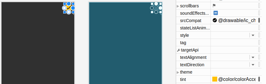
The icon appears gray. That works, but it is a bit boring, and it does not blend in with the rest of the colors used in the app. To change it to use our accent color, switch to the “Code” view and add app:tint="@color/colorAccent" as an attribute to the <ImageView> element. This will apply our amber accent color as a tint, which you will see if you switch back to the “Design” view:
Your layout XML should now resemble:
<?xml version="1.0" encoding="utf-8"?>
<androidx.constraintlayout.widget.ConstraintLayout
  xmlns:android="http://schemas.android.com/apk/res/android"
  xmlns:app="http://schemas.android.com/apk/res-auto"
  xmlns:tools="http://schemas.android.com/tools"
  android:layout_width="match_parent" android:layout_height="match_parent">

  <ImageView
    android:id="@+id/completed"
    android:layout_width="@dimen/checked_icon_size"
    android:layout_height="@dimen/checked_icon_size"
    android:layout_marginTop="8dp"
    android:layout_marginEnd="8dp"
    android:contentDescription="@string/is_completed"
    android:tint="@color/colorAccent"
    app:layout_constraintEnd_toEndOf="parent"
    app:layout_constraintTop_toTopOf="parent"
    app:srcCompat="@drawable/ic_check_circle" />
</androidx.constraintlayout.widget.ConstraintLayout>
Prev Table of Contents Next
This book is licensed under the Creative Commons Attribution-ShareAlike 4.0 International license.