Populating Our RecyclerView
We now have a repository with some fake to-do items. It would be helpful if the user could see these items in our MainActivity and its RosterListFragment. We have a RecyclerView in that fragment, and now we need to tie the data from the repository into the RecyclerView.
This is a continuation of the work we did in the previous tutorial. The book’s GitLab repository contains the results of the previous tutorial as well as the results of completing the work in this tutorial.
 You can learn more about
 RecyclerView in the "Employing RecyclerView" chapter of Elements of Android Jetpack!
Step #1: Defining a Row Layout
Next, we need to define a layout resource to use for the rows in our roster of to-do items.
Right-click over the res/layout/ directory and choose “New” > “Layout resource file” from the context menu. In the dialog that appears, fill in todo_row as the “File name” and ensure that the “Root element” is set to androidx.constraintlayout.widget.ConstraintLayout. Then, click “OK” to close the dialog and create the mostly-empty resource file.
We want a CheckBox in the rows. We can then arrange to allow the users to mark to-do items as completed by checking the CheckBox.
In Android, a CheckBox widget consists of the actual “box” plus an associated text caption. In principle, we could use that caption to show the description of the to-do item. The downside of this approach is that CheckBox does not distinguish between click events on the box itself and clicks on the caption. Both serve to check (or uncheck) the CheckBox. In many situations, that is fine. In this case, though, we also want the user to be able to click on a row in our RecyclerView and be able to navigate to a screen with the full details of this to-do item. Ideally, we would have the user click the caption to navigate to the detail screen, with clicks on the box to check and uncheck it. Unfortunately, CheckBox does not support that.
As a result, what we are going to do is use a CheckBox but leave its caption empty. Instead, we will place a TextView next to the CheckBox and use that for the description. Then, we can distinguish between clicks on the box and clicks on anything else in the row.
With all that in mind… let’s start off by setting up the CheckBox.
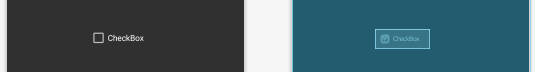
So, drag a CheckBox from the “Buttons” category in the “Palette” into the preview area:
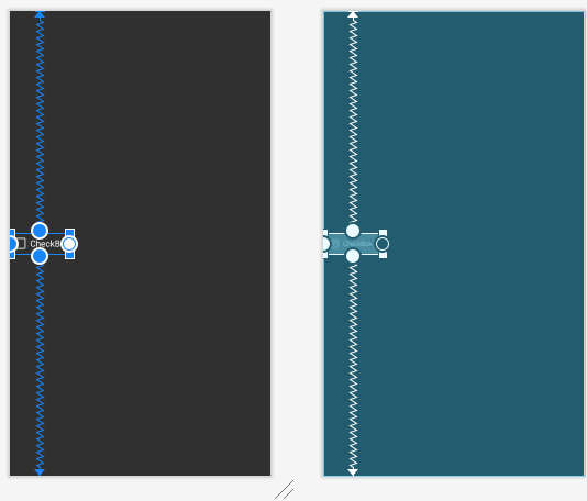
Use the round grab handles to drag connections from the CheckBox to the top, bottom, and start sides of the ConstraintLayout:
CheckBox
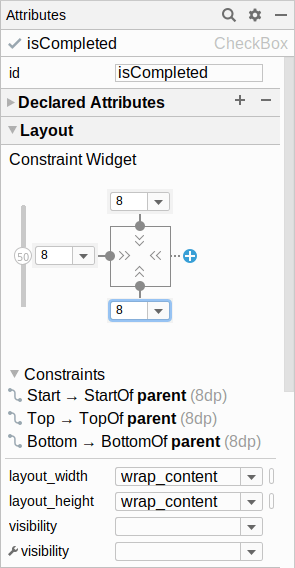
In the “Attributes” tool, change the “id” to isCompleted. Also, in the “Layout” section, change the three drop-downs surrounding the square to be 8dp, setting margins on those sides:
Also, clear out the “text” attribute, leaving that blank.
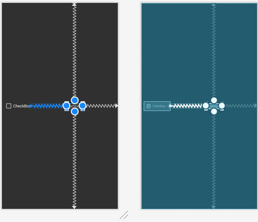
Next, from the “Common” category in the “Palette”, drag a TextView into the layout. Using the round circles, add constraints from the TextView to:
- the top, bottom, and end edges of the
ConstraintLayout, and - the end side of the
CheckBox
CheckBox and
TextView
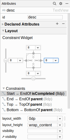
In the “Attributes” pane, set the “id” to desc and the “layout_width” to “match_constraint” (a.k.a., 0dp). Also, clear out the “text” attribute, leaving it blank. Then, in the “Layout” section, change the four drop-downs surrounding the square to be 8dp, setting margins on those sides:
Then, in the “Attributes” pane, fold open the “All Attributes” section. This brings up a long list of possible attributes to change. In there, change “ellipsize” to end, by choosing end from the drop-down for that attribute. And, set “maxLines” to 3. This says “show at most 3 lines of text, and if our description is longer than that, truncate the end and show an ellipsis (…) instead”.
Next, select the ConstraintLayout itself in the “Component Tree”. Then, in the “Attributes” pane, set the “layout_height” to be wrap_content. This will keep our rows to be only as tall as is the content in the row.
Finally, switch to the “Code” view in the layout editor and add three attributes to the root <ConstraintLayout> element:
-
android:clickable="true", to indicate that this widget represents something that can be clicked -
android:focusable="true", to indicate that this widget represents something that should be focusable if the user is using arrow keys, a D-pad, or other similar sort of non-touchscreen form of input -
android:background="?attr/selectableItemBackground", to give this widget a background that is the stock background from our theme for things that can be clicked upon
The reason for these three attributes is that rows should be clickable elements, and we want to provide the proper visual response when the user clicks upon them. In Material Design, the standard visual response is a ripple effect in a contrasting color, and android:background="?attr/selectableItemBackground" will give that to us automatically for clickable-and-focusable widgets.
At this point, with those manual edits, the todo_row layout XML should look like:
<?xml version="1.0" encoding="utf-8"?>
<androidx.constraintlayout.widget.ConstraintLayout
  xmlns:android="http://schemas.android.com/apk/res/android"
  xmlns:app="http://schemas.android.com/apk/res-auto"
  android:layout_width="match_parent"
  android:layout_height="wrap_content"
  android:clickable="true"
  android:focusable="true"
  android:background="?attr/selectableItemBackground">

  <CheckBox
    android:id="@+id/isCompleted"
    android:layout_width="wrap_content"
    android:layout_height="wrap_content"
    android:layout_marginStart="8dp"
    android:layout_marginTop="8dp"
    android:layout_marginBottom="8dp"
    app:layout_constraintBottom_toBottomOf="parent"
    app:layout_constraintStart_toStartOf="parent"
    app:layout_constraintTop_toTopOf="parent" />

  <TextView
    android:id="@+id/desc"
    android:layout_width="0dp"
    android:layout_height="wrap_content"
    android:layout_marginStart="8dp"
    android:layout_marginTop="8dp"
    android:layout_marginEnd="8dp"
    android:layout_marginBottom="8dp"
    android:ellipsize="end"
    android:maxLines="3"
    app:layout_constraintBottom_toBottomOf="parent"
    app:layout_constraintEnd_toEndOf="parent"
    app:layout_constraintStart_toEndOf="@+id/isCompleted"
    app:layout_constraintTop_toTopOf="parent" />
</androidx.constraintlayout.widget.ConstraintLayout>Prev Table of Contents Next
This book is licensed under the Creative Commons Attribution-ShareAlike 4.0 International license.